Text annotator
Updated a month ago to v3.9.4 by Flourish team
How to use this template
What is it for?
Use the “Text annotator” for written content that you want to add definitions, explanations, and notes to. It lets you highlight parts of a text and add annotations with various styling options.
How to get started
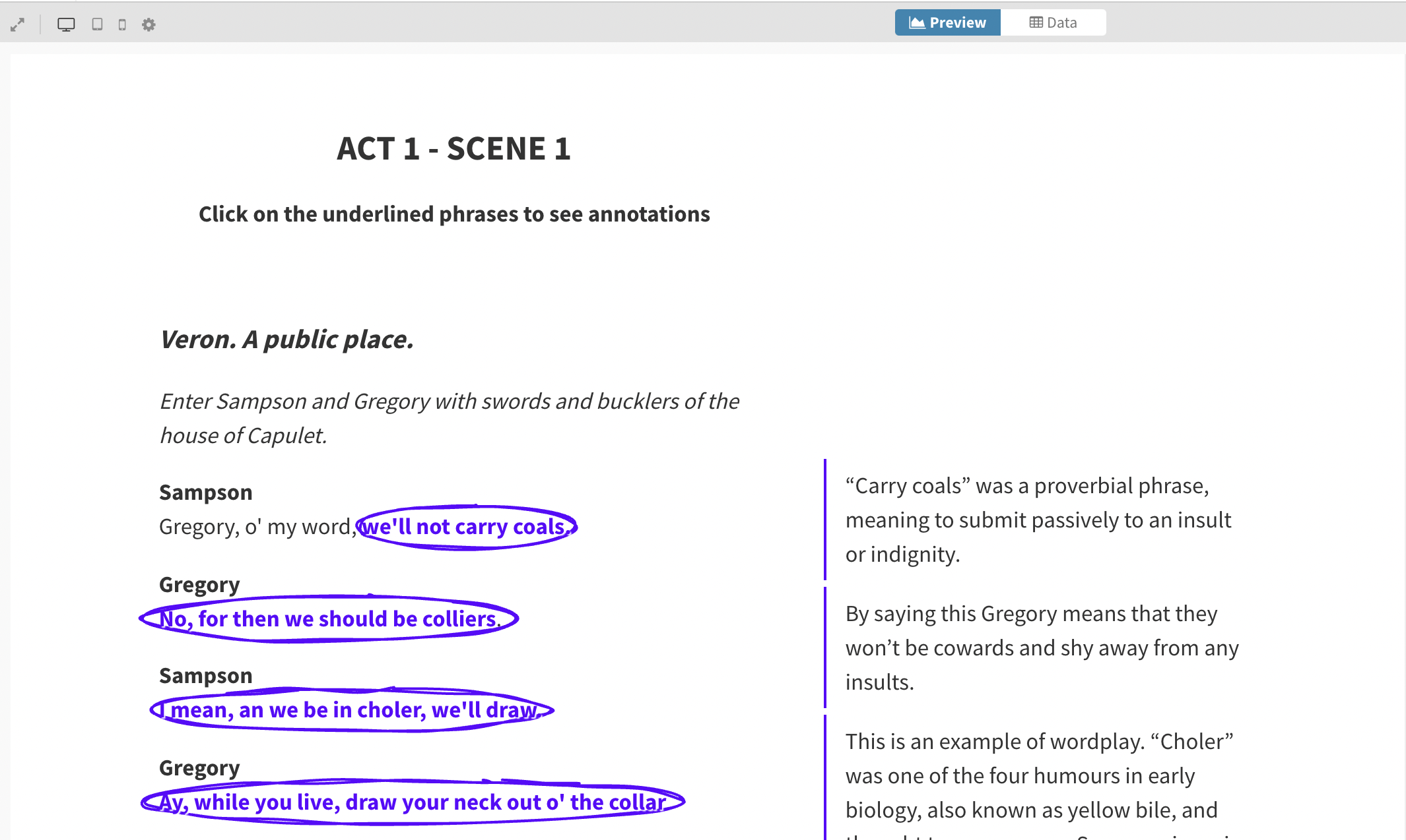
Choose a “Text annotator” starting point from the template chooser.
Find the piece of text you would like to annotate and enter it into the Text box in the Text settings panel. TIP: You can add HTML and CSS to enhance your visualization further. Click here to find out more.
Make a note of the annotations you want to add to your text, we will add these in the Data tab.
In the Data tab, add the snippets of text you want to annotate from your chosen piece of writing and bind that to the Text column. Add your annotations into a column next to this and bind that column to Annotations.
If you want to annotate a specific part of the text that occurs more than once, you can add identifiers in your text. To use identifiers, wrap the text you'd like to annotate in square brackets and write the identifier in curly brackets next to it. Then, in the Data tab, supply the content to display with the word. For example:
[Sam]{sam-annotation}. In the datasheet, you can write "sam-annotation" in the first column and the text to write as the annotation in the second column. TIP: Use identifiers when you have annotation content that you would like to use more than once.

- Once you've input your data, back in the Preview tab the text for which you've added annotations will be highlighted and circled, with annotations appearing to the right-hand side of the text.
How to style your text and annotations
Now you have your annotations set up, you can change how the text and annotations are styled.
Under Text styling, you can customize the text alignment and how the highlighted text is displayed.
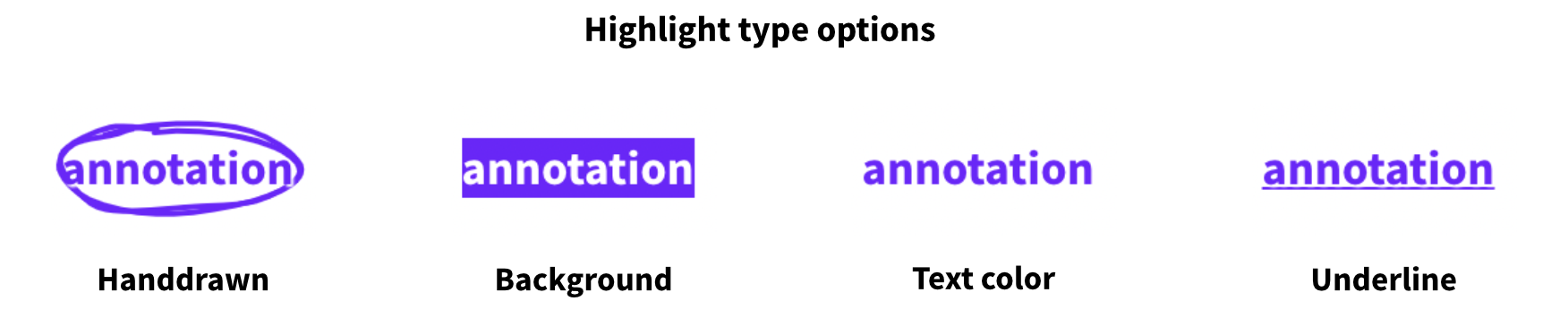
For Highlight type, there are four options: handdrawn, background, text color, or underline.
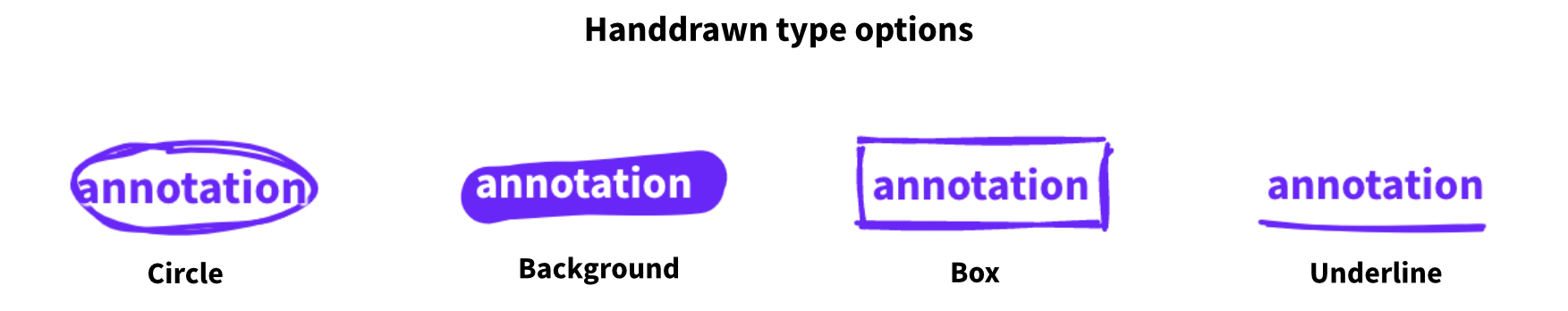
If you choose handdrawn, you can choose between a few other handdrawn type options for styling your highlighted text.
Under Annotations styling, you can choose where and when the annotations should display.
There are two Mode options: Side panel displays the annotations to the right-hand side of the text, while Inline blocks places them directly below the part of the text to which they apply.
There are settings to choose whether annotations appear Always or only On click, as well as some font settings. You can also add custom HTML and CSS in the Note content box.
Under Annotations styling, when you are using Side panel mode there is also the option to set a different mode for mobile devices. Side panel mode is not always optimal for smaller devices, so you may want to use Inline blocks or Overlap panels.
As with our other templates, you can customize your visualization under Layout (such as adding a background image) and you can add headers and footers too.
API information
This section documents API usage specific to this template, so for an introduction we suggest you refer to the generic API documentation instead.
template: @flourish/text-annotator
version: 3
Template data
There are three different formats in which you can supply data to this template. The most convenient for you to use likely depends on the source of your data, as described below.
1. Array of arrays, and a bindings object
You can supply arrays of arrays to opts.data, which might look
like:
{
    data: {
        data: [
            [ "DataColumn1Value1", "DataColumn2Value1",
            [ "DataColumn1Value2", "DataColumn2Value2",
            [ "DataColumn1Value3", "DataColumn2Value3",
            ...
        ]
    }
}
where each array of arrays represents the rows in a data sheet.
To tell the API how the values from each column should be
associated with the keys that the template is expecting, you must also supply
an object attached to opts.bindings. (The meanings of the
keys in the bindings object are documented
below.) The minimal bindings you can
supply for this template are as shown in this example:
{
    template: "@flourish/text-annotator",
    version: "3",
    bindings: {
        data: {
            text: 0, // index of a column in your data
            note: 1, // index of a column in your data
        }
    },
    data: {
        data: [
            [ "DataColumn1Value1", "DataColumn2Value1",
            [ "DataColumn1Value2", "DataColumn2Value2",
            [ "DataColumn1Value3", "DataColumn2Value3",
            ...
        ]
    }
}
All possible bindings that you can supply are shown in this example:
{
    template: "@flourish/text-annotator",
    version: "3",
    bindings: {
        data: {
            text: 0, // index of a column in your data
            note: 1, // index of a column in your data
        }
    },
    data: {
        data: [
            [ "DataColumn1Value1", "DataColumn2Value1",
            [ "DataColumn1Value2", "DataColumn2Value2",
            [ "DataColumn1Value3", "DataColumn2Value3",
            ...
        ]
    }
}
2. Array of objects with arbitrary keys, and a bindings object
This format is most likely useful when you have data from an external source,
such as CSV data loaded from d3-dsv.
You should supply this attached to the opts.data, which might look
like:
{
        data: [
            { "DataHeader1": ..., "DataHeader2": ..., ... },
            { "DataHeader1": ..., "DataHeader2": ..., ... },
            { "DataHeader1": ..., "DataHeader2": ..., ... },
            ...
        ]
    }
... but with the keys being the column headers from your
source data instead. You must also supply an object attached to
opts.bindings. The minimal bindings you can
supply for this template are as shown in this example:
{
    template: "@flourish/text-annotator",
    version: "3",
    bindings: {
        data: {
            text: "DataHeader1",
            note: "DataHeader2",
        }
    },
    data: {
        data: [
            { "DataHeader1": ..., "DataHeader2": ..., ... },
            { "DataHeader1": ..., "DataHeader2": ..., ... },
            { "DataHeader1": ..., "DataHeader2": ..., ... },
            ...
        ]
    }
}
All possible bindings that you can supply are shown in this example:
{
    template: "@flourish/text-annotator",
    version: "3",
    bindings: {
        data: {
            text: "DataHeader1",
            note: "DataHeader2",
        }
    },
    data: {
        data: [
            { "DataHeader1": ..., "DataHeader2": ..., ... },
            { "DataHeader1": ..., "DataHeader2": ..., ... },
            { "DataHeader1": ..., "DataHeader2": ..., ... },
            ...
        ]
    }
}
(As before, the keys containing "Header" would be replaced by column names from your data source.)
3. Array of objects with template-defined keys
There is an alternative format you can use, which is likely to be easier to
use if your data is not from a spreadsheet source. With this alternative format
you supply your data to the template as
an array of objects, attached to opts.data, where the keys must
be those used by the template, as documented below. In this case
there is no need to supply a bindings object, since the key names are already
those expected by the template. The required properties in the data
object are as follows (scroll down for a
description of what each property is):
{
    template: "@flourish/text-annotator",
    version: "3",
    data: {
    data: [
        {
            text: ...,
            note: ...
        },
        ...
    ]
},
    ...
}
And the full list of all possible properties is as follows:
{
    template: "@flourish/text-annotator",
    version: "3",
    data: {
    data: [
        {
            text: ...,
            note: ...
        },
        ...
    ]
},
    ...
}
Meanings of the template data keys:
- data.text: The piece of text you want to highlight. Note that text is case and space sensitive.
- data.note: The annotation content
Template settings
Options for opts.state.
Text
text html
Text. Fill in the text you want to annotate. In the datasheet, you can write which parts of the text should be annotated. If you want to annotate a specific part of the text that occurs more than once, you can add identifiers to your text. For example, "I'd like to annotate the word [beautiful]{beautiful-annotation}." Then, in the datasheet, you can write "beautiful-annotation" in the first column and the text to include in the annotation in the second column.
Text styling
highlight_color color
Highlight color.
layout_align string
Align. Allowed values:
text_container_width number
Width. Max width of text container
text_font_size number
Font size. In rems, a multiple of the page's base font size
text_font_color color
Text color.
text_font_color_highlighted color
Text color (highlighted).
text_font_color_highlighted_contrast color
Text color (highlighted).
text_highlight_type string
Highlight type. Allowed values:
text_highlight_handdrawn string
Handdrawn type. Allowed values:
highlighted_stroke_end string
Stroke end. Allowed values:
highlighted_stroke_amount number
Iterations. Number of lines to draw Min: 1 Max: 20
highlighted_stroke_width number
Thickness. Min: 0.5 Max: 20
Annotation styling
note_type string
Mode. Allowed values:
note_visibility string
Show notes. Allowed values:
note_font_size number
Text size.
side_panel_width number
Width. Max width of side panel
note_font_color color
Text color.
note_background_color color
Background color.
note_custom_content html
Note content. Use {{NOTE}} to show the annotation content. Use this setting to add prefixes, suffixes or additional HTML styling to your annotations.
note_mobile_mode string
Mobile mode. Choose where to display the notes on smaller screens Allowed values:
Layout
layout.body_font font
Main font. This font will apply to the whole graphic by default. You can optionally change the font for the title, subtitle, footer, etc in the Header and Footer settings panels.
layout.font_color color
Text color. This color will apply to the whole graphic by default, You can optionally change the color for individual text elements, in other settings panels.
layout.background_color_enabled boolean
Color. Allowed values:
layout.background_image_enabled boolean
Image. Allowed values:
layout.background_color color
Background color.
layout.background_image_src url
Image URL.
layout.background_image_size string
Size. Allowed values:
layout.background_image_position string
Position. Allowed values:
layout.max_width_target string
Maximum width. Apply a maximum width to just the main graphic or everything (main graphic plus header, footer, etc). Allowed values:
layout.max_width number
Maximum width. Leave blank to stretch to container width Min: 50
layout.max_width_align string
Align. Allowed values:
layout.layout_order string
Layout order. Allowed values:
layout.space_between_sections string
Space between sections. Allowed values:
layout.space_between_sections_custom number
Custom. Max: 100
layout.margin_top number
Top.
layout.margin_right number
Right.
layout.margin_bottom number
Bottom.
layout.margin_left number
Left.
layout.border.enabled boolean
Show borders around visualisation.
layout.border.top.width number
Top.
layout.border.top.style string
Style. Allowed values:
layout.border.top.color color
Color.
layout.border.right.width number
Right.
layout.border.right.style string
Style. Allowed values:
layout.border.right.color color
Color.
layout.border.bottom.width number
Bottom.
layout.border.bottom.style string
Style. Allowed values:
layout.border.bottom.color color
Color.
layout.border.left.width number
Left.
layout.border.left.style string
Style. Allowed values:
layout.border.left.color color
Color.
layout.read_direction string
Read direction. This will change the reading direction of the main text elements on the page. It's not possible to adjust this on all elements, such as axes. Allowed values:
Note that when direction is set to right to left any alignment icons will be reversed.
layout.font_size_mobile_small number
layout.font_size_mobile_big number
layout.font_size_tablet number
layout.font_size_desktop number
layout.font_size_big_screen number
layout.breakpoint_mobile_small number
layout.breakpoint_mobile_big number
layout.breakpoint_tablet number
layout.breakpoint_desktop number
layout.breakpoint_big_screen number
Header
layout.header_align string
Alignment. Allowed values:
layout.title html
layout.title_styling boolean
Styling.
layout.title_font font
Title Font.
layout.title_size string
Size. Allowed values:
layout.title_size_custom number
Custom. Specify a custom responsive font size in rems. The best results will be with values between 1.2 and 3
layout.title_weight string
Weight. Allowed values:
layout.title_color color
Color.
layout.title_line_height number
Line height. Max: 3
layout.title_space_above string
Space above. Allowed values:
layout.title_space_above_custom number
Custom. Max: 100
layout.subtitle html
layout.subtitle_styling boolean
Styling.
layout.subtitle_font font
Subtitle Font.
layout.subtitle_size string
Size. Allowed values:
layout.subtitle_size_custom number
Custom. Specify a custom responsive font size in rems. The best results will be with values between 1.2 and 3
layout.subtitle_weight string
Weight. Allowed values:
layout.subtitle_color color
Color.
layout.subtitle_line_height number
Line height. Max: 3
layout.subtitle_space_above string
Space above. Allowed values:
layout.subtitle_space_above_custom number
Custom. Max: 100
layout.header_text html
layout.header_text_styling boolean
Styling.
layout.header_text_size string
Size. Allowed values:
layout.header_text_size_custom number
Custom. Specify a custom responsive font size in rems. The best results will be with values between 1.2 and 3
layout.header_text_weight string
Weight. Allowed values:
layout.header_text_color color
Color.
layout.header_text_line_height number
Line height. Max: 3
layout.header_text_space_above string
Space above. Allowed values:
layout.header_text_space_above_custom number
Custom. Max: 100
layout.header_border string
Allowed values:
- top (Top)
- bottom (Bottom)
- top_and_bottom (Top & bottom)
- none (None)
layout.header_border_width number
Width.
layout.header_border_color color
Color.
layout.header_border_style string
Style. Allowed values:
layout.header_border_space number
Space. Space between border and header text
layout.header_logo_enabled boolean
Allowed values:
- true (Enabled)
- false (Disabled)
layout.header_logo_src url
Image.
layout.header_logo_alt string
Alt text.
layout.header_logo_link_url string
Link.
layout.header_logo_height number
Height.
layout.header_logo_align string
Align. Align logo inside either the header or the main visualization container Allowed values:
layout.header_logo_position_inside string
Position. Allowed values:
layout.header_logo_position_outside string
Position. Allowed values:
layout.header_logo_margin_top number
Top.
layout.header_logo_margin_right number
Right.
layout.header_logo_margin_bottom number
Bottom.
layout.header_logo_margin_left number
Left.
Footer
layout.footer_align string
Alignment. Allowed values:
layout.footer_text_size number
Size.
layout.footer_text_color color
Color.
layout.footer_styling boolean
Advanced footer styles.
layout.footer_font font
Font.
layout.footer_text_weight string
Weight. Allowed values:
layout.source_name string
Source name.
layout.source_url string
Source url.
layout.multiple_sources boolean
Multiple sources.
layout.source_name_2 string
Source name.
layout.source_url_2 string
Source url.
layout.source_name_3 string
Source name.
layout.source_url_3 string
Source url.
layout.source_label string
Source label.
layout.footer_note html
Note. To add the time/date stamp of when the data was last updated add {{data_last_updated}}. For example, "Last updated at {{data_last_updated}}". To customize the format, use the advanced options below.
layout.footer_note_secondary html
Note (secondary). The secondary note is placed below the source and primary note. To add the time/date stamp of when the data was last updated add {{data_last_updated}}. For example, "Last updated at {{data_last_updated}}". To customize the format, use the advanced options below.
layout.advanced_note_styling boolean
Advanced.
layout.footer_timestamp_format string
Time/date stamp formatting. To change the date/time format of your timestamp, choose from the below options or provide a custom date format in d3-time-format syntax Predefined values:
layout.footer_logo_enabled boolean
Image. Allowed values:
layout.footer_logo_src url
Image.
layout.footer_logo_src_light hidden
Image (light version). If provided this version will be used whenever the background color is dark
layout.footer_logo_alt string
Alt text.
layout.footer_logo_link_url string
Link.
layout.footer_logo_height number
Height.
layout.footer_logo_margin number
Margin.
layout.footer_logo_order string
Position. Allowed values:
layout.footer_align_vertical string
V. align. Allowed values:
layout.footer_border string
Allowed values:
- top (Top)
- bottom (Bottom)
- top_and_bottom (Top & bottom)
- none (None)
layout.footer_border_width number
Width.
layout.footer_border_color color
Color.
layout.footer_border_style string
Style. Allowed values:
layout.footer_border_space number
Space. Space between border and footer text
Accessibility
layout.screenreader_text_primary text
Screenreader description. A text alternative to the visual content that will only be visible to screenreaders, e.g. “The line chart shows China consistently higher than the other countries since 1990”.
Do not replicate your title, since that will also be read by screenreaders.
layout.screenreader_label string
Screenreader label. A short text label given to the main Flourish embed wrapper to provide an accessible name that is only visible to screenreaders. Added in the form of an "aria-label".
layout.screenreader_hide_primary boolean
Screenreader mode for main visual container. Whether the main visual container is visible to screenreaders. (Text in the header and footer are always available to screenreaders.) Allowed values: