Data explorer
Updated a month ago to v20.2.3 by Flourish team
How to use this template
Data explorer
A template for exploring and presenting data. Each row of data is represented by a single shape (e.g. a circle) and you can choose different columns to position, size and color the shapes by.
For example if you choose to position by a categorical column and size by a numeric column the circles will group by category and size according to the numeric column.
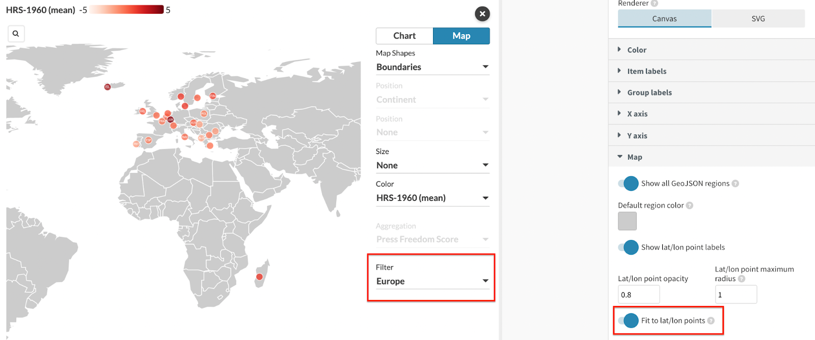
There are several different layouts including packed circles, beeswarm and scatter. The chosen layout depends on which columns have been selected to position, size and color the shapes. There's also a map view.
Data requirements
Each row of data represents an item (such as a country). There can be zero or more categorical columns (e.g. region) and numeric columns (e.g. GDP).
| Country | ID | Continent | Result | Value-19 | Value-20 |
|---|---|---|---|---|---|
| UK | GBR | Europe | Pass | 1.4 | 1.8 |
| US | USA | North America | Fail | 3.8 | 3.7 |
| Australia | AUS | Australia | Fail | 5 | 5.2 |
The Data tab consists of three different spreadsheets – Data, Geo Regions and Geo Points. The main Data tab has multiple column bindings that determine the information type and what users can select in the dropdown menu of the visualization.
The two main types you can divide your columns into are Categorical and Numerical. The category columns determine the Color and Aggregation options in your chart, and you can also select a column to Filter by. Meanwhile, the Numeric columns are important for the positioning of each entity on an axis and the sizing of the shapes.
You can also add a Name column (which'll be used to label the shapes) and an ID column (which'll ensure object constancy during transitions).
For the map view you can add a GeoJSON geometry (e.g. {"type": "polygon", "coordinates": [...]}) to each data item by adding another CSV file containing the features. Use the Geo region key binding in each sheet to join the two files.
You can also visualize your geographical data as points by using the Geo point key column binding.
When using points or regions, make sure your Geo point key or Geo region key contain values that exactly match the values in the Geo Regions or Geo Points data tab. The same goes for the Geo point key and Geo Points spreadsheet.
Other features
The Data explorer settings allow you to adjust the Maximum radius of the Scatter plot layout, as well as set a different Aspect ratio. In addition, you can choose to hide values with invalid or missing data – for example, if your axis is positioned according to a categorical column, items without a valid value will be filtered out.
Depending on your column bindings, your Data Explorer will have multiple filters which users can explore. Alternatively, you can create a story to build the desired narrative. In general, these settings help the user explore the information and easily spot trends and patterns. You can customize the look of these controls under the Controls settings in the Preview tab.

Click an item to freeze/unfreeze its popup. You can also click the background to unfreeze the popup.
Under Color, you can adjust the look of both your Categorical and Numerical coloring by switching between the Scale type. You can also choose a different Default color of your entries, as this would be the default view of your chart unless you create a story.

While the Item labels are the default labels of your entries, the Group labels settings are used when you position your data by a single category. In addition, you can Sort the groups in ascending or descending order, or in the same order as your data sheet by selecting None.
You can customize your Map view under the Map settings. You can decide whether you would like to include countries with no data in your layout or not, by using the Show all GeoJSON regions toggle.
If you have a Points layer included, you will be able to adjust the points’ opacity and display/hide their labels. In addition, if you use a Filter alongside your points and prefer a zoomed-in view of one particular area, you can enable the Fit to lat/lon points toggle.
Learn more in our help docs.
API information
This section documents API usage specific to this template, so for an introduction we suggest you refer to the generic API documentation instead.
template: @flourish/data-explorer
version: 20
Template data
There are three different formats in which you can supply data to this template. The most convenient for you to use likely depends on the source of your data, as described below.
1. Array of arrays, and a bindings object
You can supply arrays of arrays to opts.data, which might look
like:
{
    data: {
        data: [
            [ "DataColumn1Value1", "DataColumn2Value1",
            [ "DataColumn1Value2", "DataColumn2Value2",
            [ "DataColumn1Value3", "DataColumn2Value3",
            ...
        ],
        geo_regions: [
            [ "Geo_regionsColumn1Value1", "Geo_regionsColumn2Value1",
            [ "Geo_regionsColumn1Value2", "Geo_regionsColumn2Value2",
            [ "Geo_regionsColumn1Value3", "Geo_regionsColumn2Value3",
            ...
        ],
        geo_points: [
            [ "Geo_pointsColumn1Value1", "Geo_pointsColumn2Value1",
            [ "Geo_pointsColumn1Value2", "Geo_pointsColumn2Value2",
            [ "Geo_pointsColumn1Value3", "Geo_pointsColumn2Value3",
            ...
        ]
    }
}
where each array of arrays represents the rows in a data sheet.
To tell the API how the values from each column should be
associated with the keys that the template is expecting, you must also supply
an object attached to opts.bindings. (The meanings of the
keys in the bindings object are documented
below.) The minimal bindings you can
supply for this template are as shown in this example:
{
    template: "@flourish/data-explorer",
    version: "20",
    bindings: {
        data: {

        },
        geo_regions: {

        },
        geo_points: {

        }
    },
    data: {
        data: [
            [ "DataColumn1Value1", "DataColumn2Value1",
            [ "DataColumn1Value2", "DataColumn2Value2",
            [ "DataColumn1Value3", "DataColumn2Value3",
            ...
        ],
        geo_regions: [
            [ "Geo_regionsColumn1Value1", "Geo_regionsColumn2Value1",
            [ "Geo_regionsColumn1Value2", "Geo_regionsColumn2Value2",
            [ "Geo_regionsColumn1Value3", "Geo_regionsColumn2Value3",
            ...
        ],
        geo_points: [
            [ "Geo_pointsColumn1Value1", "Geo_pointsColumn2Value1",
            [ "Geo_pointsColumn1Value2", "Geo_pointsColumn2Value2",
            [ "Geo_pointsColumn1Value3", "Geo_pointsColumn2Value3",
            ...
        ]
    }
}
All possible bindings that you can supply are shown in this example:
{
    template: "@flourish/data-explorer",
    version: "20",
    bindings: {
        data: {
            categoryColumns: [0, 1, ...], // index(es) of column(s) in your data
            numericColumns: [2, 3, ...], // index(es) of column(s) in your data
            filter: 4, // index of a column in your data
            id: 5, // index of a column in your data
            label: 6, // index of a column in your data
            short_label: 7, // index of a column in your data
            geo_region_key: 8, // index of a column in your data
            geo_point_key: 9, // index of a column in your data
            metadata: [10, 11, ...], // index(es) of column(s) in your data
        },
        geo_regions: {
            geo_region_key: 0, // index of a column in your data
            shapes: [1, 2, ...], // index(es) of column(s) in your data
        },
        geo_points: {
            geo_point_key: 0, // index of a column in your data
            lat: 1, // index of a column in your data
            lon: 2, // index of a column in your data
        }
    },
    data: {
        data: [
            [ "DataColumn1Value1", "DataColumn2Value1",
            [ "DataColumn1Value2", "DataColumn2Value2",
            [ "DataColumn1Value3", "DataColumn2Value3",
            ...
        ],
        geo_regions: [
            [ "Geo_regionsColumn1Value1", "Geo_regionsColumn2Value1",
            [ "Geo_regionsColumn1Value2", "Geo_regionsColumn2Value2",
            [ "Geo_regionsColumn1Value3", "Geo_regionsColumn2Value3",
            ...
        ],
        geo_points: [
            [ "Geo_pointsColumn1Value1", "Geo_pointsColumn2Value1",
            [ "Geo_pointsColumn1Value2", "Geo_pointsColumn2Value2",
            [ "Geo_pointsColumn1Value3", "Geo_pointsColumn2Value3",
            ...
        ]
    }
}
2. Array of objects with arbitrary keys, and a bindings object
This format is most likely useful when you have data from an external source,
such as CSV data loaded from d3-dsv.
You should supply this attached to the opts.data, which might look
like:
{
        data: [
            { "DataHeader1": ..., "DataHeader2": ..., ... },
            { "DataHeader1": ..., "DataHeader2": ..., ... },
            { "DataHeader1": ..., "DataHeader2": ..., ... },
            ...
        ],
        geo_regions: [
            { "Geo_regionsHeader1": ..., "Geo_regionsHeader2": ..., ... },
            { "Geo_regionsHeader1": ..., "Geo_regionsHeader2": ..., ... },
            { "Geo_regionsHeader1": ..., "Geo_regionsHeader2": ..., ... },
            ...
        ],
        geo_points: [
            { "Geo_pointsHeader1": ..., "Geo_pointsHeader2": ..., ... },
            { "Geo_pointsHeader1": ..., "Geo_pointsHeader2": ..., ... },
            { "Geo_pointsHeader1": ..., "Geo_pointsHeader2": ..., ... },
            ...
        ]
    }
... but with the keys being the column headers from your
source data instead. You must also supply an object attached to
opts.bindings. The minimal bindings you can
supply for this template are as shown in this example:
{
    template: "@flourish/data-explorer",
    version: "20",
    bindings: {
        data: {

        },
        geo_regions: {

        },
        geo_points: {

        }
    },
    data: {
        data: [
            { "DataHeader1": ..., "DataHeader2": ..., ... },
            { "DataHeader1": ..., "DataHeader2": ..., ... },
            { "DataHeader1": ..., "DataHeader2": ..., ... },
            ...
        ],
        geo_regions: [
            { "Geo_regionsHeader1": ..., "Geo_regionsHeader2": ..., ... },
            { "Geo_regionsHeader1": ..., "Geo_regionsHeader2": ..., ... },
            { "Geo_regionsHeader1": ..., "Geo_regionsHeader2": ..., ... },
            ...
        ],
        geo_points: [
            { "Geo_pointsHeader1": ..., "Geo_pointsHeader2": ..., ... },
            { "Geo_pointsHeader1": ..., "Geo_pointsHeader2": ..., ... },
            { "Geo_pointsHeader1": ..., "Geo_pointsHeader2": ..., ... },
            ...
        ]
    }
}
All possible bindings that you can supply are shown in this example:
{
    template: "@flourish/data-explorer",
    version: "20",
    bindings: {
        data: {
            categoryColumns: ["DataHeader1", "DataHeader2", ...],
            numericColumns: ["DataHeader3", "DataHeader4", ...],
            filter: "DataHeader5",
            id: "DataHeader6",
            label: "DataHeader7",
            short_label: "DataHeader8",
            geo_region_key: "DataHeader9",
            geo_point_key: "DataHeader10",
            metadata: ["DataHeader11", "DataHeader12", ...],
        },
        geo_regions: {
            geo_region_key: "Geo_regionsHeader1",
            shapes: ["Geo_regionsHeader2", "Geo_regionsHeader3", ...],
        },
        geo_points: {
            geo_point_key: "Geo_pointsHeader1",
            lat: "Geo_pointsHeader2",
            lon: "Geo_pointsHeader3",
        }
    },
    data: {
        data: [
            { "DataHeader1": ..., "DataHeader2": ..., ... },
            { "DataHeader1": ..., "DataHeader2": ..., ... },
            { "DataHeader1": ..., "DataHeader2": ..., ... },
            ...
        ],
        geo_regions: [
            { "Geo_regionsHeader1": ..., "Geo_regionsHeader2": ..., ... },
            { "Geo_regionsHeader1": ..., "Geo_regionsHeader2": ..., ... },
            { "Geo_regionsHeader1": ..., "Geo_regionsHeader2": ..., ... },
            ...
        ],
        geo_points: [
            { "Geo_pointsHeader1": ..., "Geo_pointsHeader2": ..., ... },
            { "Geo_pointsHeader1": ..., "Geo_pointsHeader2": ..., ... },
            { "Geo_pointsHeader1": ..., "Geo_pointsHeader2": ..., ... },
            ...
        ]
    }
}
(As before, the keys containing "Header" would be replaced by column names from your data source.)
3. Array of objects with template-defined keys
There is an alternative format you can use, which is likely to be easier to
use if your data is not from a spreadsheet source. With this alternative format
you supply your data to the template as
an array of objects, attached to opts.data, where the keys must
be those used by the template, as documented below. In this case
there is no need to supply a bindings object, since the key names are already
those expected by the template. The required properties in the data
object are as follows (scroll down for a
description of what each property is):
{
    template: "@flourish/data-explorer",
    version: "20",
    data: {
    data: [
        {
            categoryColumns: [...],
            numericColumns: [...],
            metadata: [...]
        },
        ...
    ],
    geo_regions: [
        {
            shapes: [...]
        },
        ...
    ]
},
    ...
}
And the full list of all possible properties is as follows:
{
    template: "@flourish/data-explorer",
    version: "20",
    data: {
    data: [
        {
            categoryColumns: [...],
            numericColumns: [...],
            filter: ...,
            id: ...,
            label: ...,
            short_label: ...,
            geo_region_key: ...,
            geo_point_key: ...,
            metadata: [...]
        },
        ...
    ],
    geo_regions: [
        {
            geo_region_key: ...,
            shapes: [...]
        },
        ...
    ],
    geo_points: [
        {
            geo_point_key: ...,
            lat: ...,
            lon: ...
        },
        ...
    ]
},
    ...
}
Meanings of the template data keys:
- data.categoryColumns: Columns containing categorical data
- data.numericColumns: Columns containing numeric data
- data.filter: Categorical column to filter by
- data.id: Column to use as a unique id (to ensure object constancy during transitions)
- data.label: Column to use as a label for each item
- data.short_label: Column to use as a label for each item if there's insufficient space for the original label
- data.geo_region_key: Unique id for joining boundary data in the <b>Geo Regions</b> datasheet. This column must contain values that match <b>Geo region key</b> values in <b>Geo Regions</b>.
- data.geo_point_key: Unique id for joining point data in the <b>Geo Points</b> datasheet. Must contain values that match <b>Geo point key</b> values in <b>Geo Points</b>.
- data.metadata: One or more columns of information (text, <a href="https://help.flourish.studio/article/46-how-to-add-images-to-your-visualization">image URLs</a>, <a href="https://help.flourish.studio/article/259-how-to-embed-charts-in-your-popups-or-panels">embedded charts</a> etc) to include in custom <a href="https://help.flourish.studio/article/69-how-to-add-custom-content-to-your-popups">popups and panels</a>.
- geo_regions.geo_region_key: Unique id for joining boundary data. Must contain ids that match the <b>Geo region key</b> values in <b>Data</b>.
- geo_regions.shapes: Columns containing GeoJSON geometry that describe a boundary (typically geometry type will be MultiPolygon or Polygon)
- geo_points.geo_point_key: Unique id for joining latitude/longitude data. Most contain ids that match the <b>Geo point key</b> values in <b>Data</b>.
- geo_points.lat: lat
- geo_points.lon: lon
Template settings
Options for opts.state.
Data explorer
scatter_max_radius number
Scatter plot maximum radius. Maximum radius of scatter points (as a percentage of chart width) Max: 25
aspect_ratio number
Chart aspect ratio. Min: 0.1 Max: 5
filter_out_blank_values boolean
Hide items with invalid or missing values. Filter out items with invalid or missing values. For example, if Position by is a categorical column, items without a valid value or left empty will be filtered out.
prevent_clipping boolean
Prevent clipping. Prevent shapes close to the chart boundaries from being clipped. (This most often applies to beeswarm and scatter layouts.)
renderer string
Renderer. Use SVG or Canvas for rendering. Canvas is more perfomant for very large datasets Allowed values:
draw_smaller_points_on_top boolean
Draw smaller points on top. Applies to scatter plots and maps. If true, smaller points are drawn on top of larger points. If false, larger points are drawn in front of smaller points.
Color
default_color color
Default color. Color to use when Shade by is set to None
invalid_color color
Missing or invalid data color. Color to use when data value is invalid or missing
text_color color
Text color.
stroke_color color
Stroke color.
stroke_width number
Stroke width.
scale_type string
Allowed values:
- categorical (Categorical)
- numeric (Numeric)
color.categorical_palette colors
Palette.
color.categorical_extend boolean
Extend. Automatically generate additional colours when needed to avoid the palette colours being used more than once
color.categorical_custom_palette text
Custom overrides. Enter the label name for which you wish to set the color, followed by a colon and the desired color value.
Colors can be set using Hex, RGB, color names or RGBA, if you want to set the opacity. Multiple colors can be set using multiple lines. For example:
Party 1: red
Party 2: #4455AA
Party 3: rgb(30,168,26)
color.numeric_type string
Scale type. Allowed values:
color.binning boolean
In linear mode, the color scale will run as a smooth gradient between 2 colors. In binned mode, the gradient will be divided in smaller blocks. Allowed values:
color.bin_mode string
Binning mode. Allowed values:
color.bin_count number
Number of bins.
color.bin_thresholds string
Custom thresholds. Enter your desired thresholds, separating them with a ";". For instance, "5;10;15".
Bins form as follows:
For "5;10;15", you'll get four bins based on your data's range.
color.sequential_palette string
Palette. Allowed values:
color.sequential_reverse boolean
Reverse.
color.sequential_custom_min color
Minimum color.
color.sequential_custom_max color
Maximum color.
color.sequential_color_space string
Color space. Allowed values:
color.sequential_custom_domain boolean
Domain. Allowed values:
color.sequential_domain_min number
Min.
color.sequential_domain_max number
Max.
color.diverging_palette string
Palette. Allowed values:
color.diverging_reverse boolean
Reverse.
color.diverging_custom_min color
Minimum color.
color.diverging_custom_mid color
Midpoint color.
color.diverging_custom_max color
Maximum color.
color.diverging_color_space string
Color space. Allowed values:
color.diverging_custom_domain boolean
Domain. Allowed values:
color.diverging_domain_min number
Min.
color.diverging_domain_mid number
Mid.
color.diverging_domain_max number
Max.
Item labels
item_label_min_size number
Minimum size. Labels smaller than the specified size will be hidden. Specified in rems, a multiple of the base font size.
item_label_max_size number
Maximum size. Labels larger than the specified size will be hidden. Specified in rems, a multiple of the base font size.
item_label_padding number
Padding. The amount of space between the label and the item boundary, as a percentage of the item size Max: 100
item_label_color color
Color. The color of the labels (left blank, it will auto-contrast to the background color of the dot)
Group labels
group_label_size number
Size. Sets size of group labels. In rems, a multiple of the page's base font size
group_label_margin number
Space for label. Sets the size of group labels. Specified in <a href='https://help.flourish.studio/article/192-how-sizing-with-rems-works-in-flourish">rems, a multiple of the base font size.
group_label_color color
Color.
group_label_weight string
Weight. Allowed values:
group_sort_method string
Sort groups. Sets how the groups will be sorted. If None is chosen, group labels will be in the same order as in the datasheet. Allowed values:
X axis
xAxis.axis_position string
Position. Allowed values:
xAxis.y_axis_position string
Y value. Vertical position of the x axis on the y scale
xAxis.numeric_scale_type string
Type. Allowed values:
xAxis.linear_min number
Min.
xAxis.linear_max number
Max.
xAxis.log_min number
Min.
xAxis.log_max number
Max.
xAxis.datetime_min string
Min (date).
xAxis.datetime_max string
Max (date).
xAxis.flip boolean
Flip axis.
xAxis.show_scale_settings boolean
Configure default min/max.
xAxis.nice boolean
Round min/max. When enabled, scales automatically extend to "nice" rounded start/end values, such as hundreds or whole years. Overridden by any explicitly specified scale min and max. Allowed values:
xAxis.zero_axis string
Include zero. Whether to extend the axis to include zero if the data values are all positive or all negative. Overridden by any explicitly specified scale min and max. Allowed values:
xAxis.title_mode string
Type. Allowed values:
xAxis.title string
Text.
xAxis.title_styling boolean
Styling.
xAxis.title_weight string
Weight. Allowed values:
xAxis.title_color color
Color.
xAxis.title_size number
Size.
xAxis.title_padding number
Padding.
xAxis.tick_label_position string
Position. Allowed values:
xAxis.tick_label_styling boolean
Styling.
xAxis.tick_label_size number
Size.
xAxis.tick_label_color color
Color.
xAxis.tick_padding number
Padding.
xAxis.tick_label_angle string
Angle. Allowed values:
xAxis.tick_label_weight string
Weight. Allowed values:
xAxis.tick_label_max_lines number
Max lines. Min: 1
xAxis.tick_label_line_height number
Line height.
xAxis.tick_label_space_mode string
Space mode. How the vertical space available for tick labels is determined. "Auto" means that the space is automatically determined. "Max" lets you specify the maximum vertical space tick labels may occupy. "Fixed" lets you specify a fixed amount of vertical space for tick labels. Tick labels will be truncated to fit within the allocated horizontal space. Allowed values:
xAxis.tick_label_space number
Space. The space allocated for tick labels (relative to the root font size).
xAxis.tick_mode string
Mode. Determines how the tick values are chosen. "Auto" mode chooses the ticks automatically. "Number" mode lets you specify how many ticks are drawn. "Custom" mode lets you specify which ticks are drawn. If the axis is categorical, "Number" mode is ignored. Allowed values:
xAxis.tick_number number
Number. Approximate number of ticks or gridlines. The actual number will depend on the range of values, chart size, etc.
xAxis.tick_custom text
One tick label per line. Specify the ticks to show, one per line. For dates, use the input format as specified in the datasheet. You can also use {{FIRST}} and {{LAST}} to add ticks at the minimum and maximum of the axis. For example:
{{FIRST}}
25000
50000
75000
{{LAST}}
xAxis.line_and_tick_color color
Line color.
xAxis.line_and_tick_width number
Line width.
xAxis.tick_length number
Tick length.
xAxis.tick_side string
Tick side. Allowed values:
xAxis.line_visible boolean
Axis line.
xAxis.edge_padding number
Edge padding (%). Space between start/end of axis line and first/last category tick as a percentage of the spacing between ticks Max: 100
xAxis.gridlines_visible boolean
Allowed values:
- true (On)
- false (Off)
xAxis.gridlines_styling boolean
Styling.
xAxis.gridline_color color
Color.
xAxis.gridline_style string
Style. Allowed values:
xAxis.gridline_width number
Width.
xAxis.gridline_category_dividers boolean
Put lines between categories. On a categorical axis this option disables the gridline on each tick and instead adds rules between each category to give a table-like design.
xAxis.gridline_category_dividers_extend boolean
Extend. Extends the dividers into the axis margins.
Y axis
yAxis.axis_visible boolean
Allowed values:
- true (Axis visible)
- false (Axis hidden)
yAxis.numeric_scale_type string
Type. Allowed values:
yAxis.linear_min number
Min.
yAxis.linear_max number
Max.
yAxis.log_min number
Min.
yAxis.log_max number
Max.
yAxis.datetime_min string
Min (date).
yAxis.datetime_max string
Max (date).
yAxis.flip boolean
Flip axis.
yAxis.show_scale_settings boolean
Configure default min/max.
yAxis.nice boolean
Round min/max. When enabled, scales automatically extend to "nice" rounded start/end values, such as hundreds or whole years. Allowed values:
yAxis.zero_axis string
Include zero. Whether to extend the axis to include zero if the data values are all positive or all negative. Allowed values:
yAxis.title_mode string
Type. Allowed values:
yAxis.title string
Text.
yAxis.title_styling boolean
Styling.
yAxis.title_position string
Position. Allowed values:
yAxis.title_weight string
Weight. Allowed values:
yAxis.title_color color
Color.
yAxis.title_size number
Size.
yAxis.title_padding number
Padding.
yAxis.tick_label_position string
Position. Allowed values:
yAxis.tick_label_styling boolean
Styling.
yAxis.tick_label_size number
Size.
yAxis.tick_label_color color
Color.
yAxis.tick_padding number
Padding.
yAxis.tick_label_angle string
Angle. Allowed values:
yAxis.tick_label_weight string
Weight. Allowed values:
yAxis.tick_label_max_lines number
Max lines. Min: 1
yAxis.tick_label_line_height number
Line height.
yAxis.tick_label_space_mode string
Space mode. Sets how the horizontal space available for tick labels is determined. "Auto" means that the space is automatically determined. "Max" lets you specify the maximum horizontal space tick labels may occupy. "Fixed" lets you specify a fixed amount of horizontal space for tick labels. Tick labels will be truncated to fit within the allocated horizontal space. Allowed values:
yAxis.tick_label_space number
Space. The space allocated for tick labels (relative to the root font size).
yAxis.tick_mode string
Mode. Determines how the tick values are chosen. "Auto" mode chooses the ticks automatically. "Number" mode lets you specify how many ticks are drawn. "Custom" mode lets you specify which ticks are drawn. If the axis is categorical, "Number" mode is ignored. Allowed values:
yAxis.tick_number number
Number. Approximate number of ticks or gridlines. The actual number will depend on the range of values, chart size, etc.
yAxis.tick_custom text
One tick label per line. Specify the ticks to show, one per line. For dates, use the input format as specified in the datasheet. You can also use {{FIRST}} and {{LAST}} to add ticks at the minimum and maximum of the axis. For example:
{{FIRST}}
25000
50000
75000
{{LAST}}
yAxis.line_and_tick_color color
Line color.
yAxis.line_and_tick_width number
Line width.
yAxis.tick_length number
Tick length.
yAxis.tick_side string
Side. Allowed values:
yAxis.line_visible boolean
Axis line.
yAxis.edge_padding number
Edge padding (%). Space between start/end of axis line and first/last category tick as a percentage of the spacing between ticks Max: 100
yAxis.gridlines_visible boolean
Allowed values:
- true (On)
- false (Off)
yAxis.gridlines_styling boolean
Styling.
yAxis.gridline_color color
Color.
yAxis.gridline_style string
Style. Allowed values:
yAxis.gridline_width number
Width.
yAxis.gridline_category_dividers boolean
Put lines between categories. On a categorical axis this option disables the gridline on each tick and instead adds rules between each category to give a table-like design. Ignored for date and numeric axes.
yAxis.gridline_category_dividers_extend boolean
Extend. Extends the dividers into the axis margins
Map
geo_zoom_enabled boolean
Zoom. Allowed values:
show_all_geojson_regions boolean
Show all GeoJSON regions. Show all the GeoJSON regions even if a region does not have a corresponding Geo region key in the datasheet
geo_region_default_color color
Default region color. Color of GeoJSON regions that aren't joined to data
geo_point_show_labels boolean
Show geo point labels.
geo_point_opacity number
Geo point opacity. Max: 1
geo_point_max_radius number
Geo point maximum radius. Maximum radius of geo points (as a percentage of chart width) Max: 25
geo_apply_zoom_scale_to_points boolean
Apply zoom scale to geo points. If true, geo points will be scaled in same manner as regions when zooming
geo_fit_to_points boolean
Fit to geo points. Fit view to geo points
Legend
legend_container.alignment string
Alignment. Allowed values:
legend_container.orientation string
Orientation. Allowed values:
legend_container.title_weight string
Title weight. Allowed values:
legend_container.text_weight string
Text weight. Allowed values:
legend_container.text_color color
Color.
legend_container.text_size number
Size. Max: 10
size_by_legend.show_legend boolean
Allowed values:
- true (Enabled)
- false (Disabled)
size_by_legend.title_mode string
Title mode. Allowed values:
size_by_legend.title string
Title.
size_by_legend.shape_fill color
Shape fill.
size_by_legend.shape_stroke color
Shape stroke. Hint: set to same value as fill for no stroke
size_by_legend.clip_height number
Max height. Maximum height of shape (relative to root font size)
size_by_legend.small_symbol_size number
Small/large proportion. Proportion of the smallest symbol's value compared to the biggest symbol's value. 0.5 means it's half the value of the big symbol. Max: 1
shade_by_legend_discrete.show_legend boolean
Legend mode. A legend will not show with a single entry Allowed values:
shade_by_legend_discrete.title_mode string
Title mode. Allowed values:
shade_by_legend_discrete.title string
Title.
shade_by_legend_discrete.swatch_width number
Width.
shade_by_legend_discrete.swatch_height number
Height.
shade_by_legend_discrete.swatch_radius number
Roundness. The radius of the corners of the swatch (in pixels)
shade_by_legend_discrete.legend_items_padding number
Padding. Padding between legend items (in rems)
shade_by_legend_discrete.swatch_outline boolean
Outline. An optional outline for the swatch in the legend
shade_by_legend_discrete.swatch_outline_color color
Color.
shade_by_legend_discrete.order_override text
Custom order override. Manually specify the order of legend entries (one entry per line)
shade_by_legend_discrete.icon_height number
Height. Height of icon (in rems)
shade_by_legend_discrete.icon_color color
Color. Fallback color (icon color if not determined by template)
shade_by_legend_discrete.max_width number
Max width.
shade_by_legend_discrete.orientation string
Orientation. Allowed values:
shade_by_legend_continuous.show_legend boolean
Allowed values:
- true (Enabled)
- false (Disabled)
shade_by_legend_continuous.title_mode string
Title mode. Allowed values:
shade_by_legend_continuous.title string
Title.
shade_by_legend_continuous.color_band_width number
Width.
shade_by_legend_continuous.color_band_height number
Height.
shade_by_legend_continuous.color_band_radius number
Roundness. The radius of the corners of the color band (in pixels)
shade_by_legend_continuous.binned_label_mode string
Binned label mode. Allowed values:
shade_by_legend_continuous.binned_label_custom string
Custom bin labels. List numeric values, separated by semi-colons.
shade_by_legend_continuous.legend_min number
Legend min.
shade_by_legend_continuous.additional_min_label string
Custom min label.
shade_by_legend_continuous.legend_max number
Legend max.
shade_by_legend_continuous.additional_max_label string
Custom max label.
Search box
search_enabled boolean
Allowed values:
- true (Enabled)
- false (Disabled)
search_box_size number
Box size. In rems, a multiple of the page's base font size Max: 5
search_bg_color color
Background.
search_bg_opacity number
Opacity. Max: 1
search_box_stroke number
Stroke. Max: 1
search_text_color color
Text color.
search_icon_color color
Icon color.
search_box_radius number
Roundness.
search_placeholder string
Placeholder text. The text to show when the search field is empty
search_dropdown boolean
Always show dropdown suggestions. If disabled it will only show suggestions after typing 2 characters
search_expanded boolean
Always expand searchbox.
Popups and panels
popup.mode string
Allowed values:
- none (None)
- popup (Popup)
- panel (Panel)
- both (Both)
popup.popup_is_custom boolean
Popup content. Allowed values:
popup.show_popup_styles boolean
Show popup styles.
popup.popup_custom_header html
Popup custom header. Use {{column_name}} to add a value from your data. Ensure the column is selected, or add it to Info for popups for popup use.
Advanced users can add HTML styling or add category colors to popup headers.
To hide parts of the popup when a column is empty using {{#if column_name}}Content for non-empty column_name{{/if}}. For example: {{#if Capital name}}Capital:{{/if}} {{Capital name}}. Here, the word "Capital:" will only show if the corresponding cell in the "Capital name" column is not empty.
popup.popup_custom_main html
Popup custom main content. Use {{column_name}} to add a value from your data. Ensure the column is selected, or add it to Info for popups for popup use.
Advanced users can add HTML for designs, styles, and images.
To hide parts of the popup when a column is empty use the syntax {{#if column_name}}Content for non-empty column_name{{/if}}. For example: {{#if Capital name}}Capital:{{/if}} {{Capital name}}. Here, the word "Capital:" will only show if the corresponding cell in the "Capital name" column is not empty.
popup.popup_custom_accessible text
Popup custom accessible content. A text alternative to visual custom popup content that will be read out by screenreaders. This content is added as an aria-label attribute to data point elements. You can still use {{column_name}} to add values from your data, but do not use HTML. For example: {Name}}, Population: {{Population}}, GDP: {{GDP}} If left empty, accessible content will fallback to the default popup content.
popup.popup_width number
Max width. In rems, multiples of base font size. Leave blank to let the width adjust based on the contents.
popup.popup_font_size number
Text size.
popup.popup_text_color color
Text color.
popup.popup_align string
Align. Allowed values:
popup.popup_background color
Fill color.
popup.popup_background_opacity number
Fill opacity. Max: 1
popup.popup_padding number
Padding.
popup.popup_radius number
Radius. Corner radius of popup
popup.popup_header_type string
Header style. Allowed values:
popup.popup_header_background color
Background.
popup.popup_header_text_color color
Text.
popup.popup_list_type string
List type. Allowed values:
popup.popup_list_label_weight string
Label weight. Allowed values:
popup.popup_list_separator string
List separator. Predefined values:
popup.popup_shadow boolean
Shadow.
popup.popup_pointer boolean
Pointer.
popup.panel_position string
Allowed values:
- overlay (Overlay)
- left (Left)
- right (Right)
- top (Top)
- bottom (Bottom)
popup.panel_open_duration number
Open duration. Max: 2000
popup.panel_side_fixed boolean
Always show.
popup.panel_side_default_content text
Placeholder content.
popup.panel_is_custom boolean
Panel content. Allowed values:
popup.show_panel_styles boolean
Show panel styles.
popup.panel_custom_header html
Panel custom header. Use {{column_name}} to add a value from your data. Ensure the column is selected, or add it to Info for popups for panel use.
Advanced users can add HTML for styling or add category colors to panel headers.
To hide parts of the panel when a column is empty using {{#if column_name}}Content for non-empty column_name{{/if}}. For example: {{#if Capital name}}Capital:{{/if}} {{Capital name}}. Here, the word "Capital:" will only show if the corresponding cell in the "Capital name" column is not empty.
popup.panel_custom_main html
Panel custom main content. Use {{column_name}} to add a value from your data. Ensure the column is selected, or add it to Info for popups for panel use.
Advanced users can add HTML for designs, styles, images, videos and embedded Flourish charts,
To hide parts of the panel when a column is empty using {{#if column_name}}Content for non-empty column_name{{/if}}. For example: {{#if Capital name}}Capital:{{/if}} {{Capital name}}. Here, the word "Capital:" will only show if the corresponding cell in the "Capital name" column is not empty.
popup.panel_width_overlay number
Width (%).
popup.panel_height_overlay number
Height (%).
popup.panel_width_side number
Width (%).
popup.panel_height_side number
Height (%).
popup.panel_max_width number
Max width (px).
popup.panel_max_height number
Max height (px).
popup.panel_vertical_position string
Vertical position. Choosing Click position is especially useful when your visualization is really tall, this will make sure the panel content is always on top of the element you've clicked on Allowed values:
popup.panel_text_color color
Text color.
popup.panel_font_size number
Text size.
popup.panel_align string
Alignment. Allowed values:
popup.panel_background color
Fill color.
popup.panel_background_opacity number
Fill opacity. Max: 1
popup.panel_padding number
Padding.
popup.panel_radius number
Radius. Corner radius of panel
popup.panel_list_type string
List type. Allowed values:
popup.panel_list_label_weight string
Label weight. Allowed values:
popup.panel_list_separator string
List separator. Predefined values:
popup.panel_shadow boolean
Shadow.
Controls
control_text_color color
Text color.
narrow_breakpoint number
Mobile breakpoint. If the window width is smaller than this number in pixels, the control panel will become an overlay
controls_style.font_size number
Text size. Max: 5
controls_style.font_weight string
Text weight. Allowed values:
controls_style.height number
Height. Max: 5
button_style.background color
Background.
button_style.background_selected color
Selected.
button_style.background_hover color
Mouse over.
button_style.font_color color
Text color.
button_style.font_color_selected color
Selected.
button_style.font_color_hover color
Mouse over.
button_style.button_styles_advanced boolean
Button border styles.
button_style.border_width number
Border width. Max: 20
button_style.border_color color
Color.
button_style.border_transparency number
Transparency. Max: 1
button_style.border_radius number
Radius. Max: 100
dropdown_style.background color
Background.
dropdown_style.font_color color
Text color.
dropdown_style.border_styles_advanced boolean
Dropdown border styles.
dropdown_style.border_style string
Border style. Show border on all sides, or only at the bottom Allowed values:
dropdown_style.border_width number
Border width. Max: 20
dropdown_style.border_color color
Color.
dropdown_style.border_transparency number
Transparency. Max: 1
dropdown_style.border_radius number
Radius. Max: 100
controls_geo_visible boolean
Map.
controls_geo_shapes_visible boolean
Map shapes.
controls_position_by_1_visible boolean
Position 1.
controls_position_by_2_visible boolean
Position 2.
controls_size_by_visible boolean
Size.
controls_shade_by_visible boolean
Color.
controls_aggregate_by_visible boolean
Aggregation.
controls_filter_visible boolean
Filter.
controls_geo_shapes_label string
Map shapes.
controls_position_by_1_label string
Position 1.
controls_position_by_2_label string
Position 2.
controls_size_by_label string
Size.
controls_shade_by_label string
Color.
controls_aggregate_by_label string
Aggregation.
controls_filter_label string
Filter.
controls_position_by_items text
Position. List of columns to include or exclude in the position dropdown. If blank, all categorical and numerical columns are used.
For aggregated values, add ' (mean)', ' (sum)', ' (min)' or ' (max)' after the column name. 'Count' can be used for the count aggregation.
Multiple columns may be specified using separate lines. For example:
Region
Forest area (sq. km) (sum)
Count
controls_exclude_position_by_items boolean
Inclusion. If Include is selected, only the items in the adjacent list will be included in the dropdown. Allowed values:
If Exclude is selected, items in the adjacent list will be excluded from the dropdown.
controls_size_by_items text
Size. List of columns to include or exclude in the position dropdown. If blank, all categorical and numerical columns are used.
For aggregated values, add ' (mean)', ' (sum)', ' (min)' or ' (max)' after the column name. 'Count' can be used for the count aggregation.
Multiple columns may be specified using separate lines. For example:
Region
Forest area (sq. km) (sum)
Count
controls_exclude_size_by_items boolean
Inclusion. If Include is selected only the items in the adjacent list will be included in the dropdown. Allowed values:
If Exclude is selected items in the adjacent list will be excluded from the dropdown.
controls_shade_by_items text
Color. List of columns to include or exclude in the position dropdown. If blank, all categorical and numerical columns are used.
For aggregated values, add ' (mean)', ' (sum)', ' (min)' or ' (max)' after the column name. 'Count' can be used for the count aggregation.
Multiple columns may be specified using separate lines. For example:
Region
Forest area (sq. km) (sum)
Count
controls_exclude_shade_by_items boolean
Inclusion. If Include is selected only the items in the adjacent list will be included in the dropdown. Allowed values:
If Exclude is selected items in the adjacent list will be excluded from the dropdown.
controls_aggregate_by_items text
Aggregation. List of columns to include or exclude in the aggregation dropdown. If blank, all categorical columns are used.
Multiple columns may be specified using separate lines. For example:
Region
Income Group
controls_exclude_aggregate_by_items boolean
Inclusion. If Include is selected only the items in the adjacent list will be included in the dropdown. Allowed values:
If Exclude is selected items in the adjacent list will be excluded from the dropdown.
controls_dropdown_sort boolean
Sort dropdown menu items. Enables alphabetical sorting. If turned off, the dropdown will contain first any categorical columns (in the order selected in the column settings), and then any numeric columns.
controls_dropdown_separate_categorical_and_numeric boolean
Keep categorical and numeric items separate. If turned off, categorical and numeric columns will be sorted together alphabetically
hide_controls_toggle boolean
Disable controls toggle in published graphic. When checked, the slider icon for showing/hiding the controls panel is visible only in the visualization and story editors – not in the published visualization or story.
Note: When making a story you can still lock the panel to be visible or hidden by clicking the slider icon in the story editor.
controls_toggle_size number
Size.
controls_toggle_background color
Background.
controls_toggle_color color
Icon color.
Filter
filter_control_include_all boolean
Include "All" in filter.
filter_control_all_text string
“All” label.
Number formatting
localization.input_decimal_separator string
Decimal separator in data sheet. Used for interpreting your data. Only change if data is not displaying on the chart as expected. Allowed values:
localization.output_separators string
Number format to display. How the numbers should appear on chart labels Allowed values:
number_format.prefix string
Prefix. Text to place in front of number
number_format.suffix string
Suffix. Text to place after number
number_format.n_dec number
Decimal places. Enter a negative integer to round to a whole number with that many zeros. For example, -2 will round to the nearest hundred. Min: -10 Max: 10
number_format.advanced boolean
Advanced.
number_format.negative_sign string
Styling of negative numbers. Allowed values:
number_format.strip_zeros boolean
Remove trailing zeros.
number_format.strip_separator boolean
Hide thousands separator below 10,000. Turn off if you want four-digit numbers to include a separator, e.g. “1,234” rather than “1234”.
number_format.transform_labels boolean
Multiply/divide values.
number_format.transform string
Allowed values:
- multiply (Multiply by)
- divide (Divide by)
- exponentiate (×10 to the power of)
number_format.multiply_divide_constant number
number_format.exponentiate_constant number
Animations
transition_duration number
Animation duration. The duration of the animation for each item in seconds
Layout
Layout
layout.body_font font
Main font. This font will apply to the whole graphic by default. You can optionally change the font for the title, subtitle, footer, etc in the Header and Footer settings panels.
layout.font_color color
Text color. This color will apply to the whole graphic by default, You can optionally change the color for individual text elements, in other settings panels.
layout.background_color_enabled boolean
Color. Allowed values:
layout.background_image_enabled boolean
Image. Allowed values:
layout.background_color color
Background color.
layout.background_image_src url
Image URL.
layout.background_image_size string
Size. Allowed values:
layout.background_image_position string
Position. Allowed values:
layout.max_width_target string
Maximum width. Apply a maximum width to just the main graphic or everything (main graphic plus header, footer, etc). Allowed values:
layout.max_width number
Maximum width. Leave blank to stretch to container width Min: 50
layout.max_width_align string
Align. Allowed values:
layout.layout_order string
Layout order. Allowed values:
layout.space_between_sections string
Space between sections. Allowed values:
layout.space_between_sections_custom number
Custom. Max: 100
layout.margin_top number
Top.
layout.margin_right number
Right.
layout.margin_bottom number
Bottom.
layout.margin_left number
Left.
layout.border.enabled boolean
Show borders around visualisation.
layout.border.top.width number
Top.
layout.border.top.style string
Style. Allowed values:
layout.border.top.color color
Color.
layout.border.right.width number
Right.
layout.border.right.style string
Style. Allowed values:
layout.border.right.color color
Color.
layout.border.bottom.width number
Bottom.
layout.border.bottom.style string
Style. Allowed values:
layout.border.bottom.color color
Color.
layout.border.left.width number
Left.
layout.border.left.style string
Style. Allowed values:
layout.border.left.color color
Color.
layout.read_direction string
Read direction. This will change the reading direction of the main text elements on the page. It's not possible to adjust this on all elements, such as axes. Allowed values:
Note that when direction is set to right to left any alignment icons will be reversed.
layout.font_size_mobile_small number
layout.font_size_mobile_big number
layout.font_size_tablet number
layout.font_size_desktop number
layout.font_size_big_screen number
layout.breakpoint_mobile_small number
layout.breakpoint_mobile_big number
layout.breakpoint_tablet number
layout.breakpoint_desktop number
layout.breakpoint_big_screen number
Header
layout.header_align string
Alignment. Allowed values:
layout.title html
layout.title_styling boolean
Styling.
layout.title_font font
Title Font.
layout.title_size string
Size. Allowed values:
layout.title_size_custom number
Custom. Specify a custom responsive font size in rems. The best results will be with values between 1.2 and 3
layout.title_weight string
Weight. Allowed values:
layout.title_color color
Color.
layout.title_line_height number
Line height. Max: 3
layout.title_space_above string
Space above. Allowed values:
layout.title_space_above_custom number
Custom. Max: 100
layout.subtitle html
layout.subtitle_styling boolean
Styling.
layout.subtitle_font font
Subtitle Font.
layout.subtitle_size string
Size. Allowed values:
layout.subtitle_size_custom number
Custom. Specify a custom responsive font size in rems. The best results will be with values between 1.2 and 3
layout.subtitle_weight string
Weight. Allowed values:
layout.subtitle_color color
Color.
layout.subtitle_line_height number
Line height. Max: 3
layout.subtitle_space_above string
Space above. Allowed values:
layout.subtitle_space_above_custom number
Custom. Max: 100
layout.header_text html
layout.header_text_styling boolean
Styling.
layout.header_text_size string
Size. Allowed values:
layout.header_text_size_custom number
Custom. Specify a custom responsive font size in rems. The best results will be with values between 1.2 and 3
layout.header_text_weight string
Weight. Allowed values:
layout.header_text_color color
Color.
layout.header_text_line_height number
Line height. Max: 3
layout.header_text_space_above string
Space above. Allowed values:
layout.header_text_space_above_custom number
Custom. Max: 100
layout.header_border string
Allowed values:
- top (Top)
- bottom (Bottom)
- top_and_bottom (Top & bottom)
- none (None)
layout.header_border_width number
Width.
layout.header_border_color color
Color.
layout.header_border_style string
Style. Allowed values:
layout.header_border_space number
Space. Space between border and header text
layout.header_logo_enabled boolean
Allowed values:
- true (Enabled)
- false (Disabled)
layout.header_logo_src url
Image.
layout.header_logo_alt string
Alt text.
layout.header_logo_link_url string
Link.
layout.header_logo_height number
Height.
layout.header_logo_align string
Align. Align logo inside either the header or the main visualization container Allowed values:
layout.header_logo_position_inside string
Position. Allowed values:
layout.header_logo_position_outside string
Position. Allowed values:
layout.header_logo_margin_top number
Top.
layout.header_logo_margin_right number
Right.
layout.header_logo_margin_bottom number
Bottom.
layout.header_logo_margin_left number
Left.
Footer
layout.footer_align string
Alignment. Allowed values:
layout.footer_text_size number
Size.
layout.footer_text_color color
Color.
layout.footer_styling boolean
Advanced footer styles.
layout.footer_font font
Font.
layout.footer_text_weight string
Weight. Allowed values:
layout.source_name string
Source name.
layout.source_url string
Source url.
layout.multiple_sources boolean
Multiple sources.
layout.source_name_2 string
Source name.
layout.source_url_2 string
Source url.
layout.source_name_3 string
Source name.
layout.source_url_3 string
Source url.
layout.source_label string
Source label.
layout.footer_note html
Note. To add the time/date stamp of when the data was last updated add {{data_last_updated}}. For example, "Last updated at {{data_last_updated}}". To customize the format, use the advanced options below.
layout.footer_note_secondary html
Note (secondary). The secondary note is placed below the source and primary note. To add the time/date stamp of when the data was last updated add {{data_last_updated}}. For example, "Last updated at {{data_last_updated}}". To customize the format, use the advanced options below.
layout.advanced_note_styling boolean
Advanced.
layout.footer_timestamp_format string
Time/date stamp formatting. To change the date/time format of your timestamp, choose from the below options or provide a custom date format in d3-time-format syntax Predefined values:
layout.footer_logo_enabled boolean
Image. Allowed values:
layout.footer_logo_src url
Image.
layout.footer_logo_src_light hidden
Image (light version). If provided this version will be used whenever the background color is dark
layout.footer_logo_alt string
Alt text.
layout.footer_logo_link_url string
Link.
layout.footer_logo_height number
Height.
layout.footer_logo_margin number
Margin.
layout.footer_logo_order string
Position. Allowed values:
layout.footer_align_vertical string
V. align. Allowed values:
layout.footer_border string
Allowed values:
- top (Top)
- bottom (Bottom)
- top_and_bottom (Top & bottom)
- none (None)
layout.footer_border_width number
Width.
layout.footer_border_color color
Color.
layout.footer_border_style string
Style. Allowed values:
layout.footer_border_space number
Space. Space between border and footer text
Accessibility
layout.screenreader_text_primary text
Screenreader description. A text alternative to the visual content that will only be visible to screenreaders, e.g. “The line chart shows China consistently higher than the other countries since 1990”.
Do not replicate your title, since that will also be read by screenreaders.
layout.screenreader_label string
Screenreader label. A short text label given to the main Flourish embed wrapper to provide an accessible name that is only visible to screenreaders. Added in the form of an "aria-label".
layout.screenreader_hide_primary boolean
Screenreader mode for main visual container. Whether the main visual container is visible to screenreaders. (Text in the header and footer are always available to screenreaders.) Allowed values:
non_header_font.name string
Non header font name.
non_header_font.url string
Non header font url.