Hierarchy
Updated 3 years ago to v13.0.0 by Flourish team
How to use this template
This template is great for summarising your data across different categories.
Your data is summarised (like a pivot table) then visualised using one of five chart types:
- Treemap (nested rectangles)
- Circles (nested circles)
- Sunburst (layered circular segments)
- Bar (stacked bar chart)
- Radial (radial bar chart)
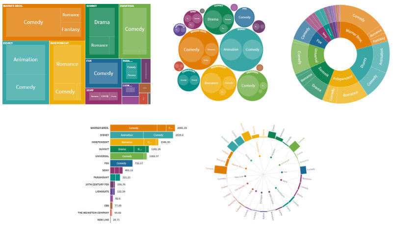
As an example, suppose you have the following sales data:
| Type | Colour | Price |
|---|---|---|
| T-shirt | Red | 10 |
| T-shirt | Yellow | 15 |
| T-shirt | Red | 10 |
| Jeans | Blue | 30 |
| Jeans | Blue | 35 |
You choose:
- one or more columns to summarise by (using the "Nesting" binding) and
- a column to size by (using the "Size by" binding).
For example if you set the "Nesting" binding to Type and the "Size by" binding to Price the data is summarised as:
| Type | Price |
|---|---|
| T-shirt | 35 |
| Jeans | 65 |
(Notice that Price is summed for each Type.)
If Treemap is chosen you'll see:
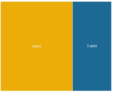
and if Sunburst is chosen you'll see:
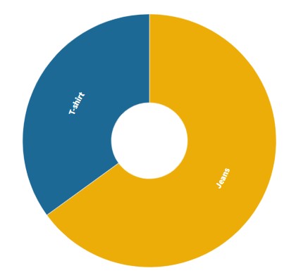
If the "Nesting" binding is changed to Type and Colour the data is summarised as:
| Type | Colour | Price |
|---|---|---|
| T-shirt | Red | 20 |
| T-shirt | Yellow | 15 |
| Jeans | Blue | 65 |
(Price is summed for each combination of Type and Colour.)
If Treemap is chosen you'll see that each Type (T-shirt, Jeans etc.) contains rectangles for each Colour (Red, Yellow, Blue etc.):
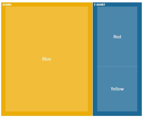
If Sunburst is chosen you'll see that each Type (T-shirt, Jeans etc.) divides into segments for each Colour (Red, Yellow, Blue etc.):
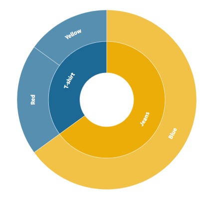
Each column in the "Nesting" binding forms a layer in a hierarchy. In the above example the first layer represents Type (T-shirt or Jeans) and the second layer represents Colour (Red, Yellow or Blue).
Data requirements
The data should be in "long-form" i.e. each row represents a single data-point and each column represents a variable. For example:
| Film | Genre | Studio | Worldwide Gross |
|---|---|---|---|
| 27 Dresses | Comedy | Fox | 160.31 |
| (500) Days of Summer | Comedy | Fox | 60.72 |
| A Dangerous Method | Drama | Independent | 8.97 |
| A Serious Man | Drama | Universal | 30.68 |
| Across the Universe | Romance | Independent | 29.37 |
| Beginners | Comedy | Independent | 14.31 |
| Dear John | Drama | Sony | 114.97 |
Data bindings
Columns are either categorical (e.g. Genre and Studio) or numeric (e.g. Worldwide Gross).
Choose:
- categorical columns for the "Nesting" binding
- a numeric column for the "Size by" binding
For example, if you wanted to know which studio took the most revenue set the "Nesting" binding to Studio and the "Size by" binding to Worldwide Gross.
If you wanted to break down each studio by genre set the "Nesting" binding to Studio and Genre.
Zooming
If two or more "Nesting" columns are chosen you'll be able to zoom into a category by clicking. Zoom out by clicking the triangle that appears in the top right of the chart.
Custom popups
Custom popup content may be defined for items at the deepest level in the hierarchy.
Enable by selecting "Custom content" in the Popups menu. In the custom popup template you can use columns from the "Nesting" and "Size by" bindings. You can also add other columns by using the "Info for popups" binding.
Custom popups only work when the hovered item represents a single row of data.
See this tutorial for more detailed information.
Tips
- You don't have to choose a column to size by. If you do not, the shapes will be sized by the count of data points.
- Click on the popup to freeze it. Click on it again to unfreeze.
- You can choose the number of visible hierarchy levels. Try varying this within a story to gradually break down categories into sub-categories.
- You can also add a filter menu. To do this, set the "Filter" column setting in the data area.
Credits
Created by Peter Cook and the Flourish team.
API information
This section documents API usage specific to this template, so for an introduction we suggest you refer to the generic API documentation instead.
template: @flourish/hierarchy
version: 13
Template data
There are three different formats in which you can supply data to this template. The most convenient for you to use likely depends on the source of your data, as described below.
1. Array of arrays, and a bindings object
You can supply arrays of arrays to opts.data, which might look
like:
{
    data: {
        data: [
            [ "DataColumn1Value1", "DataColumn2Value1",
            [ "DataColumn1Value2", "DataColumn2Value2",
            [ "DataColumn1Value3", "DataColumn2Value3",
            ...
        ]
    }
}
where each array of arrays represents the rows in a data sheet.
To tell the API how the values from each column should be
associated with the keys that the template is expecting, you must also supply
an object attached to opts.bindings. (The meanings of the
keys in the bindings object are documented
below.) The minimal bindings you can
supply for this template are as shown in this example:
{
    template: "@flourish/hierarchy",
    version: "13",
    bindings: {
        data: {

        }
    },
    data: {
        data: [
            [ "DataColumn1Value1", "DataColumn2Value1",
            [ "DataColumn1Value2", "DataColumn2Value2",
            [ "DataColumn1Value3", "DataColumn2Value3",
            ...
        ]
    }
}
All possible bindings that you can supply are shown in this example:
{
    template: "@flourish/hierarchy",
    version: "13",
    bindings: {
        data: {
            nest_columns: [0, 1, ...], // index(es) of column(s) in your data
            size_columns: [2, 3, ...], // index(es) of column(s) in your data
            filter: 4, // index of a column in your data
            popup_metadata: [5, 6, ...], // index(es) of column(s) in your data
        }
    },
    data: {
        data: [
            [ "DataColumn1Value1", "DataColumn2Value1",
            [ "DataColumn1Value2", "DataColumn2Value2",
            [ "DataColumn1Value3", "DataColumn2Value3",
            ...
        ]
    }
}
2. Array of objects with arbitrary keys, and a bindings object
This format is most likely useful when you have data from an external source,
such as CSV data loaded from d3-dsv.
You should supply this attached to the opts.data, which might look
like:
{
        data: [
            { "DataHeader1": ..., "DataHeader2": ..., ... },
            { "DataHeader1": ..., "DataHeader2": ..., ... },
            { "DataHeader1": ..., "DataHeader2": ..., ... },
            ...
        ]
    }
... but with the keys being the column headers from your
source data instead. You must also supply an object attached to
opts.bindings. The minimal bindings you can
supply for this template are as shown in this example:
{
    template: "@flourish/hierarchy",
    version: "13",
    bindings: {
        data: {

        }
    },
    data: {
        data: [
            { "DataHeader1": ..., "DataHeader2": ..., ... },
            { "DataHeader1": ..., "DataHeader2": ..., ... },
            { "DataHeader1": ..., "DataHeader2": ..., ... },
            ...
        ]
    }
}
All possible bindings that you can supply are shown in this example:
{
    template: "@flourish/hierarchy",
    version: "13",
    bindings: {
        data: {
            nest_columns: ["DataHeader1", "DataHeader2", ...],
            size_columns: ["DataHeader3", "DataHeader4", ...],
            filter: "DataHeader5",
            popup_metadata: ["DataHeader6", "DataHeader7", ...],
        }
    },
    data: {
        data: [
            { "DataHeader1": ..., "DataHeader2": ..., ... },
            { "DataHeader1": ..., "DataHeader2": ..., ... },
            { "DataHeader1": ..., "DataHeader2": ..., ... },
            ...
        ]
    }
}
(As before, the keys containing "Header" would be replaced by column names from your data source.)
3. Array of objects with template-defined keys
There is an alternative format you can use, which is likely to be easier to
use if your data is not from a spreadsheet source. With this alternative format
you supply your data to the template as
an array of objects, attached to opts.data, where the keys must
be those used by the template, as documented below. In this case
there is no need to supply a bindings object, since the key names are already
those expected by the template. The required properties in the data
object are as follows (scroll down for a
description of what each property is):
{
    template: "@flourish/hierarchy",
    version: "13",
    data: {
    data: [
        {
            nest_columns: [...],
            size_columns: [...],
            popup_metadata: [...]
        },
        ...
    ]
},
    ...
}
And the full list of all possible properties is as follows:
{
    template: "@flourish/hierarchy",
    version: "13",
    data: {
    data: [
        {
            nest_columns: [...],
            size_columns: [...],
            filter: ...,
            popup_metadata: [...]
        },
        ...
    ]
},
    ...
}
Meanings of the template data keys:
- data.nest_columns: Choose categorical columns to nest by (e.g. C,B,A). The data is nested in the same order as the chosen columns. For example if the chosen columns are 'C,B' the data is first grouped by Lead Studio and then by Genre.
- data.size_columns: (Optional) Choose numeric columns to size by (e.g. Worldwide Gross). If more than 1 is chosen, a dropdown will appear in the visualisation which lets the user choose. Rows with negative values are excluded.
- data.filter: (Optional) Choose a categorical column to filter by. A dropdown will appear in the visualisation.
- data.popup_metadata: Makes additional columns (text, emoji, image URLs, etc) available in custom popups
Template settings
Options for opts.state.
Hierarchy
hierarchy_layout string
Layout. Choose between a treemap, packed circles, radial sunburst, stacked bar or radial tree chart Allowed values:
num_of_visible_levels number
Visible levels. How many hierarchy levels are visible at once? Min: 1
sort_by string
Sort by. Sort cells by value or by name. (In Circles layout, the circles are placed in the specified order following an approximately spiral path.) Allowed values:
aggregation_type string
Size cells by. Allowed values:
auto_set_height boolean
Auto set height. Automatically determine container height. For example circle packing, sunburst and radial tree will fill width and treemap will use the specified aspect ratio.
Treemap
treemap_aspect_ratio_normal number
Aspect (desktop). Height of treemap, as % of width
treemap_aspect_ratio_narrow number
Aspect (mobile). Height of treemap, as % of width
responsive_narrow_breakpoint number
Breakpoint. The width at which mobile mode ends and desktop begins
treemap_type string
Layout mode. Allowed values:
treemap_ratio number
Target. The target ratio between width and height, where 1 is sqaure and a large number is a tall or wide rectangle Min: 1
cellPadding string
Padding. Add padding between hierarchy levels Allowed values:
Sunburst
sunburst_show_zoomed_node_in_center boolean
Show zoomed node in center. Show zoomed node as a circle in the center of the sunburst chart. (If not zoomed, the space is left blank.)
sunburst_inner_radius number
Inner radius. As a % of max radius
sunburst_outer_radius number
Outer radius. As a % of max radius
sunburst_depth_fade number
Depth fade. How quickly the segments fade with hierachical depth. (Use 1 for no fade.) Min: 0.25 Max: 1
sunburst_labelling string
Labels. How the labels should be oriented Allowed values:
Bar
bar_min_bar_thickness number
Minimum bar thickness. Minimum bar thickness in pixels. This also determines bar height if 'Auto set height' is true. Min: 10 Max: 100
bar_max_bar_thickness number
Maximum bar thickness. Maximum bar thickness in pixels. Applies when 'Auto set height' is false. Min: 10 Max: 100
bar_bar_padding number
Bar padding. Distance between bars in pixels Max: 50
bar_max_value number
Maximum value. The maximum value represented by bar length (leave blank for auto-scaling)
bar_axis_label_space number
Space for axis labels. Space available for axis labels (relative to root font size)
bar_value_label_space number
Space for value labels. Space available for value labels (relative to root font size)
bar_show_value_label boolean
Show value label.
Radial Tree
radial_tree_outer_radius number
Outer radius (%). Radius of outer nodes (as a percent of the container size) Max: 100
radial_tree_bar_length number
Bar length (%). Bar length (as a percent of the container size) Max: 100
radial_tree_bar_width number
Bar width (pixels). Bar width in pixels Max: 100
radial_tree_rotation number
Rotation (degrees). Rotates the whole tree Min: -180 Max: 180
radial_tree_show_values boolean
Show value labels.
Labels
min_label_size number
Minimum label size. Minimum label size (relative to root font size) Min: 0.25
max_label_size number
Maximum label size. Maximum label size (relative to root font size) Min: 0.25
label_padding number
Label padding. Padding (relative to root font size) between label and border Max: 2
multi_line_labels boolean
Multi line labels. Display long labels across multiple lines where possible. Currently supported in treemap and circle packing.
label_case string
Label case. Determines whether labels are lower or upper case. Items at the top level of the hierarchy can have a different case to the remaining items. Allowed values:
label_weight string
Label weight. Determines the font weight (normal or bold) of labels. Items at the top level of the hierarchy can have a different weight to the remaining items. Allowed values:
value_labels_bold boolean
Bold value labels.
Colors
color.scale_type string
Scale type. Allowed values:
color.categorical_palette colors
Palette.
color.categorical_extend boolean
Extend. Automatically generate additional colours when needed to avoid the palette colours being used more than once.
color.categorical_custom_palette text
Custom overrides. Type the name of the entity whose colour you want to set, a colon and then a colour (using a name, hex-code or rgb declaration). Multiple colours can be set using multiple lines. For example:
Party 1: red
Party 2: #4455AA
Party 3: rgb(30,168,26)
color.numeric_type string
Scale type. Allowed values:
color.binning boolean
In linear mode, the color scale will run as a smooth gradient between 2 colors. In binned mode, the gradient will be divided in smaller blocks. Allowed values:
color.bin_mode string
Binning mode. Allowed values:
color.bin_count number
Number of bins.
color.bin_thresholds string
Custom thresholds. Write your custom thresholds, separated by a ";" For example 5;10;15
color.sequential_palette string
Palette. Allowed values:
color.sequential_reverse boolean
Reverse.
color.sequential_custom_min color
Minimum color.
color.sequential_custom_max color
Maximum color.
color.sequential_color_space string
Color space. Allowed values:
color.sequential_custom_domain boolean
Domain. Allowed values:
color.sequential_domain_min number
Min.
color.sequential_domain_max number
Max.
color.diverging_palette string
Palette. Allowed values:
color.diverging_reverse boolean
Reverse.
color.diverging_custom_min color
Minimum color.
color.diverging_custom_mid color
Midpoint color.
color.diverging_custom_max color
Maximum color.
color.diverging_color_space string
Color space. Allowed values:
color.diverging_custom_domain boolean
Domain. Allowed values:
color.diverging_domain_min number
Min.
color.diverging_domain_mid number
Mid.
color.diverging_domain_max number
Max.
stroke_color color
Stroke color.
zoom_out_button_color color
Button colour.
zoom_out_arrow_color color
Arrow colour.
label_color color
Label color.
axis_label_color color
Axis color.
radial_tree_colored_links boolean
Coloured links. Use coloured links
radial_tree_link_color color
Radial tree link colour.
Popups and panels
popup.mode string
Allowed values:
- none (None)
- popup (Popup)
- both (Popup & Panel)
popup.popup_is_custom boolean
Popup content. Allowed values:
popup.show_popup_styles boolean
Show popup styles.
popup.popup_custom_header string
Popup custom header. The text to appear in the popup. You can use {{column_name}} to add a value from your data. It must be in a selected column, but you can add columns to “Metadata” if you just want to include them for use in the popup.
You can also use {{NAME}} to include the name of the current item, {{VALUE}} to include the value of the current item and {{SIZEBY}} to include the name of the column chosen to size items.
Advanced users can include HTML to apply layouts, formatting, images, etc.
You can also hide content based on a column name being empty using {{# if column_name}}Text to display when column_name is not empty{{/if}}. For example: {{Country}} {{#if Capital}}(Capital: {{Capital}}){{/if}}
popup.popup_custom_main text
Popup custom main content. The text to appear in the popup. You can use {{column_name}} to add a value from your data. It must be in a selected column, but you can add columns to “Metadata” if you just want to include them for use in the popup.
You can also use {{NAME}} to include the name of the current item, {{VALUE}} to include the value of the current item and {{SIZEBY}} to include the name of the column chosen to size items.
Advanced users can include HTML to apply layouts, formatting, images, etc.
You can also hide content based on a column name being empty using {{# if column_name}}Text to display when column_name is not empty{{/if}}. For example: {{Country}} {{#if Capital}}(Capital: {{Capital}}){{/if}}
popup.popup_width number
Max width. In rems, multiples of base font size. Leave blank to let the width adjust based on the contents.
popup.popup_font_size number
Text size.
popup.popup_text_color color
Text color.
popup.popup_align string
Align. Allowed values:
popup.popup_background color
Fill color.
popup.popup_background_opacity number
Fill opacity. Max: 1
popup.popup_padding number
Padding.
popup.popup_radius number
Radius. Corner radius of popup
popup.popup_header_type string
Header style. Allowed values:
popup.popup_header_background color
Background.
popup.popup_header_text_color color
Text.
popup.popup_list_type string
List type. Allowed values:
popup.popup_list_label_weight string
Label weight. Allowed values:
popup.popup_list_separator string
List separator. Predefined values:
popup.popup_shadow boolean
Shadow.
popup.popup_pointer boolean
Pointer.
popup.panel_position string
Allowed values:
- overlay (Overlay)
- left (Left)
- right (Right)
- top (Top)
- bottom (Bottom)
popup.panel_open_duration number
Open duration. Max: 2000
popup.panel_side_fixed boolean
Always show.
popup.panel_side_default_content text
Placeholder content.
popup.panel_is_custom boolean
Panel content. Allowed values:
popup.show_panel_styles boolean
Show panel styles.
popup.panel_custom_header string
Panel custom header. The text to appear in the panel. You can use {{column_name}} to add a value from your data. It must be in a selected column, but you can add columns to “Metadata” if you just want to include them for use in the panel.
You can also use {{NAME}} to include the name of the current item, {{VALUE}} to include the value of the current item and {{SIZEBY}} to include the name of the column chosen to size items.
Advanced users can include HTML to apply layouts, formatting, images, etc.
You can also hide content based on a column name being empty using {{# if column_name}}Text to display when column_name is not empty{{/if}}. For example: {{Country}} {{#if Capital}}(Capital: {{Capital}}){{/if}}
popup.panel_custom_main text
Panel custom main content. The text to appear in the panel. You can use {{column_name}} to add a value from your data. It must be in a selected column, but you can add columns to “Metadata” if you just want to include them for use in the panel.
You can also use {{NAME}} to include the name of the current item, {{VALUE}} to include the value of the current item and {{SIZEBY}} to include the name of the column chosen to size items.
Advanced users can include HTML to apply layouts, formatting, images, etc.
You can also hide content based on a column name being empty using {{# if column_name}}Text to display when column_name is not empty{{/if}}. For example: {{Country}} {{#if Capital}}(Capital: {{Capital}}){{/if}}
popup.panel_width_overlay number
Width (%).
popup.panel_height_overlay number
Height (%).
popup.panel_width_side number
Width (%).
popup.panel_height_side number
Height (%).
popup.panel_max_width number
Max width (px).
popup.panel_max_height number
Max height (px).
popup.panel_vertical_position string
Vertical position. Choosing "Click position" is especially useful when your visualisation is really tall, this will make sure the panel content is always on top of the element you've clicked on Allowed values:
popup.panel_text_color color
Text color.
popup.panel_font_size number
Text size.
popup.panel_align string
Alignment. Allowed values:
popup.panel_background color
Fill color.
popup.panel_background_opacity number
Fill opacity. Max: 1
popup.panel_padding number
Padding.
popup.panel_radius number
Radius. Corner radius of panel
popup.panel_list_type string
List type. Allowed values:
popup.panel_list_label_weight string
Label weight. Allowed values:
popup.panel_list_separator string
List separator. Predefined values:
popup.panel_shadow boolean
Shadow.
popup_active_levels string
Levels on which popup is active. Specify which hierarchy levels popup is active on Allowed values:
Controls
controls_padding number
Padding.
filter_control_visibility string
Show filter control. Sets whether the Filter control is always visible, only visible when editing or never visible. Allowed values:
filter_include_all boolean
Include "All" in filter.
filter_all_label string
Filter All label.
filter_control.control_type string
Control type. Choose between a dropdown, buttons or a time slider. Allowed values:
filter_control.control_styles boolean
Adv..
filter_control.button_group boolean
Grouped. Allowed values:
filter_control.button_group_width_mode string
Button group width. Allowed values:
filter_control.button_group_width_fixed number
Width. Max: 100
filter_control.dropdown_width_mode string
Dropdown width. Allowed values:
filter_control.dropdown_width_fixed number
Width. Max: 100
filter_control.slider_background_color color
Background.
filter_control.slider_font_color color
Text.
filter_control.slider_handle_color color
Handle.
filter_control.slider_width number
Width. Max: 100
filter_control.slider_margin number
Label width. Max: 50
filter_control.slider_handle_height number
Height. Max: 10
filter_control.slider_track_height number
Track height. Max: 10
filter_control.slider_play_button boolean
Play button.
filter_control.slider_loop boolean
Loop.
filter_control.slider_step_time number
Time between steps. Measured in seconds, positive values move the slider left to right, negative values move the slider right to left. Min: -100 Max: 100
filter_control.slider_restart_pause number
Pause before loop. Measured in seconds and in addition to the regular step time displayed above. Max: 100
filter_control.sort string
Sorting. Allowed values:
filter_control.sort_temporal_format string
Date/time format in data. The date/time format in your data sheet. Used only to sort the data, if required. If your format isn’t in the list, you can enter a custom format using d3-time-format syntax. See npmjs.com/package/d3-time-format for details. Predefined values:
size_by_control_visibility string
Show size by control. Sets whether the Size by control is always visible, only visible when editing or never visible. Allowed values:
size_by_control.control_type string
Control type. Choose between a dropdown, buttons or a time slider. Allowed values:
size_by_control.control_styles boolean
Adv..
size_by_control.button_group boolean
Grouped. Allowed values:
size_by_control.button_group_width_mode string
Button group width. Allowed values:
size_by_control.button_group_width_fixed number
Width. Max: 100
size_by_control.dropdown_width_mode string
Dropdown width. Allowed values:
size_by_control.dropdown_width_fixed number
Width. Max: 100
size_by_control.slider_background_color color
Background.
size_by_control.slider_font_color color
Text.
size_by_control.slider_handle_color color
Handle.
size_by_control.slider_width number
Width. Max: 100
size_by_control.slider_margin number
Label width. Max: 50
size_by_control.slider_handle_height number
Height. Max: 10
size_by_control.slider_track_height number
Track height. Max: 10
size_by_control.slider_play_button boolean
Play button.
size_by_control.slider_loop boolean
Loop.
size_by_control.slider_step_time number
Time between steps. Measured in seconds, positive values move the slider left to right, negative values move the slider right to left. Min: -100 Max: 100
size_by_control.slider_restart_pause number
Pause before loop. Measured in seconds and in addition to the regular step time displayed above. Max: 100
size_by_control.sort string
Sorting. Allowed values:
size_by_control.sort_temporal_format string
Date/time format in data. The date/time format in your data sheet. Used only to sort the data, if required. If your format isn’t in the list, you can enter a custom format using d3-time-format syntax. See npmjs.com/package/d3-time-format for details. Predefined values:
controls_style.font_size number
Text size. Max: 5
controls_style.font_weight string
Text weight. Allowed values:
controls_style.padding number
Height. Space below and above controls text Max: 5
dropdown_style.background color
Background.
dropdown_style.font_color color
Text color.
dropdown_style.border_styles_advanced boolean
Dropdown border styles.
dropdown_style.border_style string
Border style. Show border on all sides, or only at the bottom Allowed values:
dropdown_style.border_width number
Border width. Max: 20
dropdown_style.border_color color
Color.
dropdown_style.border_transparency number
Transparency. Max: 1
dropdown_style.border_radius number
Radius. Max: 100
button_style.background color
Background.
button_style.background_selected color
Selected.
button_style.background_hover color
Mouse over.
button_style.font_color color
Text color.
button_style.font_color_selected color
Selected.
button_style.font_color_hover color
Mouse over.
button_style.button_styles_advanced boolean
Button border styles.
button_style.border_width number
Border width. Max: 20
button_style.border_color color
Color.
button_style.border_transparency number
Transparency. Max: 1
button_style.border_radius number
Radius. Max: 100
ascend_button_visibility string
"Go up a level" button visibility. Sets whether the "Go up a level" button is always visible, only visible when editing or never visible. Allowed values:
Animations
animation_duration number
Duration. In seconds
Number formatting
localization.input_decimal_separator string
Decimal separator in data sheet. Used for interpreting your data. Only change if data is not displaying on the chart as expected. Allowed values:
localization.output_separators string
Number format to display. How the numbers should appear on chart labels Allowed values:
number_formatter.prefix string
Prefix. Text to place in front of number
number_formatter.suffix string
Suffix. Text to place after number
number_formatter.n_dec number
Decimal places. Use negative integers to round to positive powers of ten (eg -2 rounds to the nearest 100) Min: -10 Max: 10
number_formatter.advanced boolean
Advanced.
number_formatter.negative_sign string
Styling of negative numbers. Allowed values:
number_formatter.strip_zeros boolean
Remove trailing zeros.
number_formatter.strip_separator boolean
Hide thousands separator below 10,000. Turn off if you want four-digit numbers to include a separator, e.g. “1,234” rather than “1234”.
number_formatter.transform_labels boolean
Multiply/divide values.
number_formatter.transform string
Allowed values:
- multiply (Multiply by)
- divide (Divide by)
- exponentiate (×10 to the power of)
number_formatter.multiply_divide_constant number
number_formatter.exponentiate_constant number
Layout
Layout
layout.body_font font
Main font. This font will apply to the whole graphic by default, but you can optionally change the font for the title, subtitle, footer, etc in the Header and Footer settings panels.
layout.font_color color
Text color. This color will apply to the whole graphic by default, but you can optionally change the color for individual text elements, in other settings panels.
layout.background_color_enabled boolean
Color. Allowed values:
layout.background_image_enabled boolean
Image. Allowed values:
layout.background_color color
Background color.
layout.background_image_src url
Image URL.
layout.background_image_size string
Size. Allowed values:
layout.background_image_position string
Position. Allowed values:
layout.max_width_target string
Maximum width. Apply a maximum width to just the main graphic or everything (main graphic plus header, footer, etc) Allowed values:
layout.max_width number
Maximum width. Leave blank to stretch to container width Min: 50
layout.max_width_align string
Align. Allowed values:
layout.layout_order string
Layout order. Allowed values:
layout.space_between_sections string
Space between sections. Allowed values:
layout.space_between_sections_custom number
Custom. Max: 100
layout.margin_top number
Top.
layout.margin_right number
Right.
layout.margin_bottom number
Bottom.
layout.margin_left number
Left.
layout.border.enabled boolean
Show borders around visualisation.
layout.border.top.width number
Top.
layout.border.top.style string
Style. Allowed values:
layout.border.top.color color
Color.
layout.border.right.width number
Right.
layout.border.right.style string
Style. Allowed values:
layout.border.right.color color
Color.
layout.border.bottom.width number
Bottom.
layout.border.bottom.style string
Style. Allowed values:
layout.border.bottom.color color
Color.
layout.border.left.width number
Left.
layout.border.left.style string
Style. Allowed values:
layout.border.left.color color
Color.
Header
layout.header_align string
Alignment. Allowed values:
layout.title string
layout.title_styling boolean
Change title styles.
layout.title_font font
Title Font.
layout.title_size string
Size. Allowed values:
layout.title_size_custom number
Custom. Specify a custom responsive font size. Best results will be with values between 1.2 and 3
layout.title_weight string
Weight. Allowed values:
layout.title_color color
Color.
layout.title_line_height number
Line height. Max: 3
layout.title_space_above string
Space above. Allowed values:
layout.title_space_above_custom number
Custom. Max: 100
layout.subtitle string
layout.subtitle_styling boolean
Change subtitle styles.
layout.subtitle_font font
Subtitle Font.
layout.subtitle_size string
Size. Allowed values:
layout.subtitle_size_custom number
Custom. Specify a custom responsive font size. Best results will be with values between 1.2 and 3
layout.subtitle_weight string
Weight. Allowed values:
layout.subtitle_color color
Color.
layout.subtitle_line_height number
Line height. Max: 3
layout.subtitle_space_above string
Space above. Allowed values:
layout.subtitle_space_above_custom number
Custom. Max: 100
layout.header_text string
layout.header_text_styling boolean
Styling.
layout.header_text_size string
Size. Allowed values:
layout.header_text_size_custom number
Custom. Specify a custom responsive font size. Best results will be with values between 1.2 and 3
layout.header_text_weight string
Weight. Allowed values:
layout.header_text_color color
Color.
layout.header_text_line_height number
Line height. Max: 3
layout.header_text_space_above string
Space above. Allowed values:
layout.header_text_space_above_custom number
Custom. Max: 100
layout.header_border string
Allowed values:
- top (Top)
- bottom (Bottom)
- none (None)
layout.header_border_width number
Width.
layout.header_border_color color
Color.
layout.header_border_style string
Style. Allowed values:
layout.header_border_space number
Space. Space between border and header text
layout.header_logo_enabled boolean
Allowed values:
- true (Enabled)
- false (Disabled)
layout.header_logo_src url
URL.
layout.header_logo_height number
Height.
layout.header_logo_align string
Align. Align logo inside header or outer visualisation container Allowed values:
layout.header_logo_position_inside string
Position. Allowed values:
layout.header_logo_position_outside string
Position. Allowed values:
layout.header_logo_margin_top number
Top.
layout.header_logo_margin_right number
Right.
layout.header_logo_margin_bottom number
Bottom.
layout.header_logo_margin_left number
Left.
Footer
layout.footer_align string
Alignment. Allowed values:
layout.footer_text_size number
Size.
layout.footer_text_color color
Color.
layout.footer_styling boolean
Advanced footer styles.
layout.footer_font font
Font.
layout.source_name string
Source name.
layout.source_url string
Source url.
layout.multiple_sources boolean
Multiple sources.
layout.source_name_2 string
Source name.
layout.source_url_2 string
Source url.
layout.source_name_3 string
Source name.
layout.source_url_3 string
Source url.
layout.source_label string
Source label.
layout.footer_note string
Note.
layout.footer_note_secondary string
Note (secondary). The secondary note is placed below the source and primary note
layout.footer_logo_enabled boolean
Image. Allowed values:
layout.footer_logo_src url
Image.
layout.footer_logo_src_light hidden
Image (light version). If provided this version will be used whenever the background colour is dark
layout.footer_logo_link_url string
Link.
layout.footer_logo_height number
Height.
layout.footer_logo_margin number
Margin.
layout.footer_logo_order string
Position. Allowed values:
layout.footer_align_vertical string
V. align. Allowed values:
layout.footer_border string
Allowed values:
- top (Top)
- bottom (Bottom)
- none (None)
layout.footer_border_width number
Width.
layout.footer_border_color color
Color.
layout.footer_border_style string
Style. Allowed values:
layout.footer_border_space number
Space. Space between border and footer text
Accessibility
layout.screenreader_hide_primary boolean
Screenreader mode for main visual container. Whether the main visual container is visible to screenreaders. (Text in the header and footer are always available to screenreaders.) Allowed values:
layout.screenreader_text_primary text
Screenreader description. A text alternative to the visual content that will only be visible to screenreaders, e.g. “The line chart shows China consistently higher than the other countries since 1990”. Do no replicate your title, since that will also be read by screenreaders.


