Projection map
Updated 8 days ago to v14.4.1 by Flourish team
How to use this template
Projection map
Make thematic maps using a range of projections with your own geometric data.
Data requirements: Regions
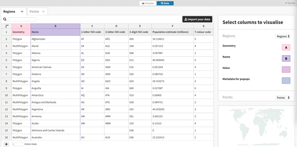
Create shadeable geographic regions by uploading your own map data in GeoJSON format. The file should contain a FeatureCollection with each feature being a Polygon or MultiPolygon in unprojected (WGS84) coordinates. Each feature will become a row in the datasheet with the geometry in the first column and metadata (properties) in subsequent columns.
The metadata can be used for shading regions to make a choropleth map. Additional data from a separate source (an xlsx or CSV file) can be added using the merge option when importing data as shown below and in the video at the bottom of the page.
Data requirements: Points
Alongside regions, one can also draw points. For Points data the template requires one row per point with at least a column for longitudae and a column for latitude (both in decimal degrees). In addition, it is possible to shade points by (categorical) value and/or size points by (numeric) value.
Tips
- Remove a region from a visualisation by deleting the corresponding row in the Regions datasheet.
- Choose from over 40 different map projections in the Projections panel. In advanced mode the map can be centred around any point on Earth.
- Use the Meta data for popups column selection boxes to add additional data to popups.
Credits
The default data comes from the World Bank and is licensed under CC-BY 4.0.
API information
This section documents API usage specific to this template, so for an introduction we suggest you refer to the generic API documentation instead.
template: @flourish/projection-map
version: 14
Template data
There are three different formats in which you can supply data to this template. The most convenient for you to use likely depends on the source of your data, as described below.
1. Array of arrays, and a bindings object
You can supply arrays of arrays to opts.data, which might look
like:
{
    data: {
        regions: [
            [ "RegionsColumn1Value1", "RegionsColumn2Value1",
            [ "RegionsColumn1Value2", "RegionsColumn2Value2",
            [ "RegionsColumn1Value3", "RegionsColumn2Value3",
            ...
        ],
        regions_geometry: [
            [ "Regions_geometryColumn1Value1", "Regions_geometryColumn2Value1",
            [ "Regions_geometryColumn1Value2", "Regions_geometryColumn2Value2",
            [ "Regions_geometryColumn1Value3", "Regions_geometryColumn2Value3",
            ...
        ],
        points: [
            [ "PointsColumn1Value1", "PointsColumn2Value1",
            [ "PointsColumn1Value2", "PointsColumn2Value2",
            [ "PointsColumn1Value3", "PointsColumn2Value3",
            ...
        ],
        lines: [
            [ "LinesColumn1Value1", "LinesColumn2Value1",
            [ "LinesColumn1Value2", "LinesColumn2Value2",
            [ "LinesColumn1Value3", "LinesColumn2Value3",
            ...
        ]
    }
}
where each array of arrays represents the rows in a data sheet.
To tell the API how the values from each column should be
associated with the keys that the template is expecting, you must also supply
an object attached to opts.bindings. (The meanings of the
keys in the bindings object are documented
below.) The minimal bindings you can
supply for this template are as shown in this example:
{
    template: "@flourish/projection-map",
    version: "14",
    bindings: {
        regions: {

        },
        regions_geometry: {

        },
        points: {

        },
        lines: {

        }
    },
    data: {
        regions: [
            [ "RegionsColumn1Value1", "RegionsColumn2Value1",
            [ "RegionsColumn1Value2", "RegionsColumn2Value2",
            [ "RegionsColumn1Value3", "RegionsColumn2Value3",
            ...
        ],
        regions_geometry: [
            [ "Regions_geometryColumn1Value1", "Regions_geometryColumn2Value1",
            [ "Regions_geometryColumn1Value2", "Regions_geometryColumn2Value2",
            [ "Regions_geometryColumn1Value3", "Regions_geometryColumn2Value3",
            ...
        ],
        points: [
            [ "PointsColumn1Value1", "PointsColumn2Value1",
            [ "PointsColumn1Value2", "PointsColumn2Value2",
            [ "PointsColumn1Value3", "PointsColumn2Value3",
            ...
        ],
        lines: [
            [ "LinesColumn1Value1", "LinesColumn2Value1",
            [ "LinesColumn1Value2", "LinesColumn2Value2",
            [ "LinesColumn1Value3", "LinesColumn2Value3",
            ...
        ]
    }
}
All possible bindings that you can supply are shown in this example:
{
    template: "@flourish/projection-map",
    version: "14",
    bindings: {
        regions: {
            id: 0, // index of a column in your data
            name: 1, // index of a column in your data
            label: 2, // index of a column in your data
            value: [3, 4, ...], // index(es) of column(s) in your data
            group: 5, // index of a column in your data
            metadata: [6, 7, ...], // index(es) of column(s) in your data
        },
        regions_geometry: {
            geometry: 0, // index of a column in your data
            id: [1, 2, ...], // index(es) of column(s) in your data
        },
        points: {
            name: 0, // index of a column in your data
            lon: 1, // index of a column in your data
            lat: 2, // index of a column in your data
            color: 3, // index of a column in your data
            value: [4, 5, ...], // index(es) of column(s) in your data
            metadata: [6, 7, ...], // index(es) of column(s) in your data
        },
        lines: {
            geometry: 0, // index of a column in your data
            series: 1, // index of a column in your data
        }
    },
    data: {
        regions: [
            [ "RegionsColumn1Value1", "RegionsColumn2Value1",
            [ "RegionsColumn1Value2", "RegionsColumn2Value2",
            [ "RegionsColumn1Value3", "RegionsColumn2Value3",
            ...
        ],
        regions_geometry: [
            [ "Regions_geometryColumn1Value1", "Regions_geometryColumn2Value1",
            [ "Regions_geometryColumn1Value2", "Regions_geometryColumn2Value2",
            [ "Regions_geometryColumn1Value3", "Regions_geometryColumn2Value3",
            ...
        ],
        points: [
            [ "PointsColumn1Value1", "PointsColumn2Value1",
            [ "PointsColumn1Value2", "PointsColumn2Value2",
            [ "PointsColumn1Value3", "PointsColumn2Value3",
            ...
        ],
        lines: [
            [ "LinesColumn1Value1", "LinesColumn2Value1",
            [ "LinesColumn1Value2", "LinesColumn2Value2",
            [ "LinesColumn1Value3", "LinesColumn2Value3",
            ...
        ]
    }
}
2. Array of objects with arbitrary keys, and a bindings object
This format is most likely useful when you have data from an external source,
such as CSV data loaded from d3-dsv.
You should supply this attached to the opts.data, which might look
like:
{
        regions: [
            { "RegionsHeader1": ..., "RegionsHeader2": ..., ... },
            { "RegionsHeader1": ..., "RegionsHeader2": ..., ... },
            { "RegionsHeader1": ..., "RegionsHeader2": ..., ... },
            ...
        ],
        regions_geometry: [
            { "Regions_geometryHeader1": ..., "Regions_geometryHeader2": ..., ... },
            { "Regions_geometryHeader1": ..., "Regions_geometryHeader2": ..., ... },
            { "Regions_geometryHeader1": ..., "Regions_geometryHeader2": ..., ... },
            ...
        ],
        points: [
            { "PointsHeader1": ..., "PointsHeader2": ..., ... },
            { "PointsHeader1": ..., "PointsHeader2": ..., ... },
            { "PointsHeader1": ..., "PointsHeader2": ..., ... },
            ...
        ],
        lines: [
            { "LinesHeader1": ..., "LinesHeader2": ..., ... },
            { "LinesHeader1": ..., "LinesHeader2": ..., ... },
            { "LinesHeader1": ..., "LinesHeader2": ..., ... },
            ...
        ]
    }
... but with the keys being the column headers from your
source data instead. You must also supply an object attached to
opts.bindings. The minimal bindings you can
supply for this template are as shown in this example:
{
    template: "@flourish/projection-map",
    version: "14",
    bindings: {
        regions: {

        },
        regions_geometry: {

        },
        points: {

        },
        lines: {

        }
    },
    data: {
        regions: [
            { "RegionsHeader1": ..., "RegionsHeader2": ..., ... },
            { "RegionsHeader1": ..., "RegionsHeader2": ..., ... },
            { "RegionsHeader1": ..., "RegionsHeader2": ..., ... },
            ...
        ],
        regions_geometry: [
            { "Regions_geometryHeader1": ..., "Regions_geometryHeader2": ..., ... },
            { "Regions_geometryHeader1": ..., "Regions_geometryHeader2": ..., ... },
            { "Regions_geometryHeader1": ..., "Regions_geometryHeader2": ..., ... },
            ...
        ],
        points: [
            { "PointsHeader1": ..., "PointsHeader2": ..., ... },
            { "PointsHeader1": ..., "PointsHeader2": ..., ... },
            { "PointsHeader1": ..., "PointsHeader2": ..., ... },
            ...
        ],
        lines: [
            { "LinesHeader1": ..., "LinesHeader2": ..., ... },
            { "LinesHeader1": ..., "LinesHeader2": ..., ... },
            { "LinesHeader1": ..., "LinesHeader2": ..., ... },
            ...
        ]
    }
}
All possible bindings that you can supply are shown in this example:
{
    template: "@flourish/projection-map",
    version: "14",
    bindings: {
        regions: {
            id: "RegionsHeader1",
            name: "RegionsHeader2",
            label: "RegionsHeader3",
            value: ["RegionsHeader4", "RegionsHeader5", ...],
            group: "RegionsHeader6",
            metadata: ["RegionsHeader7", "RegionsHeader8", ...],
        },
        regions_geometry: {
            geometry: "Regions_geometryHeader1",
            id: ["Regions_geometryHeader2", "Regions_geometryHeader3", ...],
        },
        points: {
            name: "PointsHeader1",
            lon: "PointsHeader2",
            lat: "PointsHeader3",
            color: "PointsHeader4",
            value: ["PointsHeader5", "PointsHeader6", ...],
            metadata: ["PointsHeader7", "PointsHeader8", ...],
        },
        lines: {
            geometry: "LinesHeader1",
            series: "LinesHeader2",
        }
    },
    data: {
        regions: [
            { "RegionsHeader1": ..., "RegionsHeader2": ..., ... },
            { "RegionsHeader1": ..., "RegionsHeader2": ..., ... },
            { "RegionsHeader1": ..., "RegionsHeader2": ..., ... },
            ...
        ],
        regions_geometry: [
            { "Regions_geometryHeader1": ..., "Regions_geometryHeader2": ..., ... },
            { "Regions_geometryHeader1": ..., "Regions_geometryHeader2": ..., ... },
            { "Regions_geometryHeader1": ..., "Regions_geometryHeader2": ..., ... },
            ...
        ],
        points: [
            { "PointsHeader1": ..., "PointsHeader2": ..., ... },
            { "PointsHeader1": ..., "PointsHeader2": ..., ... },
            { "PointsHeader1": ..., "PointsHeader2": ..., ... },
            ...
        ],
        lines: [
            { "LinesHeader1": ..., "LinesHeader2": ..., ... },
            { "LinesHeader1": ..., "LinesHeader2": ..., ... },
            { "LinesHeader1": ..., "LinesHeader2": ..., ... },
            ...
        ]
    }
}
(As before, the keys containing "Header" would be replaced by column names from your data source.)
3. Array of objects with template-defined keys
There is an alternative format you can use, which is likely to be easier to
use if your data is not from a spreadsheet source. With this alternative format
you supply your data to the template as
an array of objects, attached to opts.data, where the keys must
be those used by the template, as documented below. In this case
there is no need to supply a bindings object, since the key names are already
those expected by the template. The required properties in the data
object are as follows (scroll down for a
description of what each property is):
{
    template: "@flourish/projection-map",
    version: "14",
    data: {
    regions: [
        {
            value: [...],
            metadata: [...]
        },
        ...
    ],
    regions_geometry: [
        {
            id: [...]
        },
        ...
    ],
    points: [
        {
            value: [...],
            metadata: [...]
        },
        ...
    ]
},
    ...
}
And the full list of all possible properties is as follows:
{
    template: "@flourish/projection-map",
    version: "14",
    data: {
    regions: [
        {
            id: ...,
            name: ...,
            label: ...,
            value: [...],
            group: ...,
            metadata: [...]
        },
        ...
    ],
    regions_geometry: [
        {
            geometry: ...,
            id: [...]
        },
        ...
    ],
    points: [
        {
            name: ...,
            lon: ...,
            lat: ...,
            color: ...,
            value: [...],
            metadata: [...]
        },
        ...
    ],
    lines: [
        {
            geometry: ...,
            series: ...
        },
        ...
    ]
},
    ...
}
Meanings of the template data keys:
- regions.id: Unique ID for joining boundary data. This column must contain values that match "ID to match" values in the "Regions geometry" sheet. string, number
- regions.name: The name that appears in popups and panels. string
- regions.label: The name that appears in region labels on the map. string
- regions.value: One or more values or categories to color your regions by. If this column is numeric, your regions will be shaded with a sequential or diverging scale. If it's categorical, your regions will be shaded with a categorical scale. string, number
- regions.group: Draw borders around groups of regions, e.g. state borders around counties. string, number
- regions.metadata: One or more columns of information to include in popups and panels. string, number, datetime
- regions_geometry.geometry: GeoJSON geometry that describe a boundary (typically geometry type will be MultiPolygon or Polygon). string
- regions_geometry.id: One or more columns containing unique IDs for joining boundary data. This column must contain values that match "ID" values in the "Regions" sheet. string, number
- points.name: name string
- points.lon: Longitude for each point, specified in decimal degrees. number
- points.lat: Latitude for each point, specified in decimal degrees. number
- points.color: color string
- points.value: Select multiple columns to add a filter that lets you switch between different metrics number
- points.metadata: One or more columns of information to include in popups and panels. string, number, datetime
- lines.geometry: GeoJSON geometry that describe a line (typically geometry type will be Polyline). string
- lines.series: Values in the selected column can be used to define specific color and line styles in the settings panel. string, number
Template metadata
Note: metadata is optional, and the API will interpret your data for you if you do not specify it. A typical example of when specifying metadata can be useful is when column(s) in your data contain numbers or dates that you wish to format visually (e.g. to display a column containing MM/DD/YYYY dates in DD/MM/YYYY format).
This template supports an optional metadata property. metadata informs the template what type of data is in each of your columns, and how that data should be formatted visually.
You can specify metadata in one of three formats, depending on the format of opts.data.
1. Array of objects with column indexes as keys
You should supply metadata in this format when opts.data is in the previously described 'array of arrays' format. In this case, metadata should be an object with column index: column type object key/value pairs (column type objects must have type, type_id, and output_format_id keys, documented below):
{
    template: "@flourish/projection-map",
    version: "14",
    ...
    data: {
        regions: [
            [ "RegionsColumn1Value1", "RegionsColumn2Value1",
            [ "RegionsColumn1Value2", "RegionsColumn2Value2",
            [ "RegionsColumn1Value3", "RegionsColumn2Value3",
            ...
        ],
        regions_geometry: [
            [ "Regions_geometryColumn1Value1", "Regions_geometryColumn2Value1",
            [ "Regions_geometryColumn1Value2", "Regions_geometryColumn2Value2",
            [ "Regions_geometryColumn1Value3", "Regions_geometryColumn2Value3",
            ...
        ],
        points: [
            [ "PointsColumn1Value1", "PointsColumn2Value1",
            [ "PointsColumn1Value2", "PointsColumn2Value2",
            [ "PointsColumn1Value3", "PointsColumn2Value3",
            ...
        ],
        lines: [
            [ "LinesColumn1Value1", "LinesColumn2Value1",
            [ "LinesColumn1Value2", "LinesColumn2Value2",
            [ "LinesColumn1Value3", "LinesColumn2Value3",
            ...
        ]
    },
    metadata: {
        regions: {
            0: { type: ..., type_id: ..., output_format_id: ... },
            1: { type: ..., type_id: ..., output_format_id: ... },
        }
    },
    ...
}
2. Array of objects with column headers as keys
You should supply metadata in this format when opts.data is in the previously described 'array of objects with arbitrary keys' format. In this case, metadata should be an object with column header: column type object key/value pairs (column type objects must have type, type_id, and output_format_id keys, documented below):
{
    template: "@flourish/projection-map",
    version: "14",
    data: {
        regions: [
            { "RegionsHeader1": ..., "RegionsHeader2": ..., ... },
            { "RegionsHeader1": ..., "RegionsHeader2": ..., ... },
            { "RegionsHeader1": ..., "RegionsHeader2": ..., ... },
            ...
        ],
        regions_geometry: [
            { "Regions_geometryHeader1": ..., "Regions_geometryHeader2": ..., ... },
            { "Regions_geometryHeader1": ..., "Regions_geometryHeader2": ..., ... },
            { "Regions_geometryHeader1": ..., "Regions_geometryHeader2": ..., ... },
            ...
        ],
        points: [
            { "PointsHeader1": ..., "PointsHeader2": ..., ... },
            { "PointsHeader1": ..., "PointsHeader2": ..., ... },
            { "PointsHeader1": ..., "PointsHeader2": ..., ... },
            ...
        ],
        lines: [
            { "LinesHeader1": ..., "LinesHeader2": ..., ... },
            { "LinesHeader1": ..., "LinesHeader2": ..., ... },
            { "LinesHeader1": ..., "LinesHeader2": ..., ... },
            ...
        ]
    },
    metadata: {
        regions: {
            "RegionsHeader1": { type: ..., type_id: ..., output_format_id: ... },
            "RegionsHeader2": { type: ..., type_id: ..., output_format_id: ... },
        }
    },
    ...
}
Column type objects:
Column type objects tell the API what type of data is in a column:
{
    type: "number", // options also include 'string', and 'datetime'
    type_id: "number$comma_point", // numbers in the format 13,429.17
    output_format_id: "number$space_comma", // numbers in the format 13 429,17
}
For more information on valid column type values, see Recognized Type Formats.
Template settings
Options for opts.state.
Projection
projection string
Projection. Allowed values:
fit string
Bounds. Allowed values:
centering string
Allowed values:
- rotate (Rotate projection)
- center (Translate map)
min_area number
Minimum area. In km². Polygons representing areas below this size won't be considered when fitting the map. Setting is ignored if no polygons are bigger than the specified minimum area.
include_lines boolean
Include lines data. Include lines when calculating the bounds of the map Allowed values:
longitude number
Centre long..
latitude number
Centre lat..
roll number
Rotation.
zoom number
Zoom. 1 to show whole world, > 1 to zoom in.
aspect number
Aspect ratio. Width divided by height. If left blank will use aspect ratio of projection for whole world.
padding_top number
Top. Padding added to top of map (as a percentage of container width) Max: 25
padding_bottom number
Bottom. Padding added to bottom of map (as a percentage of container width) Max: 25
padding_left number
Left. Padding added to left of map (as a percentage of container width) Max: 25
padding_right number
Right. Padding added to right of map (as a percentage of container width) Max: 25
Regions layer
map_show boolean
Allowed values:
- true (Enabled)
- false (Disabled)
map_fill color
Fill. Ignored for regions with values.
map_fill_opacity number
Fill opacity. Max: 1
map_include_all_region_geometry boolean
Include all region geometry. If true, all the regions in the 'Regions geometry' sheet is included in the map. Otherwise only the geometry joined to regions in the 'Regions' sheet is included.
map_show_stroke boolean
Allowed values:
- true (On)
- false (Off)
map_stroke color
Color.
map_stroke_width number
Width. Max: 5
map_stroke_opacity number
Opacity. Max: 1
map_highlight_stroke_inner color
Inner stroke.
map_highlight_stroke_outer color
Outer stroke.
map_highlight_stroke_width number
Stroke width. Max: 5
map_colors.categorical_palette colors
Palette.
map_colors.categorical_extend boolean
Extend. Automatically generate additional colours when needed to avoid the palette colours being used more than once
map_colors.categorical_custom_palette text
Custom overrides. Enter the label name for which you wish to set the color, followed by a colon and the desired color value. <br><br><a href="https://help.flourish.studio/article/458-how-to-customize-colors-in-flourish-palettes#:~:text=The%20main%20color%20tool%20in,delete%20and%20add%20new%20colors">Colors can be set</a> using Hex, RGB, color names or RGBA, if you want to set the <a href="https://help.flourish.studio/article/393-add-transparency-to-flourish-colors">opacity</a>. Multiple colors can be set using multiple lines. For example: <br /><hr />Party 1: red <br />Party 2: #4455AA <br />Party 3: rgb(30,168,26)
map_colors.numeric_type string
Scale type. Allowed values:
map_colors.binning boolean
In <b>linear</b> mode, the color scale will run as a smooth gradient between 2 colors. In <b>binned</b> mode, the gradient will be divided in smaller blocks. Allowed values:
map_colors.bin_mode string
Binning mode. Allowed values:
map_colors.bin_count number
Number of bins.
map_colors.bin_thresholds string
Custom thresholds. Enter your desired thresholds, separating them with a ";". For instance, "5;10;15". <br><br>Bins form as follows: <ul> <li>From the data's minimum value (domain minimum) up to the first threshold.</li> <li>Between consecutive thresholds.</li> <li>From the last threshold to the data's maximum value (domain maximum).</li> <ul> </br>For "5;10;15", you'll get four bins based on your data's range.
map_colors.sequential_palette string
Palette. Allowed values:
map_colors.sequential_reverse boolean
Reverse.
map_colors.sequential_custom_min color
Minimum color.
map_colors.sequential_custom_max color
Maximum color.
map_colors.sequential_color_space string
Color space. Allowed values:
map_colors.sequential_custom_domain boolean
Domain. Allowed values:
map_colors.sequential_domain_min number
Min.
map_colors.sequential_domain_max number
Max.
map_colors.diverging_palette string
Palette. Allowed values:
map_colors.diverging_reverse boolean
Reverse.
map_colors.diverging_custom_min color
Minimum color.
map_colors.diverging_custom_mid color
Midpoint color.
map_colors.diverging_custom_max color
Maximum color.
map_colors.diverging_color_space string
Color space. Allowed values:
map_colors.diverging_custom_domain boolean
Domain. Allowed values:
map_colors.diverging_domain_min number
Min.
map_colors.diverging_domain_mid number
Mid.
map_colors.diverging_domain_max number
Max.
choropleth_scale_per_column boolean
Base default scale on:. Determines whether or not to update the default colour scale when switching between Value columns. Note that any non-default scale settings (such as custom bin thresholds) will always apply across all columns. Allowed values:
choropleth_missing_values string
Action. How to represent region geometry without an associated row in the Regions sheet (or without a value if the value binding is active) Allowed values:
missing_pattern_opacity number
Opacity. This value is multiplied by the Fill opacity value. Max: 1
missing_pattern_size number
Square size. Min: 1 Max: 20
missing_pattern_color_1 color
Colour 1.
missing_pattern_color_2 color
Colour 2.
map_formatting.prefix string
Prefix. <a href="https://help.flourish.studio/article/37-how-to-change-number-formating">Text</a> to place in front of a number
map_formatting.suffix string
Suffix. <a href="https://help.flourish.studio/article/37-how-to-change-number-formating">Text</a> to place after a number
map_formatting.n_dec number
Decimal places. Decimal places. You can also enter a negative integer to <a href="https://help.flourish.studio/article/37-how-to-change-number-formating#multiply-divide">round to a whole number</a> with that many zeros. For example, -2 will round to the nearest hundred. Min: -10 Max: 10
map_formatting.advanced boolean
Advanced.
map_formatting.negative_sign string
Styling of negative numbers. Allowed values:
map_formatting.strip_zeros boolean
Remove trailing zeros.
map_formatting.strip_separator boolean
Hide thousands separator below 10,000. Turn off if you want four-digit numbers to include a separator, e.g. “1,234” rather than “1234”.
map_formatting.transform_labels boolean
Multiply/divide values.
map_formatting.transform string
Allowed values:
- multiply (Multiply by)
- divide (Divide by)
- exponentiate (×10 to the power of)
map_formatting.multiply_divide_constant number
map_formatting.exponentiate_constant number
map_shadow boolean
Add shadow.
map_shadow_offset_x number
Horizontal offset.
map_shadow_offset_y number
Vertical offset.
map_shadow_blur number
Blur.
map_shadow_color color
Colour.
map_shadow_opacity number
Opacity. Max: 1
map_show_labels boolean
Show labels.
map_label_opacity number
Opacity. Max: 1
map_label_color color
Fill.
map_label_outline_color color
Outline color. The color of the label outline.
map_label_size number
Font size. Label size (as a percentage of the base font size)
map_label_outline_width number
Outline width (%). Width of label outline (as a percentage of font size). Max: 50
map_label_upper_case boolean
Uppercase labels.
map_label_bold boolean
Bold labels.
map_label_priority_list text
Label priority. Specify the prority with which labels should be drawn. For example:<br /><hr />Italy<br />Germany<br />Puerto Rico
map_label_hide_list text
Hide labels. Specify labels which should be hidden. For example:<br /><hr />France<br />Spain<br />United Kingdom
map_hide_non_prioritized_labels boolean
Only show labels on 'Label priority' list. If true, only the labels on the priority list will be drawn.
map_label_spacing number
Spacing (%). Specify the space to leave around each label as a percentage of font size. Increase this setting to reduce label overcrowding. Max: 100
Points layer
point_show boolean
Allowed values:
- true (Enabled)
- false (Disabled)
point_symbol_type string
Symbol. Allowed values:
point_circle_min_radius number
Minimum radius. Any smaller circles will be scaled up to the specified level. (Ignored if greater than the “Maximum radius” setting.)
point_circle_max_radius number
Maximum radius.
point_spike_max_height number
Maximum height.
point_spike_default_height number
Height.
point_spike_base_width number
Base width. Width of spike at base (in pixels, when chart width is 960px)
point_arrow_angle number
Arrow angle. Clockwise angle of positive arrows (in degrees from 12 o'clock). Negative angle arrows are calculated according to the arrow flip mode Max: 180
point_arrow_min_length number
Minimum length. Minimum length of arrows (in pixels, when chart width is 960px)
point_arrow_max_length number
Maximum length. Maximum length of arrows (in pixels, when chart width is 960px) Min: 1
point_arrow_flip_mode string
Arrow flip mode. The direction in which negative valued arrows are flipped. e.g. flipped vertically a 60 degree arrow becomes -60 degrees, flipped horizontally it becomes 120 Allowed values:
point_max_value number
Maximum value. Values bigger than this maximum will have a radius/height/length equal to the maximum radius/height/length. Leave blank to use the maximum in the dataset
point_circle_default_radius number
Radius.
point_opacity number
Fill opacity. Max: 1
point_fill color
Default fill.
point_stroke_width number
Stroke width.
point_stroke_opacity number
Stroke opacity. Max: 1
point_stroke_custom boolean
Custom stroke.
point_stroke_color color
Stroke color.
point_overlap_stroke_color color
Overlap stroke color. An additional stroke around arrow symbols which appears when fill opacity is set to 1. This helps users differentiate arrows when they overlap
point_scale_per_column boolean
Base default scale on:. Determines whether or not to update the default size scale when switching between Value columns. Allowed values:
point_highlight_stroke_inner color
Inner stroke.
point_highlight_stroke_outer color
Outer stroke.
point_highlight_stroke_width number
Stroke width.
point_highlight_fill_opacity number
Fill opacity. Max: 1
point_highlight_fill_custom boolean
Custom fill.
point_highlight_fill color
Fill color.
point_arrow_color_by_value boolean
Color by value. Color arrows by whether their value is positive or negative
point_colors.categorical_palette colors
Palette.
point_colors.categorical_extend boolean
Extend. Automatically generate additional colours when needed to avoid the palette colours being used more than once
point_colors.categorical_custom_palette text
Custom overrides. Enter the label name for which you wish to set the color, followed by a colon and the desired color value. <br><br><a href="https://help.flourish.studio/article/458-how-to-customize-colors-in-flourish-palettes#:~:text=The%20main%20color%20tool%20in,delete%20and%20add%20new%20colors">Colors can be set</a> using Hex, RGB, color names or RGBA, if you want to set the <a href="https://help.flourish.studio/article/393-add-transparency-to-flourish-colors">opacity</a>. Multiple colors can be set using multiple lines. For example: <br /><hr />Party 1: red <br />Party 2: #4455AA <br />Party 3: rgb(30,168,26)
point_colors.numeric_type string
Scale type. Allowed values:
point_colors.binning boolean
In <b>linear</b> mode, the color scale will run as a smooth gradient between 2 colors. In <b>binned</b> mode, the gradient will be divided in smaller blocks. Allowed values:
point_colors.bin_mode string
Binning mode. Allowed values:
point_colors.bin_count number
Number of bins.
point_colors.bin_thresholds string
Custom thresholds. Enter your desired thresholds, separating them with a ";". For instance, "5;10;15". <br><br>Bins form as follows: <ul> <li>From the data's minimum value (domain minimum) up to the first threshold.</li> <li>Between consecutive thresholds.</li> <li>From the last threshold to the data's maximum value (domain maximum).</li> <ul> </br>For "5;10;15", you'll get four bins based on your data's range.
point_colors.sequential_palette string
Palette. Allowed values:
point_colors.sequential_reverse boolean
Reverse.
point_colors.sequential_custom_min color
Minimum color.
point_colors.sequential_custom_max color
Maximum color.
point_colors.sequential_color_space string
Color space. Allowed values:
point_colors.sequential_custom_domain boolean
Domain. Allowed values:
point_colors.sequential_domain_min number
Min.
point_colors.sequential_domain_max number
Max.
point_colors.diverging_palette string
Palette. Allowed values:
point_colors.diverging_reverse boolean
Reverse.
point_colors.diverging_custom_min color
Minimum color.
point_colors.diverging_custom_mid color
Midpoint color.
point_colors.diverging_custom_max color
Maximum color.
point_colors.diverging_color_space string
Color space. Allowed values:
point_colors.diverging_custom_domain boolean
Domain. Allowed values:
point_colors.diverging_domain_min number
Min.
point_colors.diverging_domain_mid number
Mid.
point_colors.diverging_domain_max number
Max.
point_arrow_positive_color color
Positive color.
point_arrow_negative_color color
Negative color.
point_sort boolean
Place smaller points above. If checked the smallest points are drawn last so they're always visible and hoverable. If not checked then points at the top of the data sheet are drawn first
point_formatting.prefix string
Prefix. <a href="https://help.flourish.studio/article/37-how-to-change-number-formating">Text</a> to place in front of a number
point_formatting.suffix string
Suffix. <a href="https://help.flourish.studio/article/37-how-to-change-number-formating">Text</a> to place after a number
point_formatting.n_dec number
Decimal places. Decimal places. You can also enter a negative integer to <a href="https://help.flourish.studio/article/37-how-to-change-number-formating#multiply-divide">round to a whole number</a> with that many zeros. For example, -2 will round to the nearest hundred. Min: -10 Max: 10
point_formatting.advanced boolean
Advanced.
point_formatting.negative_sign string
Styling of negative numbers. Allowed values:
point_formatting.strip_zeros boolean
Remove trailing zeros.
point_formatting.strip_separator boolean
Hide thousands separator below 10,000. Turn off if you want four-digit numbers to include a separator, e.g. “1,234” rather than “1234”.
point_formatting.transform_labels boolean
Multiply/divide values.
point_formatting.transform string
Allowed values:
- multiply (Multiply by)
- divide (Divide by)
- exponentiate (×10 to the power of)
point_formatting.multiply_divide_constant number
point_formatting.exponentiate_constant number
Lines layer
line_above_highlights boolean
Layer position. Allowed values:
line_stroke_color color
Default.
line_stroke_color_overrides text
Overrides. Type the name of the series whose colour you want to set, a colon and then a color (using a name, hex-code or rgb declaration). Multiple colors can be set using multiple lines. For example:<br /><hr />Rivers: blue<br />Borders: #444444
line_stroke_width number
Default. Max: 5
line_stroke_width_overrides text
Overrides. Type the name of the series whose width you want to set, a colon and then a number between 0 and 5. Multiple widths can be set using multiple lines. For example:<br /><hr />Rivers: 0.5<br />Borders: 2
line_stroke_opacity number
Default. Max: 1
line_stroke_opacity_overrides text
Overrides. Type the name of the series whose opacity you want to set, a colon and then a number between 0 and 1. Multiple opacities can be set using multiple lines. For example:<br /><hr />Rivers: 0.5<br />Borders: 1
line_stroke_dash string
Default. Allowed values:
line_stroke_dash_overrides text
Overrides. Type the name of the series whose line-dash style you want to set, a colon and then a line-dash style (“solid”, “long”, “short“ or “mixed”). Multiple line-dash styles can be set using multiple lines. For example:<br /><hr />Rivers: solid<br />Borders: long
Region groups layer
group_quantization_precision number
Boundary precision. Larger values will give smoother boundaries but may highlight small topological errors Min: 1 Max: 6
group_above_highlights boolean
Keeps above region highlights.
group_stroke_color color
Color.
group_stroke_width number
Width. Max: 5
group_stroke_opacity number
Opacity. Max: 1
Globe & graticule layers
graticule_show boolean
Graticule layer. Allowed values:
graticule_color color
Colour.
graticule_width number
Width. Max: 5
graticule_opacity number
Opacity. Max: 1
graticule_separation_longitude number
Longitude separation (°). Min: 1 Max: 180
graticule_separation_latitude number
Latitude separation (°). Min: 1 Max: 90
globe_show boolean
Globe layer. Allowed values:
globe_color color
Globe colour.
Controls
controls_container.alignment string
Alignment. Allowed values:
controls_container.controls_spacing number
Spacing. The space between controls, like dropdowns and adjacent button sets, in <a href="https://help.flourish.studio/article/192-how-sizing-with-rems-works-in-flourish">em</a> units. Max: 5
region_controls.control_type string
Control type. Choose between a <b>dropdown</b>, <b>buttons</b> or a <a href="https://help.flourish.studio/article/524-how-to-add-a-time-slider-to-your-line-bar-pie-chart"><b>time slider</b></a>. Allowed values:
region_controls.control_styles boolean
Adv..
region_controls.control_title string
Control title.
region_controls.button_group boolean
Grouped. Allowed values:
region_controls.button_group_width_mode string
Button group width. Allowed values:
region_controls.button_group_width_fixed number
Width. Max: 100
region_controls.dropdown_width_mode string
Dropdown width. Allowed values:
region_controls.dropdown_width_fixed number
Width. Max: 100
region_controls.slider_width number
Slider width. Width of the slider track in <a href="https://help.flourish.studio/article/192-how-sizing-with-rems-works-in-flourish">rems</a> Max: 100
region_controls.slider_max_label_width number
Max label width. In <a href="https://help.flourish.studio/article/192-how-sizing-with-rems-works-in-flourish">rems</a>, multiples of base font size. If larger than the longest label, only the space required to fit labels will be used. Max: 100
region_controls.slider_step_time number
Time between steps. Measured in seconds, positive values move the slider left to right, negative values move the slider right to left. Min: -100 Max: 100
region_controls.slider_loop boolean
Loop.
region_controls.slider_restart_pause number
Pause before loop. Measured in seconds and in addition to the regular step time displayed above Max: 100
region_controls.sort boolean
Sorting. Allowed values:
point_controls.control_type string
Control type. Choose between a <b>dropdown</b>, <b>buttons</b> or a <a href="https://help.flourish.studio/article/524-how-to-add-a-time-slider-to-your-line-bar-pie-chart"><b>time slider</b></a>. Allowed values:
point_controls.control_styles boolean
Adv..
point_controls.control_title string
Control title.
point_controls.button_group boolean
Grouped. Allowed values:
point_controls.button_group_width_mode string
Button group width. Allowed values:
point_controls.button_group_width_fixed number
Width. Max: 100
point_controls.dropdown_width_mode string
Dropdown width. Allowed values:
point_controls.dropdown_width_fixed number
Width. Max: 100
point_controls.slider_width number
Slider width. Width of the slider track in <a href="https://help.flourish.studio/article/192-how-sizing-with-rems-works-in-flourish">rems</a> Max: 100
point_controls.slider_max_label_width number
Max label width. In <a href="https://help.flourish.studio/article/192-how-sizing-with-rems-works-in-flourish">rems</a>, multiples of base font size. If larger than the longest label, only the space required to fit labels will be used. Max: 100
point_controls.slider_step_time number
Time between steps. Measured in seconds, positive values move the slider left to right, negative values move the slider right to left. Min: -100 Max: 100
point_controls.slider_loop boolean
Loop.
point_controls.slider_restart_pause number
Pause before loop. Measured in seconds and in addition to the regular step time displayed above Max: 100
point_controls.sort boolean
Sorting. Allowed values:
controls_style.font_size number
Text size. Max: 5
controls_style.font_weight string
Text weight. Allowed values:
controls_style.height number
Height. Max: 5
dropdown_style.background color
Background.
dropdown_style.font_color color
Text color.
dropdown_style.border_styles_advanced boolean
Dropdown border styles.
dropdown_style.border_style string
Border style. Show border on all sides, or only at the bottom Allowed values:
dropdown_style.border_width number
Border width. Max: 20
dropdown_style.border_color color
Color.
dropdown_style.border_transparency number
Transparency. Max: 1
dropdown_style.border_radius number
Radius. Max: 100
button_style.background color
Background.
button_style.background_selected color
Selected.
button_style.background_hover color
Mouse over.
button_style.font_color color
Text color.
button_style.font_color_selected color
Selected.
button_style.font_color_hover color
Mouse over.
button_style.button_styles_advanced boolean
Button border styles.
button_style.border_width number
Border width. Max: 20
button_style.border_color color
Color.
button_style.border_transparency number
Transparency. Max: 1
button_style.border_radius number
Radius. Max: 100
slider_style.track_color color
Track.
slider_style.font_color color
Text.
slider_style.handle_color color
Handle.
slider_style.play_color color
Play/pause.
slider_style.track_height number
Track height. Max: 1
slider_style.handle_height number
Height. Max: 10
slider_style.play_button boolean
Play button.
Popups & panels
point_popup.mode string
Allowed values:
- none (None)
- popup (Popup)
- panel (Panel)
- both (Both)
point_popup.popup_is_custom boolean
Popup content. Allowed values:
point_popup.show_popup_styles boolean
Show popup styles.
point_popup.popup_custom_header html
Popup custom header. Use {{column_name}} to add a <a href="https://help.flourish.studio/article/69-how-to-add-custom-content-to-your-popups">value from your data</a>. Ensure the column is selected, or add it to <b>Info for popups</b> for popup use. <br><br>Advanced users can add <a href="https://help.flourish.studio/article/69-how-to-add-custom-content-to-your-popups#html">HTML</a> styling or <a href="https://help.flourish.studio/article/438-how-to-add-category-colors-to-popup-headers">add category colors</a> to popup headers. <br><br>To <a href="https://help.flourish.studio/article/490-how-to-add-conditional-statements-to-your-popups">hide parts of the popup</a> when a column is empty using <pre>{{#if column_name}}Content for non-empty column_name{{/if}}.</pre> For example: <pre>{{#if Capital name}}Capital:{{/if}} {{Capital name}}.</pre> Here, the word "Capital:" will only show if the corresponding cell in the "Capital name" column is not empty.
point_popup.popup_custom_main html
Popup custom main content. Use {{column_name}} to add a <a href="https://help.flourish.studio/article/69-how-to-add-custom-content-to-your-popups">value from your data</a>. Ensure the column is selected, or add it to <b>Info for popups</b> for popup use. <br><br>Advanced users can add <a href="https://help.flourish.studio/article/69-how-to-add-custom-content-to-your-popups#html">HTML</a> for designs, styles, and images. <br><br>To<a href="https://help.flourish.studio/article/490-how-to-add-conditional-statements-to-your-popups"> hide parts of the popup</a> when a column is empty use the syntax <pre>{{#if column_name}}Content for non-empty column_name{{/if}}.</pre> For example: <pre>{{#if Capital name}}Capital:{{/if}} {{Capital name}}.</pre> Here, the word "Capital:" will only show if the corresponding cell in the "Capital name" column is not empty.
point_popup.popup_custom_accessible text
Popup custom accessible content. A text alternative to visual custom popup content that will be read out by screenreaders. This content is added as an <code>aria-label</code> attribute to data point elements. You can still use {{column_name}} to add values from your data, but do not use HTML. For example: <code>{Name}}, Population: {{Population}}, GDP: {{GDP}}</code> If left empty, accessible content will fallback to the default popup content.
point_popup.popup_width number
Max width. In <a href="https://help.flourish.studio/article/192-how-sizing-with-rems-works-in-flourish">rems</a>, multiples of base font size. Leave blank to let the width adjust based on the contents.
point_popup.popup_font_size number
Text size.
point_popup.popup_text_color color
Text color.
point_popup.popup_align string
Align. Allowed values:
point_popup.popup_background color
Fill color.
point_popup.popup_background_opacity number
Fill opacity. Max: 1
point_popup.popup_padding number
Padding.
point_popup.popup_radius number
Radius. Corner radius of popup
point_popup.popup_header_type string
Header style. Allowed values:
point_popup.popup_header_background color
Background.
point_popup.popup_header_text_color color
Text.
point_popup.popup_list_type string
List type. Allowed values:
point_popup.popup_list_label_weight string
Label weight. Allowed values:
point_popup.popup_list_separator string
List separator. Predefined values:
point_popup.popup_shadow boolean
Shadow.
point_popup.popup_pointer boolean
Pointer.
point_popup.panel_position string
Allowed values:
- overlay (Overlay)
- left (Left)
- right (Right)
- top (Top)
- bottom (Bottom)
point_popup.panel_open_duration number
Open duration. Max: 2000
point_popup.panel_side_fixed boolean
Always show.
point_popup.panel_side_default_content text
Placeholder content.
point_popup.panel_is_custom boolean
Panel content. Allowed values:
point_popup.show_panel_styles boolean
Show panel styles.
point_popup.panel_custom_header html
Panel custom header. Use {{column_name}} to add a <a href="https://help.flourish.studio/article/69-how-to-add-custom-content-to-your-popups">value from your data</a>. Ensure the column is selected, or add it to <b>Info for popups</b> for panel use. <br><br>Advanced users can add <a href="https://help.flourish.studio/article/69-how-to-add-custom-content-to-your-popups#html">HTML</a> for styling or <a href="https://help.flourish.studio/article/438-how-to-add-category-colors-to-popup-headers">add category colors</a> to panel headers. <br><br>To <a href="https://help.flourish.studio/article/490-how-to-add-conditional-statements-to-your-popups">hide parts of the panel</a> when a column is empty using <pre>{{#if column_name}}Content for non-empty column_name{{/if}}.</pre> For example: <pre>{{#if Capital name}}Capital:{{/if}} {{Capital name}}.</pre> Here, the word "Capital:" will only show if the corresponding cell in the "Capital name" column is not empty.
point_popup.panel_custom_main html
Panel custom main content. Use {{column_name}} to add a <a href="https://help.flourish.studio/article/69-how-to-add-custom-content-to-your-popups">value from your data</a>. Ensure the column is selected, or add it to <b>Info for popups</b> for panel use. <br><br>Advanced users can add <a href="https://help.flourish.studio/article/69-how-to-add-custom-content-to-your-popups#html">HTML</a> for designs, styles, <a href="https://help.flourish.studio/article/437-how-to-add-images-to-your-popups-and-panels">images, videos and <a href="https://help.flourish.studio/article/259-how-to-embed-charts-in-your-popups-or-panels#embedding-charts-in-your-popups">embedded Flourish charts</a>, <br><br>To <a href="https://help.flourish.studio/article/490-how-to-add-conditional-statements-to-your-popups">hide parts of the panel</a> when a column is empty using <pre>{{#if column_name}}Content for non-empty column_name{{/if}}.</pre> For example: <pre>{{#if Capital name}}Capital:{{/if}} {{Capital name}}.</pre> Here, the word "Capital:" will only show if the corresponding cell in the "Capital name" column is not empty.
point_popup.panel_width_overlay number
Width (%).
point_popup.panel_height_overlay number
Height (%).
point_popup.panel_width_side number
Width (%).
point_popup.panel_height_side number
Height (%).
point_popup.panel_max_width number
Max width (px).
point_popup.panel_max_height number
Max height (px).
point_popup.panel_vertical_position string
Vertical position. Choosing <b>Click position</b> is especially useful when your visualization is really tall, this will make sure the panel content is always on top of the element you've clicked on Allowed values:
point_popup.panel_text_color color
Text color.
point_popup.panel_font_size number
Text size.
point_popup.panel_align string
Alignment. Allowed values:
point_popup.panel_background color
Fill color.
point_popup.panel_background_opacity number
Fill opacity. Max: 1
point_popup.panel_padding number
Padding.
point_popup.panel_radius number
Radius. Corner radius of panel
point_popup.panel_list_type string
List type. Allowed values:
point_popup.panel_list_label_weight string
Label weight. Allowed values:
point_popup.panel_list_separator string
List separator. Predefined values:
point_popup.panel_shadow boolean
Shadow.
choropleth_popup.mode string
Allowed values:
- none (None)
- popup (Popup)
- panel (Panel)
- both (Both)
choropleth_popup.popup_is_custom boolean
Popup content. Allowed values:
choropleth_popup.show_popup_styles boolean
Show popup styles.
choropleth_popup.popup_custom_header html
Popup custom header. Use {{column_name}} to add a <a href="https://help.flourish.studio/article/69-how-to-add-custom-content-to-your-popups">value from your data</a>. Ensure the column is selected, or add it to <b>Info for popups</b> for popup use. <br><br>Advanced users can add <a href="https://help.flourish.studio/article/69-how-to-add-custom-content-to-your-popups#html">HTML</a> styling or <a href="https://help.flourish.studio/article/438-how-to-add-category-colors-to-popup-headers">add category colors</a> to popup headers. <br><br>To <a href="https://help.flourish.studio/article/490-how-to-add-conditional-statements-to-your-popups">hide parts of the popup</a> when a column is empty using <pre>{{#if column_name}}Content for non-empty column_name{{/if}}.</pre> For example: <pre>{{#if Capital name}}Capital:{{/if}} {{Capital name}}.</pre> Here, the word "Capital:" will only show if the corresponding cell in the "Capital name" column is not empty.
choropleth_popup.popup_custom_main html
Popup custom main content. Use {{column_name}} to add a <a href="https://help.flourish.studio/article/69-how-to-add-custom-content-to-your-popups">value from your data</a>. Ensure the column is selected, or add it to <b>Info for popups</b> for popup use. <br><br>Advanced users can add <a href="https://help.flourish.studio/article/69-how-to-add-custom-content-to-your-popups#html">HTML</a> styling or <a href="https://help.flourish.studio/article/438-how-to-add-category-colors-to-popup-headers">add category colors</a> to popup headers. <br><br>To <a href="https://help.flourish.studio/article/490-how-to-add-conditional-statements-to-your-popups">hide parts of the popup</a> when a column is empty using <pre>{{#if column_name}}Content for non-empty column_name{{/if}}.</pre> For example: <pre>{{#if Capital name}}Capital:{{/if}} {{Capital name}}.</pre> Here, the word "Capital:" will only show if the corresponding cell in the "Capital name" column is not empty. <br><br>You can also use {{VALUE}} to get the currently displayed value, and {{METRIC}} to get the associated column header – useful when multiple value columns are set.
choropleth_popup.popup_custom_accessible text
Popup custom accessible content. A text alternative to visual custom popup content that will be read out by screenreaders. This content is added as an <code>aria-label</code> attribute to data point elements. You can still use {{column_name}} to add values from your data, but do not use HTML. For example: <code>{Name}}, Population: {{Population}}, GDP: {{GDP}}</code> If left empty, accessible content will fallback to the default popup content.
choropleth_popup.popup_width number
Max width. In <a href="https://help.flourish.studio/article/192-how-sizing-with-rems-works-in-flourish">rems</a>, multiples of base font size. Leave blank to let the width adjust based on the contents.
choropleth_popup.popup_font_size number
Text size.
choropleth_popup.popup_text_color color
Text color.
choropleth_popup.popup_align string
Align. Allowed values:
choropleth_popup.popup_background color
Fill color.
choropleth_popup.popup_background_opacity number
Fill opacity. Max: 1
choropleth_popup.popup_padding number
Padding.
choropleth_popup.popup_radius number
Radius. Corner radius of popup
choropleth_popup.popup_header_type string
Header style. Allowed values:
choropleth_popup.popup_header_background color
Background.
choropleth_popup.popup_header_text_color color
Text.
choropleth_popup.popup_list_type string
List type. Allowed values:
choropleth_popup.popup_list_label_weight string
Label weight. Allowed values:
choropleth_popup.popup_list_separator string
List separator. Predefined values:
choropleth_popup.popup_shadow boolean
Shadow.
choropleth_popup.popup_pointer boolean
Pointer.
choropleth_popup.panel_position string
Allowed values:
- overlay (Overlay)
- left (Left)
- right (Right)
- top (Top)
- bottom (Bottom)
choropleth_popup.panel_open_duration number
Open duration. Max: 2000
choropleth_popup.panel_side_fixed boolean
Always show.
choropleth_popup.panel_side_default_content text
Placeholder content.
choropleth_popup.panel_is_custom boolean
Panel content. Allowed values:
choropleth_popup.show_panel_styles boolean
Show panel styles.
choropleth_popup.panel_custom_header html
Panel custom header. Use {{column_name}} to add a <a href="https://help.flourish.studio/article/69-how-to-add-custom-content-to-your-popups">value from your data</a>. Ensure the column is selected, or add it to <b>Info for popups</b> for panel use. <br><br>Advanced users can add <a href="https://help.flourish.studio/article/69-how-to-add-custom-content-to-your-popups#html">HTML</a> for styling or <a href="https://help.flourish.studio/article/438-how-to-add-category-colors-to-popup-headers">add category colors</a> to panel headers. <br><br>To <a href="https://help.flourish.studio/article/490-how-to-add-conditional-statements-to-your-popups">hide parts of the panel</a> when a column is empty using <pre>{{#if column_name}}Content for non-empty column_name{{/if}}.</pre> For example: <pre>{{#if Capital name}}Capital:{{/if}} {{Capital name}}.</pre> Here, the word "Capital:" will only show if the corresponding cell in the "Capital name" column is not empty.
choropleth_popup.panel_custom_main html
Panel custom main content. Use {{column_name}} to add a <a href="https://help.flourish.studio/article/69-how-to-add-custom-content-to-your-popups">value from your data</a>. Ensure the column is selected, or add it to <b>Info for popups</b> for use in panels. <br><br>Advanced users can add <a href="https://help.flourish.studio/article/69-how-to-add-custom-content-to-your-popups#html">HTML</a> styling or <a href="https://help.flourish.studio/article/438-how-to-add-category-colors-to-popup-headers">add category colors</a> to panel headers. <br><br>To <a href="https://help.flourish.studio/article/490-how-to-add-conditional-statements-to-your-popups">hide parts of the panel content</a> when a column is empty using <pre>{{#if column_name}}Content for non-empty column_name{{/if}}.</pre> For example: <pre>{{#if Capital name}}Capital:{{/if}} {{Capital name}}.</pre> Here, the word "Capital:" will only show if the corresponding cell in the "Capital name" column is not empty.<br><br>You can also use {{VALUE}} to get the currently displayed value, and {{METRIC}} to get the associated column header – useful when multiple value columns are set.
choropleth_popup.panel_width_overlay number
Width (%).
choropleth_popup.panel_height_overlay number
Height (%).
choropleth_popup.panel_width_side number
Width (%).
choropleth_popup.panel_height_side number
Height (%).
choropleth_popup.panel_max_width number
Max width (px).
choropleth_popup.panel_max_height number
Max height (px).
choropleth_popup.panel_vertical_position string
Vertical position. Choosing <b>Click position</b> is especially useful when your visualization is really tall, this will make sure the panel content is always on top of the element you've clicked on Allowed values:
choropleth_popup.panel_text_color color
Text color.
choropleth_popup.panel_font_size number
Text size.
choropleth_popup.panel_align string
Alignment. Allowed values:
choropleth_popup.panel_background color
Fill color.
choropleth_popup.panel_background_opacity number
Fill opacity. Max: 1
choropleth_popup.panel_padding number
Padding.
choropleth_popup.panel_radius number
Radius. Corner radius of panel
choropleth_popup.panel_list_type string
List type. Allowed values:
choropleth_popup.panel_list_label_weight string
Label weight. Allowed values:
choropleth_popup.panel_list_separator string
List separator. Predefined values:
choropleth_popup.panel_shadow boolean
Shadow.
Search box
point_search boolean
Enable search for points.
map_search boolean
Enable search for regions.
search_box_size number
Box size. Max: 5
search_box_width number
Bar width. Width of the search bar when expanded Max: 40
search_bg_color color
Background.
search_bg_opacity number
Opacity. Max: 1
search_box_stroke number
Stroke. Strongness of stroke color Max: 1
search_text_color color
Text color.
search_icon_color color
Icon color.
search_box_radius number
Roundness.
search_placeholder string
Placeholder text. The text to show when the search field is empty
search_dropdown boolean
Always show dropdown suggestions. If disabled it will only show suggestions after typing 2 characters
search_expanded boolean
Always expand searchbox.
Legend
legend_container.alignment string
Alignment. Allowed values:
legend_container.orientation string
Orientation. Allowed values:
legend_container.title_weight string
Title weight. Allowed values:
legend_container.text_weight string
Text weight. Allowed values:
legend_container.text_color color
Color.
legend_container.text_size number
Size. Max: 10
legend_categorical_points_show boolean
Show point color legend. Legend will always be hidden if there are over 100 categories
legend_categorical_points.show_legend boolean
Allowed values:
- true (Enabled)
- false (Disabled)
legend_categorical_points.title_mode string
Title mode. Allowed values:
legend_categorical_points.title string
Title.
legend_categorical_points.swatch_width number
Swatch width.
legend_categorical_points.swatch_height number
Swatch height.
legend_categorical_points.swatch_radius number
Roundness. The radius of the corners of the swatch (in pixels)
legend_categorical_points.legend_items_padding number
Padding. Padding between legend items (<a href="https://help.flourish.studio/article/192-how-sizing-with-rems-works-in-flourish">in rems</a>)
legend_categorical_points.swatch_outline boolean
Outline. An optional outline for the swatch in the legend
legend_categorical_points.swatch_outline_color color
Color.
legend_categorical_points.order_override text
Custom order override. Manually specify the order of legend entries (one entry per line)
legend_categorical_points.icon_height number
Height. Height of icon (<a href="https://help.flourish.studio/article/192-how-sizing-with-rems-works-in-flourish">in rems</a>)
legend_categorical_points.icon_color color
Color. Fallback color (icon color if not determined by template)
legend_categorical_points.max_width number
Max width.
legend_categorical_points.orientation string
Orientation. Allowed values:
legend_categorical_points_interaction boolean
Click to hide/show points.
legend_arrow_show boolean
Show arrow legend.
legend_arrow_positive_label string
Positive label.
legend_arrow_negative_label string
Negative label.
legend_arrow.show_legend boolean
Allowed values:
- true (Enabled)
- false (Disabled)
legend_arrow.title_mode string
Title mode. Allowed values:
legend_arrow.title string
Title.
legend_arrow.swatch_width number
Width.
legend_arrow.swatch_height number
Height.
legend_arrow.swatch_radius number
Roundness. The radius of the corners of the swatch (in pixels)
legend_arrow.legend_items_padding number
Padding. Padding between legend items (<a href="https://help.flourish.studio/article/192-how-sizing-with-rems-works-in-flourish">in rems</a>)
legend_arrow.swatch_outline boolean
Outline. An optional outline for the swatch in the legend
legend_arrow.swatch_outline_color color
Color.
legend_arrow.order_override text
Custom order override. Manually specify the order of legend entries (one entry per line)
legend_arrow.icon_height number
Arrow height. Height of icon (<a href="https://help.flourish.studio/article/192-how-sizing-with-rems-works-in-flourish">in rems</a>)
legend_arrow.icon_color color
Color. Fallback color (icon color if not determined by template)
legend_arrow.max_width number
Max width. Max width of the legend container (relative to the base font size)
legend_arrow.orientation string
Orientation. Allowed values:
legend_size_show boolean
Show point size legend.
legend_size.show_legend boolean
Allowed values:
- true (Enabled)
- false (Disabled)
legend_size.title_mode string
Title mode. Allowed values:
legend_size.title string
Title.
legend_size.shape_fill color
Shape fill.
legend_size.shape_stroke color
Stroke. Hint: set to same value as fill for no stroke
legend_size.clip_height number
Max height. Maximum height of shape (<a href="https://help.flourish.studio/article/192-how-sizing-with-rems-works-in-flourish">relative to root font size</a>)
legend_size.small_symbol_size number
Small/large proportion. Proportion of the smallest symbol's value compared to the biggest symbol's value. 0.5 means it's half the value of the big symbol. Max: 1
legend_map_show boolean
Show region color legend. Categorical legend will always be hidden if there are over 100 categories
legend_categorical_map.show_legend boolean
Allowed values:
- true (Enabled)
- false (Disabled)
legend_categorical_map.title_mode string
Title mode. Allowed values:
legend_categorical_map.title string
Title.
legend_categorical_map.swatch_width number
Swatch width.
legend_categorical_map.swatch_height number
Swatch height.
legend_categorical_map.swatch_radius number
Roundness. The radius of the corners of the swatch (in pixels)
legend_categorical_map.legend_items_padding number
Padding. Padding between legend items (<a href="https://help.flourish.studio/article/192-how-sizing-with-rems-works-in-flourish">in rems</a>)
legend_categorical_map.swatch_outline boolean
Outline. An optional outline for the swatch in the legend
legend_categorical_map.swatch_outline_color color
Color.
legend_categorical_map.order_override text
Custom order override. Manually specify the order of legend entries (one entry per line)
legend_categorical_map.icon_height number
Height. Height of icon (<a href="https://help.flourish.studio/article/192-how-sizing-with-rems-works-in-flourish">in rems</a>)
legend_categorical_map.icon_color color
Color. Fallback color (icon color if not determined by template)
legend_categorical_map.max_width number
Max width.
legend_categorical_map.orientation string
Orientation. Allowed values:
legend_continuous_map.show_legend boolean
Allowed values:
- true (Enabled)
- false (Disabled)
legend_continuous_map.title_mode string
Title mode. Allowed values:
legend_continuous_map.title string
Title.
legend_continuous_map.color_band_width number
Color band width.
legend_continuous_map.color_band_height number
Color band height.
legend_continuous_map.color_band_radius number
Roundness. The radius of the corners of the color band (in pixels)
legend_continuous_map.binned_label_mode string
Binned label mode. Allowed values:
legend_continuous_map.binned_label_custom string
Custom bin labels. List numeric values, separated by semi-colons.
legend_continuous_map.legend_min number
Legend min.
legend_continuous_map.additional_min_label string
Custom min label.
legend_continuous_map.legend_max number
Legend max.
legend_continuous_map.additional_max_label string
Custom max label.
Zoom
zoom_on boolean
Allowed values:
- true (Enabled)
- false (Disabled)
zoom_animation_duration number
Animation duration (in seconds). Used when changing slides in stories Max: 10
zoom_scaling_mode string
Scaling of points and outlines. Allowed values:
zoom_message_key string
Zoom message (key). {{KEY}} is a special name that will be replaced by 'Ctrl' on Windows and '⌘' on Apple computers
zoom_message_touch string
Zoom message (touch).
zoom_message_fill color
Fill color.
zoom_message_stroke color
Stroke color.
Layout
layout.body_font font
Main font. This font will apply to the whole graphic by default. You can optionally change the font for the title, subtitle, footer, etc in the Header and Footer settings panels.
layout.font_color color
Text color. This color will apply to the whole graphic by default, You can optionally change the color for individual text elements, in other settings panels.
layout.background_color_enabled boolean
Color. Allowed values:
layout.background_image_enabled boolean
Image. Allowed values:
layout.background_color color
Background color.
layout.background_image_src url
Image URL.
layout.background_image_size string
Size. Allowed values:
layout.background_image_position string
Position. Allowed values:
layout.max_width_target string
Maximum width. Apply a <a href="https://help.flourish.studio/article/270-how-to-embed-a-visualization-with-a-maximum-width">maximum width</a> to just the <b>main graphic</b> or <b>everything</b> (main graphic plus header, footer, etc). Allowed values:
layout.max_width number
Maximum width. Leave blank to stretch to container width Min: 50
layout.max_width_align string
Align. Allowed values:
layout.layout_order string
Layout order. Allowed values:
layout.space_between_sections string
Space between sections. Allowed values:
layout.space_between_sections_custom number
Custom. Max: 100
layout.margin_top number
Top.
layout.margin_right number
Right.
layout.margin_bottom number
Bottom.
layout.margin_left number
Left.
layout.border.enabled boolean
Show borders around visualisation.
layout.border.top.width number
Top.
layout.border.top.style string
Style. Allowed values:
layout.border.top.color color
Color.
layout.border.right.width number
Right.
layout.border.right.style string
Style. Allowed values:
layout.border.right.color color
Color.
layout.border.bottom.width number
Bottom.
layout.border.bottom.style string
Style. Allowed values:
layout.border.bottom.color color
Color.
layout.border.left.width number
Left.
layout.border.left.style string
Style. Allowed values:
layout.border.left.color color
Color.
layout.read_direction string
Read direction. This will change the reading direction of the main text elements on the page. It's not possible to adjust this on all elements, such as axes. <br><br>Note that when direction is set to <b>right to left</b> any alignment icons will be reversed. Allowed values:
layout.font_size_mobile_small number
layout.font_size_mobile_big number
layout.font_size_tablet number
layout.font_size_desktop number
layout.font_size_big_screen number
layout.breakpoint_mobile_small number
layout.breakpoint_mobile_big number
layout.breakpoint_tablet number
layout.breakpoint_desktop number
layout.breakpoint_big_screen number
Header
layout.header_align string
Alignment. Allowed values:
layout.title html
layout.title_styling boolean
Styling.
layout.title_font font
Title Font.
layout.title_size string
Size. Allowed values:
layout.title_size_custom number
Custom. Specify a custom responsive font size in <a href="https://help.flourish.studio/article/192-how-sizing-with-rems-works-in-flourish">rems</a>. The best results will be with values between 1.2 and 3
layout.title_weight string
Weight. Allowed values:
layout.title_color color
Color.
layout.title_line_height number
Line height. Max: 3
layout.title_space_above string
Space above. Allowed values:
layout.title_space_above_custom number
Custom. Max: 100
layout.subtitle html
layout.subtitle_styling boolean
Styling.
layout.subtitle_font font
Subtitle Font.
layout.subtitle_size string
Size. Allowed values:
layout.subtitle_size_custom number
Custom. Specify a custom responsive font size in <a href="https://help.flourish.studio/article/192-how-sizing-with-rems-works-in-flourish">rems</a>. The best results will be with values between 1.2 and 3
layout.subtitle_weight string
Weight. Allowed values:
layout.subtitle_color color
Color.
layout.subtitle_line_height number
Line height. Max: 3
layout.subtitle_space_above string
Space above. Allowed values:
layout.subtitle_space_above_custom number
Custom. Max: 100
layout.header_text html
layout.header_text_styling boolean
Styling.
layout.header_text_size string
Size. Allowed values:
layout.header_text_size_custom number
Custom. Specify a custom responsive font size in <a href="https://help.flourish.studio/article/192-how-sizing-with-rems-works-in-flourish">rems</a>. The best results will be with values between 1.2 and 3
layout.header_text_weight string
Weight. Allowed values:
layout.header_text_color color
Color.
layout.header_text_line_height number
Line height. Max: 3
layout.header_text_space_above string
Space above. Allowed values:
layout.header_text_space_above_custom number
Custom. Max: 100
layout.header_border string
Allowed values:
- top (Top)
- bottom (Bottom)
- top_and_bottom (Top & bottom)
- none (None)
layout.header_border_width number
Width.
layout.header_border_color color
Color.
layout.header_border_style string
Style. Allowed values:
layout.header_border_space number
Space. Space between border and header text
layout.header_logo_enabled boolean
Allowed values:
- true (Enabled)
- false (Disabled)
layout.header_logo_src url
Image.
layout.header_logo_alt string
Alt text.
layout.header_logo_link_url string
Link.
layout.header_logo_height number
Height.
layout.header_logo_align string
Align. Align logo inside either the header or the main visualization container Allowed values:
layout.header_logo_position_inside string
Position. Allowed values:
layout.header_logo_position_outside string
Position. Allowed values:
layout.header_logo_margin_top number
Top.
layout.header_logo_margin_right number
Right.
layout.header_logo_margin_bottom number
Bottom.
layout.header_logo_margin_left number
Left.
Footer
layout.footer_align string
Alignment. Allowed values:
layout.footer_text_size number
Size.
layout.footer_text_color color
Color.
layout.footer_styling boolean
Advanced footer styles.
layout.footer_font font
Font.
layout.footer_text_weight string
Weight. Allowed values:
layout.source_name string
Source name.
layout.source_url string
Source url.
layout.multiple_sources boolean
Multiple sources.
layout.source_name_2 string
Source name.
layout.source_url_2 string
Source url.
layout.source_name_3 string
Source name.
layout.source_url_3 string
Source url.
layout.source_label string
Source label.
layout.footer_note html
Note.
layout.footer_note_secondary html
Note (secondary). The secondary note is placed below the source and primary note
layout.footer_logo_enabled boolean
Image. Allowed values:
layout.footer_logo_src url
Image.
layout.footer_logo_src_light hidden
Image (light version). If provided this version will be used whenever the background color is dark
layout.footer_logo_alt string
Alt text.
layout.footer_logo_link_url string
Link.
layout.footer_logo_height number
Height.
layout.footer_logo_margin number
Margin.
layout.footer_logo_order string
Position. Allowed values:
layout.footer_align_vertical string
V. align. Allowed values:
layout.footer_border string
Allowed values:
- top (Top)
- bottom (Bottom)
- top_and_bottom (Top & bottom)
- none (None)
layout.footer_border_width number
Width.
layout.footer_border_color color
Color.
layout.footer_border_style string
Style. Allowed values:
layout.footer_border_space number
Space. Space between border and footer text
Accessibility
layout.screenreader_text_primary text
Screenreader description. A text alternative to the visual content that will only be visible to <a href="https://help.flourish.studio/article/230-how-to-add-a-screenreader-description">screenreaders</a>, e.g. “The line chart shows China consistently higher than the other countries since 1990”. <br><br>Do not replicate your title, since that will also be read by screenreaders.
layout.screenreader_label string
Screenreader label. A short text label given to the main Flourish embed wrapper to provide an accessible name that is only visible to <a href="https://help.flourish.studio/article/230-how-to-add-a-screenreader-description">screenreaders</a>. Added in the form of an "aria-label".
layout.screenreader_hide_primary boolean
Screenreader mode for main visual container. Whether the main visual container is visible to <a href="https://help.flourish.studio/article/230-how-to-add-a-screenreader-description">screenreaders</a>. (Text in the header and footer are always available to screenreaders.) Allowed values:
URL settings
url_state.enabled boolean
Update project from URL. Make it possible to change the visualization's settings/state from the <a href="https://help.flourish.studio/article/297-how-url-state-settings-work?preview=6087fc728af76a714bfdb5c0">URL hash</a>, for example when embedding in an iframe or popup panel
url_state.whitelist text
Allowed state properties. List each state property you want to make changeable with the <a href="https://help.flourish.studio/article/297-how-url-state-settings-work?preview=6087fc728af76a714bfdb5c0">URL hash</a>. See the template page for a full list of state properties. <br><br>Add one property name per line. Use dot format for nested properties, e.g. `layout.background_color`.
State documentation
hovered_feature hidden
Selected feature. Region or point which is highlighted and which the popup should point to. If nothing is highlighted then this should be null. Otherwise it should be a string of the form <type>-<index>, where <type> is either "regions" or "points" and index is the corresponding (0-based) row index. For example "regions-0" or "points-134". When this value is not null, the sticky_hover property should usually be true.
sticky_hover hidden
Is the popup and highlighting fixed to the hovered_feature (true) or should moving the mouse over other features change which feature is highlighted?.
filter hidden
Points filter. An object whose keys are names of the colour categories (for points) that should be filtered out and whose values are (usually) something truthy.
zoom_transform hidden
Zoom transformation. An object specifying the transformation to zoom the map in on a region. It has five properties. k is the zoom level (k = 1 for no zoom, k > 1 for zoomed in). x and y are the negatives of the horizontal and vertical coordinates (0, 0 is the top left corner) the zoom is centred on. width and height specify the width and height (in pixels) of the map on which the transform is performed.