Pictogram
Updated 3 years ago to v1.3.1 by Flourish team
How to use this template
Pictogram charts are often more engaging and playful than a traditional bar chart (but perhaps not as precise).
This template lets you create different configurations including:
- a single bar
- multiple bars
- stacked bars
- single stacked bar
You can also:
- specify the orientation of the bars (whether bottom to top, left to right, top to bottom or right to left)
- add filler icons, so there's a fixed number of icons in each bar
- use your own custom icons
- set the value of each icon
Data sheet and bindings
There are two data sheets: "Data" and "Icons". (The "Icons" sheet is optional.)
"Data" sheet
The Data sheet has 5 bindings:
| Binding name | Type | Description |
|---|---|---|
| Main category | Categorical | (Optional) A bar is created for each main category. |
| Sub category | Categorical | (Optional) A layer (or stack) within each bar is created for each sub category. |
| Value | Numeric | Determines the size of each bar. If the "Sub category" binding is active, this column determines the size of each layer within each bar. |
| Icon id | Categorical | (Optional) This binding lets you associate icons with particular categories. It also allows you to use custom icons. |
| Color | Categorical | (Optional) This binding specifies which column is used to color the icons. |
If "Main category" and "Sub category" are left blank, the icons will appear in a single block.
If "Main category" is active a bar is created for each category.
If "Sub category" is active each bar will be stacked according to the categories in the chosen column.
The "Value" binding determines the size of each bar (or each layer if the "Sub category" binding is active).
By default the template will automatically calculate the value each icon represents, so that each bar contains a sensible number of icons (typically around 100 per bar). However the icon value can be overriden should you prefer more or less icons.
"Icons" sheet
The "Icons" sheet lets you associate icons with particular categories.
There are 4 bindings:
| Binding name | Type | Description |
|---|---|---|
| Icon id | Unique | Specifies a column containing unique ids. The names in the "Icon id" binding of the "Data" sheet should match these ids. |
| Icon | Text | Either a string containing the name of a built-in icon (e.g. "cat", "dog") or an SVG path string (e.g. "M10, 10 l90,0 l0,90 l-90,0 z". |
| Icon width | Number | (Optional) If an SVG path string has been specified this column contains the width (in pixels) of the icon. |
| Icon height | Number | (Optional) If an SVG path string has been specified this column contains the height (in pixels) of the icon. |
You can see the available built-in icons in the API information below.
Example
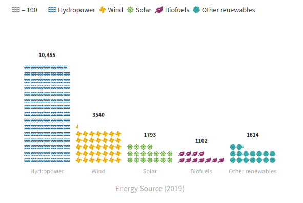
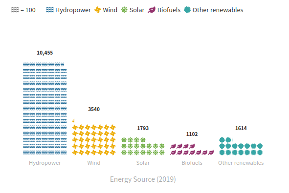
By default the "Data" sheet looks like:
Energy Source (2019),Consumption (TWh)
Hydropower,10455
Wind,3540
Solar,1793
Biofuels,1102
Other renewables,1614
The default bindings are:
| Binding name | Column |
|---|---|
| Main category | A |
| Sub category | |
| Value | B |
| Icon id | A |
| Color | A |
This results in 5 bars, one for each energy source. Each bar is sized according to the Consumption column. The energy source column (A) also determines the icon shape and icon color.
The default "Icons" sheet looks like:
id,icon,width,height
Hydropower,"M562.1 383.9 ... z",576,512
Wind,"M352.57 128 ... z",512,512
Solar,sun,,
Biofuels,leaf,,
Other renewables,"M458.622 255.92 ... z",512,512
The default bindings are:
| Binding name | Column |
|---|---|
| Icon id | A |
| Icon | B |
| Icon width | C |
| Icon height | D |
SVG path strings have been defined for "Hydropower", "Wind" and "Other renewables" and built-in icons are used for "Solar" and "Biofuels".
Settings
The main settings are:
| Settings section | Setting | Description |
|---|---|---|
| Chart settings | Bar orientation | Sets whether the bars are vertical or horizontal |
| Flip bars | Flips the bar direction. For example, if bar orientation is "Vertical" and "Flip bars" is true, the bars will point downwards. | |
| Icons | Icons | Sets whether the Icon binding (if set) determines the icon shapes. Otherwise this setting determines the shape of all the icons. |
| Auto icon value | If true, the template will compute a sensible value for each icon. | |
| Icon value | If "Auto icon value" is false, this setting determines the value of each icon. | |
| Use filler icons | If true, extra "filler" icons will be added to the end of each bar, so that all bars are the same length. | |
| Maximum bar value | (Optional) If "Use filler icons" is true, this sets the maximum value of all bars. Filler icons are used to fill space between the actual maximum and the chosen maximum. |
Ideas
Multiple bars
Set the "Main category" binding. A bar will be created for each unique category in the chosen column.
You can set the icon of each bar by using the "Icon id" bindings in the "Data" and "Icons" sheets. (Typically the "Icon id" binding in the "Data" sheet will point to the same column as the "Main category" binding.)
Multiple bars with filler icons
As for "Multiple bars", but with filler icons switched on:
A single "stacked" block of icons
You can create a single block of "stacked" icons by setting the "Sub category" binding (and leaving the "Main category" empty). You'll also need to set the "Icon id" binding and/or the "Color" binding to see the separate layers.
Multiple "stacked" bars
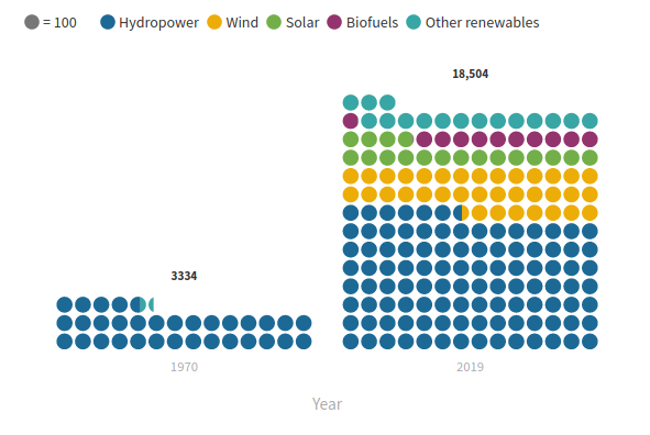
If your data has at least two categorical columns you can create a Pictogram chart with multiple stacked bars by setting the "Main category" and "Sub category" bindings to different columns.
For example, if your data looks like:
Source,Year,Consumption (TWh)
Hydropower,1970,3263
Wind,1970,0
Solar,1970,0
Biofuels,1970,0
Other renewables,1970,71
Hydropower,2019,10455
Wind,2019,3540
Solar,2019,1793
Biofuels,2019,1102
Other renewables,2019,1614
you could set "Main category" to "B" and "Sub category" to "A". Remember to set either the "Icon id" or "Color" binding to the "Sub category" column so that you can see the separate layers:
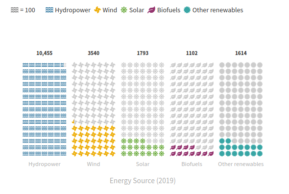
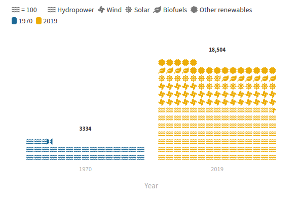
You can set the "Icon id" to achieve different effects:
| Icon id | Description |
|---|---|
| None | All icons are the same shape. |
| Same as "Main category" | Each bar has a unique icon shape. |
| Same as "Sub category" | Each stack within each bar has a unique icon shape. |
Similary for the "Color" binding:
| Color | Description |
|---|---|
| None | All icons are the same color. |
| Same as "Main category" | Each bar has a unique color. |
| Same as "Sub category" | Each stack within each bar has a unique color. |
The "Icon id" and "Color" bindings are independent. So you can, for example, set each bar to a unique color and use different icons for each stack within a bar:
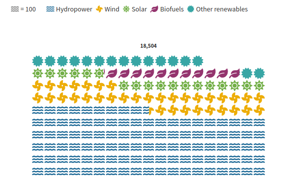
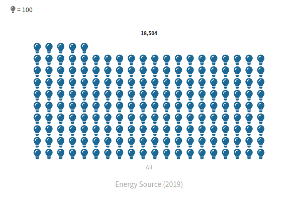
A single block of icons
You can create a single block of icons by having a single row of data in the "Data" sheet:
Energy Source (2019),Consumption (TWh)
All,18504
and setting the "Main category" binding to a categorical column.
You can also use a custom icon by setting the "Icon id" binding and defining an appropriate icon in the "Icons" sheet:
id,icon,width,height
All,"M458.622 255.92 ... z",512,512

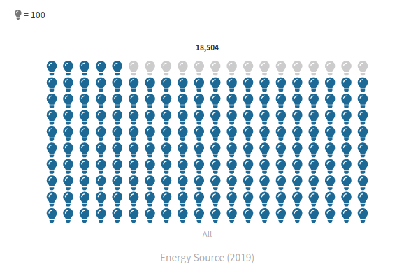
A single block of icons with filler icons
Create a single block of icons as described above. Set "Use filler icons" to true and set "Maximum bar value" to a value greater than the current bar value.
API information
This section documents API usage specific to this template, so for an introduction we suggest you refer to the generic API documentation instead.
template: @flourish/pictogram
version: 1
Template data
There are three different formats in which you can supply data to this template. The most convenient for you to use likely depends on the source of your data, as described below.
1. Array of arrays, and a bindings object
You can supply arrays of arrays to opts.data, which might look
like:
{
    data: {
        data: [
            [ "DataColumn1Value1", "DataColumn2Value1",
            [ "DataColumn1Value2", "DataColumn2Value2",
            [ "DataColumn1Value3", "DataColumn2Value3",
            ...
        ],
        icons: [
            [ "IconsColumn1Value1", "IconsColumn2Value1",
            [ "IconsColumn1Value2", "IconsColumn2Value2",
            [ "IconsColumn1Value3", "IconsColumn2Value3",
            ...
        ]
    }
}
where each array of arrays represents the rows in a data sheet.
To tell the API how the values from each column should be
associated with the keys that the template is expecting, you must also supply
an object attached to opts.bindings. (The meanings of the
keys in the bindings object are documented
below.) The minimal bindings you can
supply for this template are as shown in this example:
{
    template: "@flourish/pictogram",
    version: "1",
    bindings: {
        data: {

        },
        icons: {
            id: 0, // index of a column in your data
            path_string: 1, // index of a column in your data
        }
    },
    data: {
        data: [
            [ "DataColumn1Value1", "DataColumn2Value1",
            [ "DataColumn1Value2", "DataColumn2Value2",
            [ "DataColumn1Value3", "DataColumn2Value3",
            ...
        ],
        icons: [
            [ "IconsColumn1Value1", "IconsColumn2Value1",
            [ "IconsColumn1Value2", "IconsColumn2Value2",
            [ "IconsColumn1Value3", "IconsColumn2Value3",
            ...
        ]
    }
}
All possible bindings that you can supply are shown in this example:
{
    template: "@flourish/pictogram",
    version: "1",
    bindings: {
        data: {
            main_category: 0, // index of a column in your data
            sub_category: 1, // index of a column in your data
            value: [2, 3, ...], // index(es) of column(s) in your data
            icon_id: 4, // index of a column in your data
            color: 5, // index of a column in your data
            metadata: [6, 7, ...], // index(es) of column(s) in your data
        },
        icons: {
            id: 0, // index of a column in your data
            path_string: 1, // index of a column in your data
            width: 2, // index of a column in your data
            height: 3, // index of a column in your data
        }
    },
    data: {
        data: [
            [ "DataColumn1Value1", "DataColumn2Value1",
            [ "DataColumn1Value2", "DataColumn2Value2",
            [ "DataColumn1Value3", "DataColumn2Value3",
            ...
        ],
        icons: [
            [ "IconsColumn1Value1", "IconsColumn2Value1",
            [ "IconsColumn1Value2", "IconsColumn2Value2",
            [ "IconsColumn1Value3", "IconsColumn2Value3",
            ...
        ]
    }
}
2. Array of objects with arbitrary keys, and a bindings object
This format is most likely useful when you have data from an external source,
such as CSV data loaded from d3-dsv.
You should supply this attached to the opts.data, which might look
like:
{
        data: [
            { "DataHeader1": ..., "DataHeader2": ..., ... },
            { "DataHeader1": ..., "DataHeader2": ..., ... },
            { "DataHeader1": ..., "DataHeader2": ..., ... },
            ...
        ],
        icons: [
            { "IconsHeader1": ..., "IconsHeader2": ..., ... },
            { "IconsHeader1": ..., "IconsHeader2": ..., ... },
            { "IconsHeader1": ..., "IconsHeader2": ..., ... },
            ...
        ]
    }
... but with the keys being the column headers from your
source data instead. You must also supply an object attached to
opts.bindings. The minimal bindings you can
supply for this template are as shown in this example:
{
    template: "@flourish/pictogram",
    version: "1",
    bindings: {
        data: {

        },
        icons: {
            id: "IconsHeader1",
            path_string: "IconsHeader2",
        }
    },
    data: {
        data: [
            { "DataHeader1": ..., "DataHeader2": ..., ... },
            { "DataHeader1": ..., "DataHeader2": ..., ... },
            { "DataHeader1": ..., "DataHeader2": ..., ... },
            ...
        ],
        icons: [
            { "IconsHeader1": ..., "IconsHeader2": ..., ... },
            { "IconsHeader1": ..., "IconsHeader2": ..., ... },
            { "IconsHeader1": ..., "IconsHeader2": ..., ... },
            ...
        ]
    }
}
All possible bindings that you can supply are shown in this example:
{
    template: "@flourish/pictogram",
    version: "1",
    bindings: {
        data: {
            main_category: "DataHeader1",
            sub_category: "DataHeader2",
            value: ["DataHeader3", "DataHeader4", ...],
            icon_id: "DataHeader5",
            color: "DataHeader6",
            metadata: ["DataHeader7", "DataHeader8", ...],
        },
        icons: {
            id: "IconsHeader1",
            path_string: "IconsHeader2",
            width: "IconsHeader3",
            height: "IconsHeader4",
        }
    },
    data: {
        data: [
            { "DataHeader1": ..., "DataHeader2": ..., ... },
            { "DataHeader1": ..., "DataHeader2": ..., ... },
            { "DataHeader1": ..., "DataHeader2": ..., ... },
            ...
        ],
        icons: [
            { "IconsHeader1": ..., "IconsHeader2": ..., ... },
            { "IconsHeader1": ..., "IconsHeader2": ..., ... },
            { "IconsHeader1": ..., "IconsHeader2": ..., ... },
            ...
        ]
    }
}
(As before, the keys containing "Header" would be replaced by column names from your data source.)
3. Array of objects with template-defined keys
There is an alternative format you can use, which is likely to be easier to
use if your data is not from a spreadsheet source. With this alternative format
you supply your data to the template as
an array of objects, attached to opts.data, where the keys must
be those used by the template, as documented below. In this case
there is no need to supply a bindings object, since the key names are already
those expected by the template. The required properties in the data
object are as follows (scroll down for a
description of what each property is):
{
    template: "@flourish/pictogram",
    version: "1",
    data: {
    data: [
        {
            value: [...],
            metadata: [...]
        },
        ...
    ],
    icons: [
        {
            id: ...,
            path_string: ...
        },
        ...
    ]
},
    ...
}
And the full list of all possible properties is as follows:
{
    template: "@flourish/pictogram",
    version: "1",
    data: {
    data: [
        {
            main_category: ...,
            sub_category: ...,
            value: [...],
            icon_id: ...,
            color: ...,
            metadata: [...]
        },
        ...
    ],
    icons: [
        {
            id: ...,
            path_string: ...,
            width: ...,
            height: ...
        },
        ...
    ]
},
    ...
}
Meanings of the template data keys:
- data.main_category: The (categorical) column that defines the categories along the main axis.
- data.sub_category: The (categorical) column that defines the categories within each bar.
- data.value: The (numerical) column that determines the size of each bar.
- data.icon_id: IDs for joining icons in the "Icons" datasheet. Must contain IDs that match "Icon ID" values in "Icons". Set to the same column as the Main category or Subcategory.
- data.color: The (categorical) column which determines the icon color. Set to the same column as the Main category or Subcategory.
- data.metadata: Makes additional columns (text, emoji, image URLs, etc) available in custom popups.
- icons.id: Unique ID for joining icon path strings. Must contain IDs that match the "Icon ID" values in "Data".
- icons.path_string: Icon path string (e.g. "M10,10 l80,0 l0,80 l-80,0 z") or the name of a built-in icon (e.g. "female").
- icons.width: Icon width (in pixels).
- icons.height: Icon height (in pixels).
Template settings
Options for opts.state.
Chart settings
bar_orientation string
Bar orientation. Defines the orientation of the bars (vertical or horizontal) Allowed values:
flip_bars boolean
Flip bars. Flip the bars so they point in the opposite direction
bar_padding number
Bar padding (%). Padding surrounding bars (as a percentage of bar width) Max: 100
Icons
icons string
Icons. Use your own icons using icon bindings or choose a built in icon Allowed values:
icon_padding number
Icon padding (%). Padding surrounding icons (as a percentage of the icon size) Max: 100
auto_icon_value boolean
Auto icon value. Automatically compute a sensible value for each icon
icon_value number
Icon value. The value that each icon represents
icon_color color
Icon color. The color of the icons
icon_style string
Icon style. The style (solid or outline) of the icons Allowed values:
icon_stroke_thickness number
Icon outline thickness (%). The outline thickness (as a percentage of the icon size) Min: 1 Max: 100
use_filler_icons boolean
Use filler icons. Fill empty space with icons
filler_icon_color color
Filler icon color. Color of filler icons
max_bar_value number
Maximum bar value. (Optional) Maximum bar value (remaining bar space will be filled with filler icons). A value less than the largest bar value is disregarded.
fill_final_row boolean
Fill final row. Fill the final row of icons with filler icons (so that a grid of icons is formed)
filler_icons string
Filler icon. Icon used to fill remaining space Allowed values:
Colors
color.scale_type string
Scale type. Allowed values:
color.categorical_palette colors
Palette.
color.categorical_extend boolean
Extend. Automatically generate additional colours when needed to avoid the palette colours being used more than once.
color.categorical_custom_palette text
Custom overrides. Type the name of the entity whose colour you want to set, a colon and then a colour (using a name, hex-code or rgb declaration). Multiple colours can be set using multiple lines. For example:
Party 1: red
Party 2: #4455AA
Party 3: rgb(30,168,26)
color.numeric_type string
Scale type. Allowed values:
color.binning boolean
In linear mode, the color scale will run as a smooth gradient between 2 colors. In binned mode, the gradient will be divided in smaller blocks. Allowed values:
color.bin_mode string
Binning mode. Allowed values:
color.bin_count number
Number of bins.
color.bin_thresholds string
Custom thresholds. Write your custom thresholds, separated by a ";" For example 5;10;15
color.sequential_palette string
Palette. Allowed values:
color.sequential_reverse boolean
Reverse.
color.sequential_custom_min color
Minimum color.
color.sequential_custom_max color
Maximum color.
color.sequential_color_space string
Color space. Allowed values:
color.sequential_custom_domain boolean
Domain. Allowed values:
color.sequential_domain_min number
Min.
color.sequential_domain_max number
Max.
color.diverging_palette string
Palette. Allowed values:
color.diverging_reverse boolean
Reverse.
color.diverging_custom_min color
Minimum color.
color.diverging_custom_mid color
Midpoint color.
color.diverging_custom_max color
Maximum color.
color.diverging_color_space string
Color space. Allowed values:
color.diverging_custom_domain boolean
Domain. Allowed values:
color.diverging_domain_min number
Min.
color.diverging_domain_mid number
Mid.
color.diverging_domain_max number
Max.
Bar labels
show_bar_labels boolean
Show bar labels.
bar_label_size number
Size. Bar label size (relative to the root font size) Max: 10
bar_label_color color
Color. Bar label color
bar_label_weight string
Weight. Bar label font weight Allowed values:
Axis
axis.axis_position string
Position. Allowed values:
axis.y_axis_position string
Y value. Vertical position of the x axis on the y scale
axis.numeric_scale_type string
Type. Allowed values:
axis.linear_min number
Min.
axis.linear_max number
Max.
axis.log_min number
Min.
axis.log_max number
Max.
axis.datetime_min string
Min (date).
axis.datetime_max string
Max (date).
axis.flip boolean
Flip axis.
axis.show_scale_settings boolean
Configure default min/max.
axis.nice boolean
Round min/max. When enabled, scales automatically extend to "nice" rounded start/end values, such as hundreds or whole years. Overridden by any explicitly specified scale min and max. Allowed values:
axis.zero_axis string
Include zero. Whether to extend the axis to include zero if the data values are all positive or all negative. Overridden by any explicitly specified scale min and max. Allowed values:
axis.title_mode string
Type. Allowed values:
axis.title string
Text.
axis.title_styling boolean
Styling.
axis.title_weight string
Weight. Allowed values:
axis.title_color color
Color.
axis.title_size number
Size.
axis.title_padding number
Padding.
axis.tick_label_position string
Position. Allowed values:
axis.tick_label_styling boolean
Styling.
axis.tick_label_size number
Size.
axis.tick_label_color color
Color.
axis.tick_padding number
Padding.
axis.tick_label_angle string
Angle. Allowed values:
axis.tick_label_weight string
Weight. Allowed values:
axis.tick_label_max_lines number
Max lines. Min: 1
axis.tick_label_line_height number
Line height.
axis.tick_label_space_mode string
Space mode. Allowed values:
axis.tick_label_space number
Space.
axis.tick_mode string
Mode. Allowed values:
axis.tick_number number
Number. Approximate number of ticks or gridlines. The actual number will depend on the range of values, chart size, etc.
axis.tick_custom text
One tick label per line. Specify the ticks to show, one per line
axis.line_and_tick_color color
Line color.
axis.line_and_tick_width number
Line width.
axis.tick_length number
Tick length.
axis.tick_side string
Tick side. Allowed values:
axis.line_visible boolean
Axis line.
axis.edge_padding number
Edge padding (%). Space between start/end of axis line and first/last category tick as a percentage of the spacing between ticks Max: 100
axis.gridlines_visible boolean
Allowed values:
- true (On)
- false (Off)
axis.gridlines_styling boolean
Styling.
axis.gridline_color color
Color.
axis.gridline_style string
Style. Allowed values:
axis.gridline_width number
Width.
axis.gridline_category_dividers boolean
Put lines between categories. On a categorical axis this option disables the gridline on each tick and instead adds rules between each category to give a table-like design. Ignored for date and numeric axes.
axis.gridline_category_dividers_extend boolean
Extend. Extends the dividers into the axis margins.
Number formatting
number_localization.input_decimal_separator string
Decimal separator in data sheet. Used for interpreting your data. Only change if data is not displaying on the chart as expected. Allowed values:
number_localization.output_separators string
Number format to display. How the numbers should appear on chart labels Allowed values:
number_format.prefix string
Prefix. Text to place in front of number
number_format.suffix string
Suffix. Text to place after number
number_format.n_dec number
Decimal places. Use negative integers to round to positive powers of ten (eg -2 rounds to the nearest 100) Min: -10 Max: 10
number_format.advanced boolean
Advanced.
number_format.negative_sign string
Styling of negative numbers. Allowed values:
number_format.strip_zeros boolean
Remove trailing zeros.
number_format.strip_separator boolean
Hide thousands separator below 10,000. Turn off if you want four-digit numbers to include a separator, e.g. “1,234” rather than “1234”.
number_format.transform_labels boolean
Multiply/divide values.
number_format.transform string
Allowed values:
- multiply (Multiply by)
- divide (Divide by)
- exponentiate (×10 to the power of)
number_format.multiply_divide_constant number
number_format.exponentiate_constant number
Legends
legend_container.alignment string
Alignment. Allowed values:
legend_container.orientation string
Orientation. Allowed values:
legend_container.title_weight string
Title weight. Allowed values:
legend_container.text_weight string
Text Weight. Allowed values:
legend_container.text_color color
Color.
legend_container.text_size number
Size. Max: 10
Value legend
value_legend.show_legend boolean
Allowed values:
- true (Enabled)
- false (Disabled)
value_legend.title_mode string
Title mode. Allowed values:
value_legend.title string
Title.
value_legend.swatch_width number
Width.
value_legend.swatch_height number
Height.
value_legend.swatch_radius number
Roundness. The radius of the corners of the swatch (in pixels)
value_legend.order_override text
Custom order override. Manually specify the order of legend entries (one entry per line)
value_legend.icon_height number
Height. Height of icon (relative to the base font size)
value_legend.icon_color color
Color. Fallback color (icon color if not determined by template)
value_legend.max_width number
Max width.
value_legend.orientation string
Orientation. Allowed values:
value_legend_icon string
Icon. Icon used in legend Allowed values:
Icon legend
icon_legend.show_legend boolean
Allowed values:
- true (Enabled)
- false (Disabled)
icon_legend.title_mode string
Title mode. Allowed values:
icon_legend.title string
Title.
icon_legend.swatch_width number
Width.
icon_legend.swatch_height number
Height.
icon_legend.swatch_radius number
Roundness. The radius of the corners of the swatch (in pixels)
icon_legend.order_override text
Custom order override. Manually specify the order of legend entries (one entry per line)
icon_legend.icon_height number
Height. Height of icon (relative to the base font size)
icon_legend.icon_color color
Color. Fallback color (icon color if not determined by template)
icon_legend.max_width number
Max width.
icon_legend.orientation string
Orientation. Allowed values:
Color legend
color_legend.show_legend boolean
Allowed values:
- true (Enabled)
- false (Disabled)
color_legend.title_mode string
Title mode. Allowed values:
color_legend.title string
Title.
color_legend.swatch_width number
Width.
color_legend.swatch_height number
Height.
color_legend.swatch_radius number
Roundness. The radius of the corners of the swatch (in pixels)
color_legend.order_override text
Custom order override. Manually specify the order of legend entries (one entry per line)
color_legend.icon_height number
Height. Height of icon (relative to the base font size)
color_legend.icon_color color
Color. Fallback color (icon color if not determined by template)
color_legend.max_width number
Max width.
color_legend.orientation string
Orientation. Allowed values:
Popups
popup.mode string
Allowed values:
- none (None)
- popup (Popup)
- panel (Panel)
- both (Both)
popup.popup_is_custom boolean
Popup content. Allowed values:
popup.show_popup_styles boolean
Show popup styles.
popup.popup_custom_header string
Popup custom header. The text to appear in the popup. You can use {{column_name}} to add a value from your data. It must be in a selected column, but you can add columns to “Metadata” if you just want to include them for use in the popup. Advanced users can include HTML to apply layouts, formatting, images, etc.
You can also hide content based on a column name being empty using {{# if column_name}}Text to display when column_name is not empty{{/if}}. For example: {{Country}} {{#if Capital}}(Capital: {{Capital}}){{/if}}
popup.popup_custom_main text
Popup custom main content. The text to appear in the popup. You can use {{column_name}} to add a value from your data. It must be in a selected column, but you can add columns to “Metadata” if you just want to include them for use in the popup. Advanced users can include HTML to apply layouts, formatting, images, etc.
You can also hide content based on a column name being empty using {{# if column_name}}Text to display when column_name is not empty{{/if}}. For example: {{Country}} {{#if Capital}}(Capital: {{Capital}}){{/if}}
popup.popup_width number
Max width. In rems, multiples of base font size. Leave blank to let the width adjust based on the contents.
popup.popup_font_size number
Text size.
popup.popup_text_color color
Text color.
popup.popup_align string
Align. Allowed values:
popup.popup_background color
Fill color.
popup.popup_background_opacity number
Fill opacity. Max: 1
popup.popup_padding number
Padding.
popup.popup_radius number
Radius. Corner radius of popup
popup.popup_header_type string
Header style. Allowed values:
popup.popup_header_background color
Background.
popup.popup_header_text_color color
Text.
popup.popup_list_type string
List type. Allowed values:
popup.popup_list_label_weight string
Label weight. Allowed values:
popup.popup_list_separator string
List separator. Predefined values:
popup.popup_shadow boolean
Shadow.
popup.popup_pointer boolean
Pointer.
popup.panel_position string
Allowed values:
- overlay (Overlay)
- left (Left)
- right (Right)
- top (Top)
- bottom (Bottom)
popup.panel_open_duration number
Open duration. Max: 2000
popup.panel_side_fixed boolean
Always show.
popup.panel_side_default_content text
Placeholder content.
popup.panel_is_custom boolean
Panel content. Allowed values:
popup.show_panel_styles boolean
Show panel styles.
popup.panel_custom_header string
Panel custom header. The text to appear in the panel. You can use {{column_name}} to add a value from your data. It must be in a selected column, but you can add columns to “Metadata” if you just want to include them for use in the popup. Advanced users can include HTML to apply layouts, formatting, images, etc.
You can also hide content based on a column name being empty using {{# if column_name}}Text to display when column_name is not empty{{/if}}. For example: {{Country}} {{#if Capital}}(Capital: {{Capital}}){{/if}}
popup.panel_custom_main text
Panel custom main content. The text to appear in the panel. You can use {{column_name}} to add a value from your data. It must be in a selected column, but you can add columns to “Metadata” if you just want to include them for use in the popup. Advanced users can include HTML to apply layouts, formatting, images, etc.
You can also hide content based on a column name being empty using {{# if column_name}}Text to display when column_name is not empty{{/if}}. For example: {{Country}} {{#if Capital}}(Capital: {{Capital}}){{/if}}
popup.panel_width_overlay number
Width (%).
popup.panel_height_overlay number
Height (%).
popup.panel_width_side number
Width (%).
popup.panel_height_side number
Height (%).
popup.panel_max_width number
Max width (px).
popup.panel_max_height number
Max height (px).
popup.panel_vertical_position string
Vertical position. Choosing "Click position" is especially useful when your visualisation is really tall, this will make sure the panel content is always on top of the element you've clicked on Allowed values:
popup.panel_text_color color
Text color.
popup.panel_font_size number
Text size.
popup.panel_align string
Alignment. Allowed values:
popup.panel_background color
Fill color.
popup.panel_background_opacity number
Fill opacity. Max: 1
popup.panel_padding number
Padding.
popup.panel_radius number
Radius. Corner radius of panel
popup.panel_list_type string
List type. Allowed values:
popup.panel_list_label_weight string
Label weight. Allowed values:
popup.panel_list_separator string
List separator. Predefined values:
popup.panel_shadow boolean
Shadow.
Value control
value_control_visibility string
Show value control. Sets whether the value control is always visible, only visible when editing or never visible. Allowed values:
value_control.control_type string
Control type. Choose between a dropdown, buttons or a time slider. Allowed values:
value_control.control_styles boolean
Adv..
value_control.control_title string
Control title.
value_control.button_group boolean
Grouped. Allowed values:
value_control.button_group_width_mode string
Button group width. Allowed values:
value_control.button_group_width_fixed number
Width. Max: 100
value_control.dropdown_width_mode string
Dropdown width. Allowed values:
value_control.dropdown_width_fixed number
Width. Max: 100
value_control.slider_background_color color
Background.
value_control.slider_font_color color
Text.
value_control.slider_handle_color color
Handle.
value_control.slider_width number
Width. Max: 100
value_control.slider_margin number
Label width. Max: 50
value_control.slider_handle_height number
Height. Max: 10
value_control.slider_track_height number
Track height. Max: 10
value_control.slider_play_button boolean
Play button.
value_control.slider_loop boolean
Loop.
value_control.slider_step_time number
Time between steps. Measured in seconds, positive values move the slider left to right, negative values move the slider right to left. Min: -100 Max: 100
value_control.slider_restart_pause number
Pause before loop. Measured in seconds and in addition to the regular step time displayed above. Max: 100
value_control.sort string
Sorting. Allowed values:
value_control.sort_temporal_format string
Date/time format in data. The date/time format in your data sheet. Used only to sort the data, if required. If your format isn’t in the list, you can enter a custom format using d3-time-format syntax. See npmjs.com/package/d3-time-format for details. Predefined values:
controls_style.font_size number
Text size. Max: 5
controls_style.font_weight string
Text weight. Allowed values:
controls_style.padding number
Height. Space below and above controls text Max: 5
dropdown_style.background color
Background.
dropdown_style.font_color color
Text color.
dropdown_style.border_styles_advanced boolean
Dropdown border styles.
dropdown_style.border_style string
Border style. Show border on all sides, or only at the bottom Allowed values:
dropdown_style.border_width number
Border width. Max: 20
dropdown_style.border_color color
Color.
dropdown_style.border_transparency number
Transparency. Max: 1
dropdown_style.border_radius number
Radius. Max: 100
button_style.background color
Background.
button_style.background_selected color
Selected.
button_style.background_hover color
Mouse over.
button_style.font_color color
Text color.
button_style.font_color_selected color
Selected.
button_style.font_color_hover color
Mouse over.
button_style.button_styles_advanced boolean
Button border styles.
button_style.border_width number
Border width. Max: 20
button_style.border_color color
Color.
button_style.border_transparency number
Transparency. Max: 1
button_style.border_radius number
Radius. Max: 100
Layout
Layout
layout.body_font font
Main font. This font will apply to the whole graphic by default, but you can optionally change the font for the title, subtitle, footer, etc in the Header and Footer settings panels.
layout.font_color color
Text color. This color will apply to the whole graphic by default, but you can optionally change the color for individual text elements, in other settings panels.
layout.background_color_enabled boolean
Color. Allowed values:
layout.background_image_enabled boolean
Image. Allowed values:
layout.background_color color
Background color.
layout.background_image_src url
Image URL.
layout.background_image_size string
Size. Allowed values:
layout.background_image_position string
Position. Allowed values:
layout.max_width_target string
Maximum width. Apply a maximum width to just the main graphic or everything (main graphic plus header, footer, etc) Allowed values:
layout.max_width number
Maximum width. Leave blank to stretch to container width Min: 50
layout.max_width_align string
Align. Allowed values:
layout.layout_order string
Layout order. Allowed values:
layout.space_between_sections string
Space between sections. Allowed values:
layout.space_between_sections_custom number
Custom. Max: 100
layout.margin_top number
Top.
layout.margin_right number
Right.
layout.margin_bottom number
Bottom.
layout.margin_left number
Left.
layout.border.enabled boolean
Show borders around visualisation.
layout.border.top.width number
Top.
layout.border.top.style string
Style. Allowed values:
layout.border.top.color color
Color.
layout.border.right.width number
Right.
layout.border.right.style string
Style. Allowed values:
layout.border.right.color color
Color.
layout.border.bottom.width number
Bottom.
layout.border.bottom.style string
Style. Allowed values:
layout.border.bottom.color color
Color.
layout.border.left.width number
Left.
layout.border.left.style string
Style. Allowed values:
layout.border.left.color color
Color.
Header
layout.header_align string
Alignment. Allowed values:
layout.title string
layout.title_styling boolean
Change title styles.
layout.title_font font
Title Font.
layout.title_size string
Size. Allowed values:
layout.title_size_custom number
Custom. Specify a custom responsive font size. Best results will be with values between 1.2 and 3
layout.title_weight string
Weight. Allowed values:
layout.title_color color
Color.
layout.title_line_height number
Line height. Max: 3
layout.title_space_above string
Space above. Allowed values:
layout.title_space_above_custom number
Custom. Max: 100
layout.subtitle string
layout.subtitle_styling boolean
Change subtitle styles.
layout.subtitle_font font
Subtitle Font.
layout.subtitle_size string
Size. Allowed values:
layout.subtitle_size_custom number
Custom. Specify a custom responsive font size. Best results will be with values between 1.2 and 3
layout.subtitle_weight string
Weight. Allowed values:
layout.subtitle_color color
Color.
layout.subtitle_line_height number
Line height. Max: 3
layout.subtitle_space_above string
Space above. Allowed values:
layout.subtitle_space_above_custom number
Custom. Max: 100
layout.header_text string
layout.header_text_styling boolean
Styling.
layout.header_text_size string
Size. Allowed values:
layout.header_text_size_custom number
Custom. Specify a custom responsive font size. Best results will be with values between 1.2 and 3
layout.header_text_weight string
Weight. Allowed values:
layout.header_text_color color
Color.
layout.header_text_line_height number
Line height. Max: 3
layout.header_text_space_above string
Space above. Allowed values:
layout.header_text_space_above_custom number
Custom. Max: 100
layout.header_border string
Allowed values:
- top (Top)
- bottom (Bottom)
- none (None)
layout.header_border_width number
Width.
layout.header_border_color color
Color.
layout.header_border_style string
Style. Allowed values:
layout.header_border_space number
Space. Space between border and header text
layout.header_logo_enabled boolean
Allowed values:
- true (Enabled)
- false (Disabled)
layout.header_logo_src url
URL.
layout.header_logo_height number
Height.
layout.header_logo_align string
Align. Align logo inside header or outer visualisation container Allowed values:
layout.header_logo_position_inside string
Position. Allowed values:
layout.header_logo_position_outside string
Position. Allowed values:
layout.header_logo_margin_top number
Top.
layout.header_logo_margin_right number
Right.
layout.header_logo_margin_bottom number
Bottom.
layout.header_logo_margin_left number
Left.
Footer
layout.footer_align string
Alignment. Allowed values:
layout.footer_text_size number
Size.
layout.footer_text_color color
Color.
layout.footer_styling boolean
Advanced footer styles.
layout.footer_font font
Font.
layout.source_name string
Source name.
layout.source_url string
Source url.
layout.multiple_sources boolean
Multiple sources.
layout.source_name_2 string
Source name.
layout.source_url_2 string
Source url.
layout.source_name_3 string
Source name.
layout.source_url_3 string
Source url.
layout.source_label string
Source label.
layout.footer_note string
Note.
layout.footer_note_secondary string
Note (secondary). The secondary note is placed below the source and primary note
layout.footer_logo_enabled boolean
Image. Allowed values:
layout.footer_logo_src url
Image.
layout.footer_logo_src_light hidden
Image (light version). If provided this version will be used whenever the background colour is dark
layout.footer_logo_link_url string
Link.
layout.footer_logo_height number
Height.
layout.footer_logo_margin number
Margin.
layout.footer_logo_order string
Position. Allowed values:
layout.footer_align_vertical string
V. align. Allowed values:
layout.footer_border string
Allowed values:
- top (Top)
- bottom (Bottom)
- none (None)
layout.footer_border_width number
Width.
layout.footer_border_color color
Color.
layout.footer_border_style string
Style. Allowed values:
layout.footer_border_space number
Space. Space between border and footer text
Accessibility
layout.screenreader_hide_primary boolean
Screenreader mode for main visual container. Whether the main visual container is visible to screenreaders. (Text in the header and footer are always available to screenreaders.) Allowed values:
layout.screenreader_text_primary text
Screenreader description. A text alternative to the visual content that will only be visible to screenreaders, e.g. “The line chart shows China consistently higher than the other countries since 1990”. Do no replicate your title, since that will also be read by screenreaders.