Calculator
Updated 5 days ago to v1.6.0 by Flourish team
How to use this template
Purpose
The calculator template is great to display a set of questions and turn user answers into calculated results. A classic example would be a savings calculator asking questions about monthly ingoings and outgoings to calculate end of month funds, but it can be used for any survey, quiz or questionnaire purposes.
The template has a single Questions datasheet.
Questions sheet
Each row represents one question exposing the data bindings:
| Binding | Data type | Description |
|---|---|---|
| Question | Text | The question text |
| Type | Text | The type of question. See Question types below for options. |
| Image | Image URL as text | A URL for a background image for the question. You can also right click and upload an image |
| Default values | Text | Default value to fill the answer input if left empty by the user. (Sliders will always have a default value set) |
| Answers | Text | Answer values and specifications. See Answer options below for more information. |
Question types
The following question types are supported:
| Question type | Description | Use Case | Example |
|---|---|---|---|
| number input | Allows users to enter numeric values within a specified range. | Collecting numeric data such as age, quantity, or other numerical values within a specific range. |
min: 0 :: max: 10 :: step: 2
|
| text input | Allows users to enter a string of text. | Collecting open-ended responses, such as names, email addresses, or comments. | |
| single response buttons | Presents users with multiple buttons, but only one button can be active at a time. | Choosing one option from a list of mutually exclusive choices, such as selecting a preferred product or a yes/no response. |
apples :: pears
|
| multi response buttons | Allows users to select multiple buttons simultaneously. | Choosing multiple options from a list, such as selecting multiple interests or preferences. |
apples :: pears
|
| dropdown | Presents users with a list of options in a dropdown menu. | Choosing one option from a list, but the list is too long for single response buttons. Examples include selecting a country, state, or product category. |
apples :: pears :: bananas :: raspberries :: lemons :: kumquats
|
| single date picker | Allows users to select a single date. | Collecting date information such as birth dates, event dates, or deadlines. | |
| multi date picker | Allows users to select multiple dates. | Selecting multiple dates, such as available dates for an appointment, meeting, or event. | |
| range date picker | Allows users to select a date range. | Collecting information such as a date range for a vacation, project timeline, or any other time period. | |
| rating | Icon-based input that requires numeric input. Users can assign a rating value, and labels can be added above or below the rating icon. | Gathering feedback on satisfaction, product quality, or any other topic that requires a rating scale. |
1 >> Bad :: 2 :: 3 >> Great
|
| single slider | Requires numeric input and typically has options for minimum, maximum, step between values, prefix and suffix. | Collecting information such as price preferences, age preferences, or any other type of preference that requires numeric input. |
min: 0 :: max: 100 :: step: 1 :: value: 20 :: prefix: $ :: suffix: USD
|
| range slider | Allows users to select a range of numeric values. | Collecting information such as price ranges, age ranges, or any other type of range that requires numeric input. |
min: 0 :: max: 100 :: step: 1 :: value: 20,80 :: prefix: $ :: suffix: USD
|
Alternativly the column can be left empty to display text only.
Answer options
Question types with required answers
The question types single response buttons, multi response buttons, dropdown and rating require answer values separated by :: (double colon), for example apples :: pears for buttons and dropdowns.
Rating labels
Rating values must be numeric and are also to be separated by ::. Labels shown above or below the rating icon can be added to each value with the notation value >> label. An example with set labels for a three star rating would be 1 >> Bad :: 2 :: 3 >> Great.
Number input ranges
For number inputs the minimum, maximum and step values can be optionally set in the form:
min: 0 :: max: 10 :: step: 2
min and max values are enforced as the value snaps to the nearest allowed value. step values are not enforced for manual input, but will be applied when the input field's up and down arrows are used.
If applied, it's a good idea to also add a comment to the number input about the restricted range.
Slider options
Sliders (single slider and range slider) also typically receive options. An example with all available options would be:
min: 0 :: max: 100 :: step: 1 :: value: 20,80 :: prefix: $ :: suffix: USD
min and max set the allowed range, step the smallest distance between values and value the initial value. Use single values for single sliders (eg. value: 10) and comma-separated values for multiple slider handles in a range slider as shown in the example above. Whatever is added as prefix will precede the slider value and whatever you add as a suffix will be appended after the slider value.
If no options are defined, the following specifications are set:
min: 0 :: max: 100 :: step: 1 :: value: 50
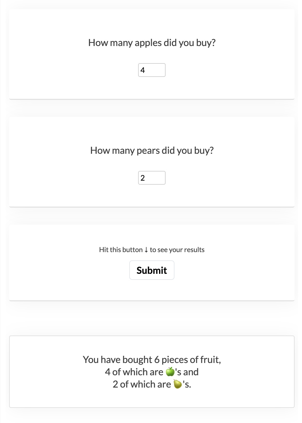
Results
In order to use the respondent's answers to show in the results:
- save the answers as variables
- compose the results with (or without) any variables
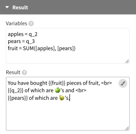
Variables are defined in the Variables field - one variable per line - and used in the Result field.
Variable values can be:
- Numbers
- Text (in 'single quotes' if they have spaces)
- References to the question responses in the form
q_2with the number representing the row number of the question in the Questions datasheet - Previously defined variables (need to be wrapped into square [ brackets ]).
- Excel functions for a wide range of calculations (see this list for all available functions)
The final result view can be composed in the Result field with any previously defined variable or any question variable (starting with "q_") by referencing them in double curly braces. It's best not to use the q_<number> signature with your self-created variables, as these are already in use to store the raw answers.
Above example would produce the following result view:
Retrieving multiple answer options
Some question types return multiple values which will be separated by ::. This becomes important when multiple values should be used in formulas. The question "Which of the following languages do you speak?" might have the answers "Arabic, English, Mandarin".
To identify if a respondent speaks more than one language the SUBSTITUTE function can be used to replace all double colons with whatever separator you prefer (commas in the following example):

In addition, there are ways to reference individual answer options rather than the whole set of options in a list:
Multi response button options can be referenced individually by using the notation q_2_0, q_2_1, q_2_2 etc. with the first number representing the question index and the second number representing the implicit answer index. It's implicit as it just depends on the order in the dataset (the first answer would be 0, the second 1, etc.).
If the answer option is selected, the variable value represents the option, if it is not selected the value is set to "false":

Multi response button also allow the author to get the number of selected options with the notation q_2_selected.

The multi date picker results also get separated by :: (for example 2000-01-01 :: 2000-01-10 :: 2000-01-20) while the range date picker and the range slider results use the double dash -- as a separator of their start and end values (2000-01-01 -- 2000-01-10 or 10 -- 20).
Range values (range date picker and range slider) can be referenced as q_2_0 or q_2_start for the first/start value as well as q_2_1 or q_2_end for the second end value.
Learn more about the available settings and functionality in our help doc.
Saving your results to a Google Sheet
While the calculator template doesn't store results by default, it is possible to link it up to a Google Sheet or other endpoints so you can collect the responses of participants. This is useful if you would like to keep a record of people's selections or further utilize them in a different visualization. Learn more about linking your calculator visualization to a Google Sheet in our help doc.
API information
This section documents API usage specific to this template, so for an introduction we suggest you refer to the generic API documentation instead.
template: @flourish/calculator
version: 1
Template data
There are three different formats in which you can supply data to this template. The most convenient for you to use likely depends on the source of your data, as described below.
1. Array of arrays, and a bindings object
You can supply arrays of arrays to opts.data, which might look
like:
{
    data: {
        questions: [
            [ "QuestionsColumn1Value1", "QuestionsColumn2Value1",
            [ "QuestionsColumn1Value2", "QuestionsColumn2Value2",
            [ "QuestionsColumn1Value3", "QuestionsColumn2Value3",
            ...
        ]
    }
}
where each array of arrays represents the rows in a data sheet.
To tell the API how the values from each column should be
associated with the keys that the template is expecting, you must also supply
an object attached to opts.bindings. (The meanings of the
keys in the bindings object are documented
below.) The minimal bindings you can
supply for this template are as shown in this example:
{
    template: "@flourish/calculator",
    version: "1",
    bindings: {
        questions: {
            question_text: 0, // index of a column in your data
            question_type: 1, // index of a column in your data
        }
    },
    data: {
        questions: [
            [ "QuestionsColumn1Value1", "QuestionsColumn2Value1",
            [ "QuestionsColumn1Value2", "QuestionsColumn2Value2",
            [ "QuestionsColumn1Value3", "QuestionsColumn2Value3",
            ...
        ]
    }
}
All possible bindings that you can supply are shown in this example:
{
    template: "@flourish/calculator",
    version: "1",
    bindings: {
        questions: {
            question_text: 0, // index of a column in your data
            question_type: 1, // index of a column in your data
            context_text: 2, // index of a column in your data
            image: 3, // index of a column in your data
            answers_raw: 4, // index of a column in your data
            fallback_value: 5, // index of a column in your data
        }
    },
    data: {
        questions: [
            [ "QuestionsColumn1Value1", "QuestionsColumn2Value1",
            [ "QuestionsColumn1Value2", "QuestionsColumn2Value2",
            [ "QuestionsColumn1Value3", "QuestionsColumn2Value3",
            ...
        ]
    }
}
2. Array of objects with arbitrary keys, and a bindings object
This format is most likely useful when you have data from an external source,
such as CSV data loaded from d3-dsv.
You should supply this attached to the opts.data, which might look
like:
{
        questions: [
            { "QuestionsHeader1": ..., "QuestionsHeader2": ..., ... },
            { "QuestionsHeader1": ..., "QuestionsHeader2": ..., ... },
            { "QuestionsHeader1": ..., "QuestionsHeader2": ..., ... },
            ...
        ]
    }
... but with the keys being the column headers from your
source data instead. You must also supply an object attached to
opts.bindings. The minimal bindings you can
supply for this template are as shown in this example:
{
    template: "@flourish/calculator",
    version: "1",
    bindings: {
        questions: {
            question_text: "QuestionsHeader1",
            question_type: "QuestionsHeader2",
        }
    },
    data: {
        questions: [
            { "QuestionsHeader1": ..., "QuestionsHeader2": ..., ... },
            { "QuestionsHeader1": ..., "QuestionsHeader2": ..., ... },
            { "QuestionsHeader1": ..., "QuestionsHeader2": ..., ... },
            ...
        ]
    }
}
All possible bindings that you can supply are shown in this example:
{
    template: "@flourish/calculator",
    version: "1",
    bindings: {
        questions: {
            question_text: "QuestionsHeader1",
            question_type: "QuestionsHeader2",
            context_text: "QuestionsHeader3",
            image: "QuestionsHeader4",
            answers_raw: "QuestionsHeader5",
            fallback_value: "QuestionsHeader6",
        }
    },
    data: {
        questions: [
            { "QuestionsHeader1": ..., "QuestionsHeader2": ..., ... },
            { "QuestionsHeader1": ..., "QuestionsHeader2": ..., ... },
            { "QuestionsHeader1": ..., "QuestionsHeader2": ..., ... },
            ...
        ]
    }
}
(As before, the keys containing "Header" would be replaced by column names from your data source.)
3. Array of objects with template-defined keys
There is an alternative format you can use, which is likely to be easier to
use if your data is not from a spreadsheet source. With this alternative format
you supply your data to the template as
an array of objects, attached to opts.data, where the keys must
be those used by the template, as documented below. In this case
there is no need to supply a bindings object, since the key names are already
those expected by the template. The required properties in the data
object are as follows (scroll down for a
description of what each property is):
{
    template: "@flourish/calculator",
    version: "1",
    data: {
    questions: [
        {
            question_text: ...,
            question_type: ...
        },
        ...
    ]
},
    ...
}
And the full list of all possible properties is as follows:
{
    template: "@flourish/calculator",
    version: "1",
    data: {
    questions: [
        {
            question_text: ...,
            question_type: ...,
            context_text: ...,
            image: ...,
            answers_raw: ...,
            fallback_value: ...
        },
        ...
    ]
},
    ...
}
Meanings of the template data keys:
- questions.question_text: The question text
- questions.question_type: The type of question. Choose from 'number input', 'text input', 'single response buttons', 'multi response buttons', 'dropdown', 'single date picker', 'range date picker', 'multi date picker', 'rating', 'single slider' or 'range slider'. Leave empty to just display text.
- questions.context_text: Additional information
- questions.image: Question background image
- questions.answers_raw: Answer values separated by "::". Required for single and multi-response buttons, dropdown and rating questions. Rating answers can take optional labels per value noted as "Value >> Label" - for example "1 >> Bad :: 2 :: 3 >> Good". Number inputs can take range specifications in the format "min: 0 :: max: 50 :: step: 2". Slider inputs can take slider specifications in the format "min: 0 :: max: 100 :: value: 10". Use two comma separated values for range sliders, eg.: "value: 1, 100". See the template's documentation for additional info.
- questions.fallback_value: Fallback value to fill the answer input if left empty by the user. Works for all question types but sliders, which will always show the initial value.
Template settings
Options for opts.state.
General design
question_flow string
Question flow. Allowed values:
design.border_type string
Border. Allowed values:
design.border_color color
Border color.
design.background color
Background. The background color of the cards. If not set, the background color in "Layout" is used.
design.advanced boolean
Advanced.
design.align_horizontal string
Align. Allowed values:
design.align_vertical string
Position. Set the vertical text position if the window height is fixed and the text doesn't stretch across the full vertical card space Allowed values:
design.max_width number
Max width (%). Max: 100
design.margin_vertical number
↕ Margins. Max: 4
design.padding_vertical number
↕ Padding. Max: 4
design.padding_horizontal number
↔ Padding. Max: 4
design.border_width number
Border width. Max: 100
design.border_style string
Border style. Allowed values:
design.border_radius number
Roundness. Max: 50
design.shadow boolean
Shadow.
design.shadow_color string
Shadow color. Shadow color as an RGBA value (red, green, blue, alpha). The alpha parameter is a number between 0.0 (fully transparent) and 1.0 (fully opaque).
Result
result.variables text
Variables. <div style="font-size: 0.7rem"> Define variables to use in the <i>Result</i> field below. Set one variable per line in the format <b>name = value</b>. Values can be: <ul style="margin: 0.25rem 0">
<li>Numbers</li>
<li>Text ('single quotes' for spaces)</li>
<li>Question references like <b>q_2</b></b> with the number representing the row number of each question in the <i>Questions</i> datasheet
<li>Previously defined variables (if wrapped into square
<b>[</b>brackets<b>]</b>) which will resolve to the answered value</li>
<li>Excel functions, e.g., <b>a = SUM(q_2, q_3)</li>
</ul>
result.input html
Result. Here you can compose your result view. You have access to all variables you created above as well as all "q_" variables by referencing them in double curly braces like for example: <b>{{<i>my_variable</i>}}</b> or <b>{{<i>q_6</i>}}</b>
result.advanced boolean
Advanced.
result.font_size string
Text size. Allowed values:
result.font_size_custom number
Custom. Specify a custom responsive text size. Best results will be with values between 1.2 and 3
result.font_color color
Color.
result.font_weight string
Text weight. Allowed values:
result.font_style string
Text style. Allowed values:
result.border_type string
Border. Allowed values:
result.border_width number
Border width.
result.border_style string
Border style. Allowed values:
result.border_color color
Border color.
result.bg_type string
Background. Allowed values:
result.bg_color color
Background color.
result.bg_image_src url
Image URL.
result.bg_image_size string
Image size. Allowed values:
Questions design
design.question.font_size string
Text size. Allowed values:
design.question.font_size_custom number
Custom. Specify a custom responsive text size. Best results will be with values between 1.2 and 3
design.question.font_color color
Color. The text color used for your questions. If not set, the text color in Layout is used.
design.question.font_weight string
Text weight. Allowed values:
design.question.font_style string
Text style. Allowed values:
design.question.margin_vertical number
↕ Margins. Max: 4
design.question.margin_horizontal number
↔ Margins. Max: 4
design.question.padding number
Padding. Max: 4
design.context.font_size string
Text size. Allowed values:
design.context.font_size_custom number
Custom. Specify a custom responsive text size. Best results will be with values between 1.2 and 3
design.context.font_color color
Color. The text color used for your question context. If not set, the text color in Layout is used.
design.context.font_weight string
Text weight. Allowed values:
design.context.font_style string
Text style. Allowed values:
design.context.margin_vertical number
↕ Margins. Max: 4
design.context.margin_horizontal number
↔ Margins. Max: 4
design.question.bg_color color
Background color. The background color for your questions and context. To change the background color of the whole question card, go to the "General design" settings.
design.question.bg_opacity number
Background opacity. The opacity of the question background color. Max: 1
design.question.border_radius number
Roundness. The roundness of the question background container. Max: 50
design.answer.margin_vertical number
↕ Margins. Max: 4
design.answer.margin_horizontal number
↔ Margins. Max: 4
Number & text input
input.color color
Color.
input.background_color color
Background color.
input.width number
Width. Max: 20
number.input_placeholder string
Number input placeholder.
text.input_placeholder string
Text input placeholder.
input.input_advanced boolean
Advanced.
input.border_color color
Border color.
input.border_radius number
Roundness. Max: 50
input.border_width number
Border width. Max: 20
input.border_style string
Border style. Allowed values:
input.align string
Alignment. Allowed values:
input.margin number
Margin. Max: 4
input.padding number
Padding. Max: 1
Buttons
button.font_size string
Text size. Allowed values:
button.font_size_custom number
Custom. Specify a custom responsive text size. Best results will be with values between 1.2 and 3 Max: 5
button_style.background color
Background.
button_style.background_selected color
Selected.
button_style.background_hover color
Mouse over.
button_style.font_color color
Text color.
button_style.font_color_selected color
Selected.
button_style.font_color_hover color
Mouse over.
button_style.button_styles_advanced boolean
Advanced.
button_style.border_width number
Border width. Max: 20
button_style.border_color color
Color.
button_style.border_transparency number
Transparency. Max: 1
button_style.border_radius number
Radius. Max: 100
button.border_style string
Border style. Allowed values:
button.container_width number
Button group width (%). The width of the button group as a percentage of the card width Max: 100
button.justify_content string
Align. Allowed values:
button.margin number
Margin. Max: 4
button.padding_factor number
Padding. Max: 4
Dropdown
dropdown.font_size string
Text size. Allowed values:
dropdown.font_size_custom number
Custom. Specify a custom responsive text size. Best results will be with values between 1.2 and 3 Max: 5
dropdown.placeholder string
Placeholder.
dropdown_style.background color
Background.
dropdown_style.font_color color
Text color.
dropdown_style.border_styles_advanced boolean
Advanced.
dropdown_style.border_style string
Border style. Show border on all sides, or only at the bottom Allowed values:
dropdown_style.border_width number
Border width. Max: 20
dropdown_style.border_color color
Color.
dropdown_style.border_transparency number
Transparency. Max: 1
dropdown_style.border_radius number
Radius. Max: 100
dropdown.padding_factor number
Padding. Max: 4
dropdown.border_style string
Border look. Allowed values:
dropdown.font_weight string
Text weight. Allowed values:
dropdown.font_style string
Text style. Allowed values:
dropdown.shadow boolean
Shadow.
dropdown.shadow_color string
Shadow color.
Date picker
date.format string
Format. Allowed values:
date.input_placeholder string
Placeholder.
date.advanced boolean
Advanced.
date.width number
Width. Max: 20
date.margin number
Margin. Max: 4
date.padding number
Padding. Max: 1
date.border_width number
Border width. Max: 20
date.border_style string
Border style. Allowed values:
date.border_color color
Border color.
date.border_radius number
Roundness. Max: 50
date.align string
Text alignment. Allowed values:
date.calendar_position.vertical string
Calendar vertical position. Allowed values:
date.calendar_position.horizontal string
Calendar horizontal position. Allowed values:
Rating
rating.icon_type string
Allowed values:
- star (data:image/png;base64,iVBORw0KGgoAAAANSUhEUgAAABkAAAAZCAYAAADE6YVjAAAACXBIWXMAAAsTAAALEwEAmpwYAAAAAXNSR0IArs4c6QAAAARnQU1BAACxjwv8YQUAAACfSURBVHgB7ZLtCcIwEIZfxAEcISOIE2QD4wKSERzBUXQR3cAVFP9rN2j7Qq9/rh80JS2l5IGHgztyySUBEoklYTEDb7rDhDhaIHCaDcJwEs8IYNtTM9Sr3FHiiX5V7UY/GIGnGaor6vKP5mGCMageu22Dh9SjoSfKERmrmtfRDlk89Hd5afykB3qXvENEXvSiclf6QyQM3ffUDBKJdVMCIqEoRA938jQAAAAASUVORK5CYII=)
- circle (data:image/png;base64,iVBORw0KGgoAAAANSUhEUgAAABkAAAAZCAYAAADE6YVjAAAACXBIWXMAAAsTAAALEwEAmpwYAAAAAXNSR0IArs4c6QAAAARnQU1BAACxjwv8YQUAAACHSURBVHgB7dPRCYAwDATQ00mymW6kG6ibOIk6gTqBGmkLRWhaaAXBPrgfIzkQA2TZLxCn5WyckzNzOv08icpa/syq51FIKLCLCBF6T4FJgwhzYMkqLSkgOxHmfq90DUvIdoRZpKGvZECYEREI6nu/+nfdakfRgUR3YhDUhU/W8gYJLz7LPuwCIcFD6xchEOIAAAAASUVORK5CYII=)
- check (data:image/png;base64,iVBORw0KGgoAAAANSUhEUgAAABkAAAAZCAYAAADE6YVjAAAACXBIWXMAAAsTAAALEwEAmpwYAAAAAXNSR0IArs4c6QAAAARnQU1BAACxjwv8YQUAAAB6SURBVHgB7dHRCYAgFIXhAy1SEzRSjtAGOmHQBI7QBtoVDEQSzGvgw/3hQD3o9yAgSdIQTeCnaCvtxE8Zmqc52oaGZtQBzYiOh20BMwng4//nbHJB+F4KgEMjEFLxghwyGaDBTGXQ1RsoQc+6AW8Q6w1qoIO2Q5KG6gbEXTH9EeCVWAAAAABJRU5ErkJggg==)
rating.icon_fill_base color
Base fill color.
rating.icon_stroke_base color
Base stroke color.
rating.icon_fill_active color
Active fill color.
rating.icon_stroke_active color
Active stroke color.
rating.advanced boolean
Advanced.
rating.icon_width number
Width. Max: 20
rating.icon_height number
Height. Max: 20
rating.icon_margin number
Vertical margin. Max: 20
rating.icon_stroke_width number
Stroke width (px). Max: 6
rating.container_width number
Rating group width (%). The width of the rating group as a percentage of the card width Max: 100
rating.wrap_margin_vertical number
↕ Margins. Max: 4
rating.wrap_margin_horizontal number
↔ Margins. Max: 4
rating.wrap_padding_vertical number
↕ Padding. Max: 4
rating.wrap_padding_horizontal number
↔ Padding. Max: 4
rating.label_width number
Width. Max: 20
rating.label_color color
Color.
rating.label_position string
Position. Allowed values:
Slider
slider.handle_color color
Handle color.
slider.track_active_color color
Track active color.
slider.track_base_color color
Track bg color.
slider.handle_size number
Handle size. % of track height Min: 10 Max: 1000
slider.ticks boolean
Range ticks. Display the minimum and the maximum of the range at the left and right
slider.advanced boolean
Advanced.
slider.container_width number
Track width (%). The width of the track as a percentage of the card width Max: 100
slider.wrap_margin_vertical number
↕ Margins. Max: 4
slider.wrap_margin_horizontal number
↔ Margins. Max: 4
slider.track_height number
Height. Max: 4
slider.track_border_radius number
Roundness. Max: 50
slider.track_border_color color
Border color.
slider.track_border_width number
Border width. The width of the border around the card. In rems. Max: 20
slider.handle_shape string
Shape. Allowed values:
slider.handle_width number
Width. % of Size (the handle height) Min: 10
slider.handle_border_color color
Stroke color.
slider.handle_border_width number
Stroke width. Max: 7
slider.handle_border_radius number
Roundness. Max: 50
slider.handle_box_shadow boolean
Box shadow.
slider.tooltips boolean
Tooltip.
slider.tooltip_background boolean
Tooltip background.
slider.tick_color color
Tick color.
slider.tick_padding number
Tick padding. Max: 4
slider.tick_number_padding number
Number padding. Max: 4
Submit panel design
submit.comment.text text
Submit label.
submit.button.text string
Submit button text.
submit.bg_type string
Background. Allowed values:
submit.bg_color color
Color.
submit.bg_image_src url
Image URL.
submit.border boolean
Border.
submit.bg_image_size string
Image size. Allowed values:
submit.advanced boolean
Advanced.
submit.comment.font_size string
Label size. Allowed values:
submit.comment.font_size_custom number
Custom. Specify a custom responsive text size. Best results will be with values between 1.2 and 3
submit.comment.font_weight string
Text weight. Allowed values:
submit.comment.font_style string
Text style. Allowed values:
submit.flex_direction string
Label position. Allowed values:
submit.comment.font_color color
Label color.
submit.comment.margin number
↕ Margins. Max: 4
submit.button.font_size string
Button text size. Allowed values:
submit.button.font_size_custom number
Custom. Specify a custom responsive text size. Best results will be with values between 1.2 and 3
submit.button.font_weight string
Button text weight. Allowed values:
submit.button.font_style string
Text style. Allowed values:
submit.button.margin number
Margin. Max: 4
submit.button.padding_factor number
Padding. Max: 4
submit.button.box_shadow boolean
Hover shadow.
submit.button.use_default_styles boolean
Use answer button styles.
submit.button.bg_color color
Background.
submit.button.bg_color_hover color
Mouse over.
submit.button.font_color color
Text color.
submit.button.font_color_hover color
Mouse over.
submit.button.border_style string
Border style. Allowed values:
submit.button.border_color color
Color.
submit.button.border_width number
Width.
submit.button.border_transparency number
Transparency. Max: 1
submit.button.border_radius number
Roundness. Max: 50
Navigation controls
design.controls.position string
Position. Allowed values:
design.controls.button.symbol_back string
Back button.
design.controls.button.symbol_forward string
Forward button.
design.controls.button.font_color color
Color.
design.controls.button.font_size number
Size. Max: 4
design.controls.advanced boolean
Advanced.
design.controls.button.margin number
Margin. Max: 4
design.controls.button.padding_factor number
Padding. Max: 4
design.controls.button.bg_color color
Background color.
design.controls.button.bg_opacity number
Background opacity. Max: 1
design.controls.button.font_weight string
Text weight. Allowed values:
design.controls.button.font_style string
Text style. Allowed values:
design.controls.button.border_width number
Border width.
design.controls.button.border_style string
Border style. Allowed values:
design.controls.button.border_color color
Border color.
design.controls.button.border_radius number
Roundness. Max: 50
Progress bar
design.progress.show boolean
Show progress bar.
design.progress.position string
Position. Allowed values:
design.progress.height number
Height. Min: 0.05 Max: 3
design.progress.margin number
↔ Margins. Max: 1
design.progress.bg_color color
Background color.
design.progress.bg_opacity number
Background opacity. Max: 1
Number formatting
number_format.prefix string
Prefix. Text to place in front of number
number_format.suffix string
Suffix. <a href="https://help.flourish.studio/article/37-how-to-change-number-formating">Text</a> to place after number
number_format.n_dec number
Decimal places. Enter a negative integer to <a href="https://help.flourish.studio/article/37-how-to-change-number-formating#multiply-divide">round to a whole number<a/> with that many zeros. For example, -2 will round to the nearest hundred. Min: -10 Max: 10
number_format.advanced boolean
Advanced.
number_format.negative_sign string
Styling of negative numbers. Allowed values:
number_format.strip_zeros boolean
Remove trailing zeros.
number_format.strip_separator boolean
Hide thousands separator below 10,000. Turn off if you want four-digit numbers to include a separator, e.g. “1,234” rather than “1234”.
number_format.transform_labels boolean
Multiply/divide values.
number_format.transform string
Allowed values:
- multiply (Multiply by)
- divide (Divide by)
- exponentiate (×10 to the power of)
number_format.multiply_divide_constant number
number_format.exponentiate_constant number
localization.input_decimal_separator string
Decimal separator in data sheet. Used for interpreting your data. Only change if data is not displaying on the chart as expected. Allowed values:
localization.output_separators string
Number format to display. How the numbers should appear on chart labels Allowed values:
External write
external_write.enabled boolean
Store result data externally.
external_write.endpoint string
Storage endpoint. Your external database, store, API or web app endpoint to post data to. If you were to use Google Sheets to store your data, please check the External write docs for integration help.
Layout
Layout
layout.body_font font
Main font. This font will apply to the whole graphic by default. You can optionally change the font for the title, subtitle, footer, etc in the Header and Footer settings panels.
layout.font_color color
Text color. This color will apply to the whole graphic by default, You can optionally change the color for individual text elements, in other settings panels.
layout.background_color_enabled boolean
Color. Allowed values:
layout.background_image_enabled boolean
Image. Allowed values:
layout.background_color color
Background color.
layout.background_image_src url
Image URL.
layout.background_image_size string
Size. Allowed values:
layout.background_image_position string
Position. Allowed values:
layout.max_width_target string
Maximum width. Apply a <a href="https://help.flourish.studio/article/270-how-to-embed-a-visualization-with-a-maximum-width">maximum width</a> to just the <b>main graphic</b> or <b>everything</b> (main graphic plus header, footer, etc). Allowed values:
layout.max_width number
Maximum width. Leave blank to stretch to container width Min: 50
layout.max_width_align string
Align. Allowed values:
layout.layout_order string
Layout order. Allowed values:
layout.space_between_sections string
Space between sections. Allowed values:
layout.space_between_sections_custom number
Custom. Max: 100
layout.margin_top number
Top.
layout.margin_right number
Right.
layout.margin_bottom number
Bottom.
layout.margin_left number
Left.
layout.border.enabled boolean
Show borders around visualisation.
layout.border.top.width number
Top.
layout.border.top.style string
Style. Allowed values:
layout.border.top.color color
Color.
layout.border.right.width number
Right.
layout.border.right.style string
Style. Allowed values:
layout.border.right.color color
Color.
layout.border.bottom.width number
Bottom.
layout.border.bottom.style string
Style. Allowed values:
layout.border.bottom.color color
Color.
layout.border.left.width number
Left.
layout.border.left.style string
Style. Allowed values:
layout.border.left.color color
Color.
layout.read_direction string
Read direction. This will change the reading direction of the main text elements on the page. It's not possible to adjust this on all elements, such as axes. <br><br>Note that when direction is set to <b>right to left</b> any alignment icons will be reversed. Allowed values:
layout.font_size_mobile_small number
layout.font_size_mobile_big number
layout.font_size_tablet number
layout.font_size_desktop number
layout.font_size_big_screen number
layout.breakpoint_mobile_small number
layout.breakpoint_mobile_big number
layout.breakpoint_tablet number
layout.breakpoint_desktop number
layout.breakpoint_big_screen number
Header
layout.header_align string
Alignment. Allowed values:
layout.title html
layout.title_styling boolean
Styling.
layout.title_font font
Title Font.
layout.title_size string
Size. Allowed values:
layout.title_size_custom number
Custom. Specify a custom responsive font size in <a href="https://help.flourish.studio/article/192-how-sizing-with-rems-works-in-flourish">rems</a>. The best results will be with values between 1.2 and 3
layout.title_weight string
Weight. Allowed values:
layout.title_color color
Color.
layout.title_line_height number
Line height. Max: 3
layout.title_space_above string
Space above. Allowed values:
layout.title_space_above_custom number
Custom. Max: 100
layout.subtitle html
layout.subtitle_styling boolean
Styling.
layout.subtitle_font font
Subtitle Font.
layout.subtitle_size string
Size. Allowed values:
layout.subtitle_size_custom number
Custom. Specify a custom responsive font size in <a href="https://help.flourish.studio/article/192-how-sizing-with-rems-works-in-flourish">rems</a>. The best results will be with values between 1.2 and 3
layout.subtitle_weight string
Weight. Allowed values:
layout.subtitle_color color
Color.
layout.subtitle_line_height number
Line height. Max: 3
layout.subtitle_space_above string
Space above. Allowed values:
layout.subtitle_space_above_custom number
Custom. Max: 100
layout.header_text html
layout.header_text_styling boolean
Styling.
layout.header_text_size string
Size. Allowed values:
layout.header_text_size_custom number
Custom. Specify a custom responsive font size in <a href="https://help.flourish.studio/article/192-how-sizing-with-rems-works-in-flourish">rems</a>. The best results will be with values between 1.2 and 3
layout.header_text_weight string
Weight. Allowed values:
layout.header_text_color color
Color.
layout.header_text_line_height number
Line height. Max: 3
layout.header_text_space_above string
Space above. Allowed values:
layout.header_text_space_above_custom number
Custom. Max: 100
layout.header_border string
Allowed values:
- top (Top)
- bottom (Bottom)
- top_and_bottom (Top & bottom)
- none (None)
layout.header_border_width number
Width.
layout.header_border_color color
Color.
layout.header_border_style string
Style. Allowed values:
layout.header_border_space number
Space. Space between border and header text
layout.header_logo_enabled boolean
Allowed values:
- true (Enabled)
- false (Disabled)
layout.header_logo_src url
Image.
layout.header_logo_alt string
Alt text.
layout.header_logo_link_url string
Link.
layout.header_logo_height number
Height.
layout.header_logo_align string
Align. Align logo inside either the header or the main visualization container Allowed values:
layout.header_logo_position_inside string
Position. Allowed values:
layout.header_logo_position_outside string
Position. Allowed values:
layout.header_logo_margin_top number
Top.
layout.header_logo_margin_right number
Right.
layout.header_logo_margin_bottom number
Bottom.
layout.header_logo_margin_left number
Left.
Footer
layout.footer_align string
Alignment. Allowed values:
layout.footer_text_size number
Size.
layout.footer_text_color color
Color.
layout.footer_styling boolean
Advanced footer styles.
layout.footer_font font
Font.
layout.footer_text_weight string
Weight. Allowed values:
layout.source_name string
Source name.
layout.source_url string
Source url.
layout.multiple_sources boolean
Multiple sources.
layout.source_name_2 string
Source name.
layout.source_url_2 string
Source url.
layout.source_name_3 string
Source name.
layout.source_url_3 string
Source url.
layout.source_label string
Source label.
layout.footer_note html
Note.
layout.footer_note_secondary html
Note (secondary). The secondary note is placed below the source and primary note
layout.footer_logo_enabled boolean
Image. Allowed values:
layout.footer_logo_src url
Image.
layout.footer_logo_src_light hidden
Image (light version). If provided this version will be used whenever the background color is dark
layout.footer_logo_alt string
Alt text.
layout.footer_logo_link_url string
Link.
layout.footer_logo_height number
Height.
layout.footer_logo_margin number
Margin.
layout.footer_logo_order string
Position. Allowed values:
layout.footer_align_vertical string
V. align. Allowed values:
layout.footer_border string
Allowed values:
- top (Top)
- bottom (Bottom)
- top_and_bottom (Top & bottom)
- none (None)
layout.footer_border_width number
Width.
layout.footer_border_color color
Color.
layout.footer_border_style string
Style. Allowed values:
layout.footer_border_space number
Space. Space between border and footer text
Accessibility
layout.screenreader_text_primary text
Screenreader description. A text alternative to the visual content that will only be visible to <a href="https://help.flourish.studio/article/230-how-to-add-a-screenreader-description">screenreaders</a>, e.g. “The line chart shows China consistently higher than the other countries since 1990”. <br><br>Do not replicate your title, since that will also be read by screenreaders.
layout.screenreader_label string
Screenreader label. A short text label given to the main Flourish embed wrapper to provide an accessible name that is only visible to <a href="https://help.flourish.studio/article/230-how-to-add-a-screenreader-description">screenreaders</a>. Added in the form of an "aria-label".
layout.screenreader_hide_primary boolean
Screenreader mode for main visual container. Whether the main visual container is visible to <a href="https://help.flourish.studio/article/230-how-to-add-a-screenreader-description">screenreaders</a>. (Text in the header and footer are always available to screenreaders.) Allowed values: